


Have you ever searched for a guide on how to create a luxury mobile banking app UI inspired by the beautiful design provided by Apple products or supercars? Here at the UXDA, we challenged ourselves to come up with a totally new banking customer experience that is visually stunning and rethinks familiar patterns of banking interaction. Who said that mobile banking experiences should be typical and boring, rather than easy to use, delightful, and most importantly - enjoyable?
Is there a difference between average and mediocre? Not so much.
Seth Godin
Why it's Worth to Read This Mobile Banking App UI Case Study:
- Step-by-step guide─how to design simple and delightful digital customer experience for the luxury mobile banking app, keeping full-scale banking functionality;
- Learn why is psychology an important aspect of ensuring a FinTech service success;
- Discover the right way to do research and how an Empathy map can provide a better understanding of exactly what your customers need;
- Understand how to make banking customer experience enjoyable and fun in order to increase your customers’ involvement;
- Find out why we gained inspiration from nature and how we integrated it into the luxury banking app design.
To reach our main goal of transforming the complicated digital banking solutions into something inspiring for users we challenged ourselves to build the simplest, most delightful and enjoyable mobile banking app design. Our mobile banking UX case study strove to prove that beautiful app design is achievable without losing any of the wide variety of banking functions and products.
It took several months to create Light Bank. This luxury mobile banking app UI design is based on UXDA's experience and knowledge, gained by regularly finding solutions to a wide variety of different financial design problems, and our devotion to revolutionizing the world of finance by having a direct focus on mobile banking app users and their needs.
In this mobile banking case study we invite you to explore our journey to a new strategy of designing financial products that is unlike anything you have ever seen before. This mobile banking UX design concept, created by UXDA, does not try to be the ’perfect’ banking solution. Instead, its goal is to present an innovative customer-centered approach to financial services design.
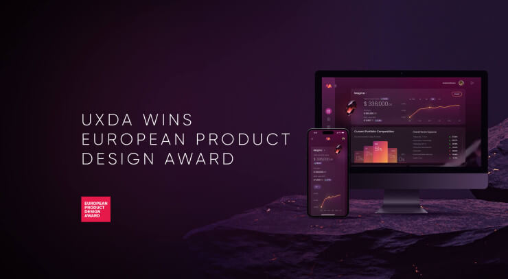
Luxury Banking App UI design Recognized by World-Famous Awards
What if your especially demanding customers would become enthusiastic about mobile banking app user interface (UI)? That would most probably result in much more trustworthiness and enthusiasm from customers. In order to do that, you need to understand the people who will use this banking app and see the world from their point of view. Each person has a unique way of looking at life, but they all share one thing in common - emotional human nature.
The UX experts of the UXDA were aiming to change some of the universally used approaches of mobile banking app UI design while retaining already known easy-to-use principles common to mobile designs. The goal was to design and build the visually stunning and simple banking app, keeping the wide-ranging functionality. As an outcome - the luxury concept of Light Bank - a fusion of beauty and simplicity, was created.
Light Bank luxury mobile banking concept has been awarded by globally famous international design awards such as A'Design Award, International Design Awards (IDA), London Design Awards and DNA Paris Design Award.
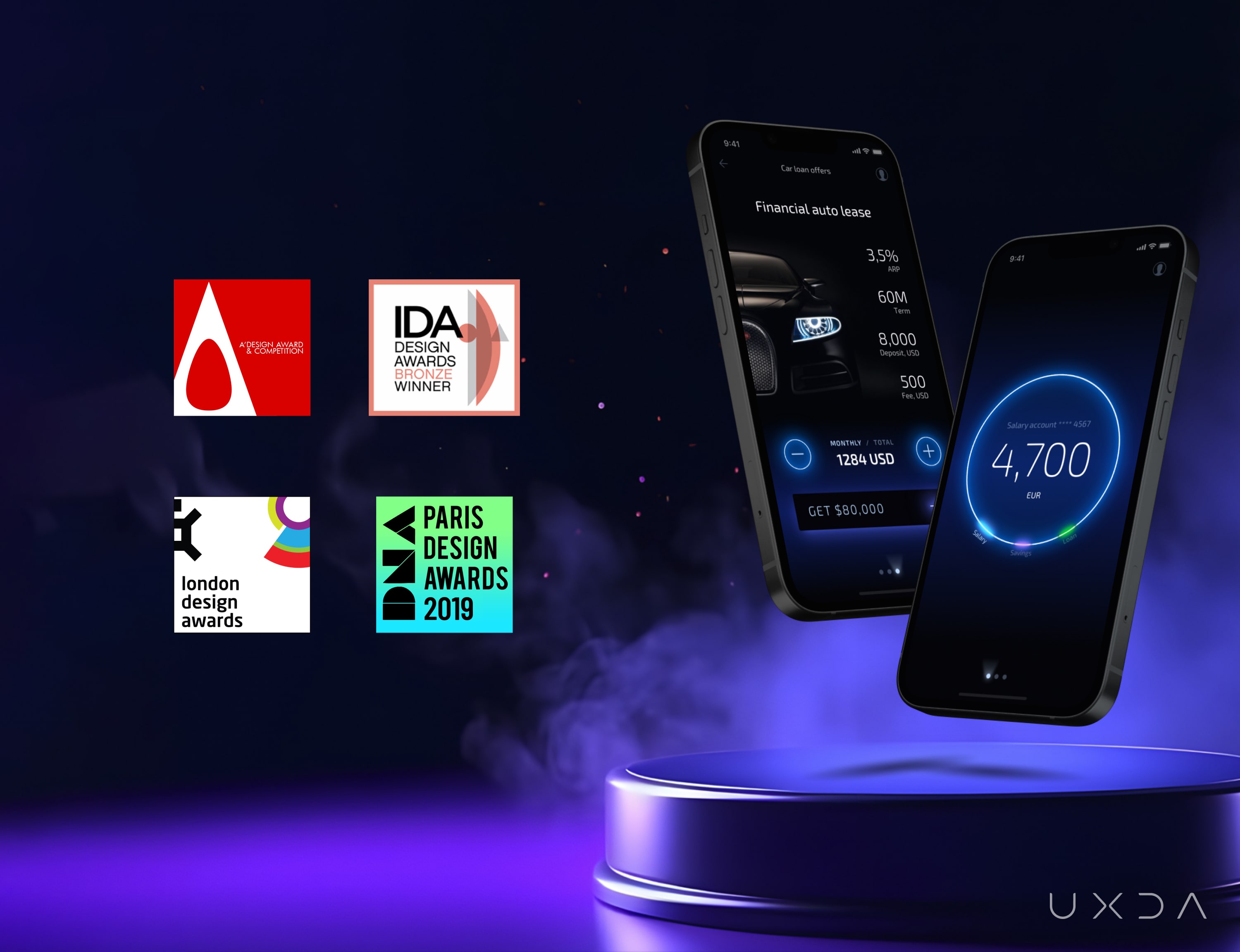 The Light Bank digital CX design concept was also shortlisted for one of the world's biggest and most prestigious design awards─the iF Design Award 2019 and the Red Dot Award 2019.
How does UXDA create awarded financial products
How to Create a Luxury Banking App UI / UX Design
Our 10 steps recipe of creating the multi-awarded luxury mobile banking design starts from business objectives to determine the business model and commercial context of the financial product.
After that, we gathered as much information as we could about the app’s potential end-users. It was crucial for us to determine the wishes and perceptions of people who could become enthusiastic supporters of Light Bank.
Step 1. Find Heroes of Your Story
By conducting multiple interviews, collecting online accessible data, and setting up different surveys on social media we created the key user personas as possible customers of the future bank app. Based on the results of our research, the personas were a millennial student, a sales manager and an entrepreneur.
The main characters to whom we are creating mobile banking app were generally described as :
- Discoverers - energetic people who keep up with the current trends and consider traditional banking apps to be complicated and tedious.
- Lovers of beauty - enthusiasts of good-looking, authentic solutions and modern novelties, eager to maintain their appreciation of beauty in their lives.
After discovering these values in our customers, we realized that to create luxury mobile banking app UI our design had to be:
- mind-blowing,
- emotionally engaging,
- delightful,
- easy to use,
- innovative.
In other words, our financial app UI design needed to be cutting-edge, visually appealing, and emerge as one of the top banking apps in the market.
Step 2. Open Your Heart to Users’ Feelings
Next, for each of the personas, we built an Empathy Map. It compiled what would become the main paths of usage, based on their importance. By doing this we were able to have a better understanding of our heroes’ emotional aspects and an ability to ‘walk in their shoes.’
When creating the Empathy Map, we discovered a lot of pain points and dissatisfaction in regards to our heroes’ experiences when they used other common banking services. The main issues included difficulty understanding the out-of-date designs of the service. To improve this, we had to gain a better understanding of our customers, their expectations and needs.
Our characters were eager to use neo banking types of solutions. They were also advised to try alternative options by their friends, who were already using these kind of products.
Step 3. Create a Map of Banking App User Journey
During this phase, we merged the observations collected in the earlier stages into a document called Customer Journey Map (CJM).
The CJM, created by UXDA, is based on bUP (Business, User, Product) and is specifically tailored for the development of financial solutions according to financial UX design methodology.
Our goal was to learn about the essence of what exactly the users were expecting from the banking app, what kind of feelings they would experience when they used it, and their main usage paths, along with business objectives, KPI's and an action plan. Being able to see the whole picture helped us to create a detailed step-by-step product experience that would satisfy the needs of both the users and the business in the best possible way.
During this stage, we determined exactly what the most crucial action points would be from the users’ emotional point of view.
People tend to remember the services that have caused them to have negative feelings, and it is difficult to make them forget that negativity through other positive experiences. By considering these circumstances and having a goal to create an amazing experience for our users, we identified the main trouble points and tried to make them as easy to use as possible.
The banking's Customer Journey Map consisted of 5 stages, 17 touchpoints and 346 bullets. For more complicated banking platforms there can be more than 100 touchpoints and up to 2,000 bullets. Take a look at this explanation of a Customer Journey Map to gain a better understanding of how this works.
Let's say that the aim of a touchpoint ’Top up account’ is to quickly and securely increase the amount of money held in a user’s Light Bank account by transferring funds from another bank account. In this case, the main tasks consist of:
- Adding funds from another account/card
- Adding funds from a card that is already registered in Light Bank
- Adding funds from Apple Pay
- Adding funds from PayPal.
By doing these tasks, a person can sense different feelings such as impatience and excitement. Also, at this step, the user might have some questions, such as:
- How can I increase the amount of money in my Light Bank account?
- What information is required from me?
- Is this secure?
- How long will this process take?
If we talk about the possible pain points a user could have, one of them would definitely be their obligation to enter the payment data repeatedly, every time, when performing a top-up function to add money to their Light Bank account.
From the perspective of a business, the most important goals of this touchpoint could be the frequency of top-ups and amount of money being topped up by the users. Furthermore, the KPI's (Key Performance Indicators) could be determined by:
- the percentage of transactions with or without errors;
- the average amount of time spent to complete a transaction;
- the average amount of transactions.
Also, it is crucial that the users consider the process of adding money to the account to be simple, easy to understand and as safe as possible. At this particular stage, the banking app can state the benefit to the users as ‘top-up your account in seconds’.
After learning about the customers and the businesses, we were able to determine what was necessary at each step of the user’s interaction with the app. This allowed us to prepare a list of functional requirements for the project, create a Red Route Map Analysis, and identify ‘power’ user scenarios.
Step 4. Fit the Service Conceptual Model to Users Mental Model
Next, we were able to prepare the Information Architecture of the banking app’s design based on the mental models of user perception, so that they can easily understand the structure and principle of operations in our product. After creating the banking Information Architecture we were able to learn everything about the conceptual service model, which was created from fundamental sections of data along with a thesaurus. To achieve this, it was beneficial to use a practice called ‘Card Sorting’, in which potential users are asked to arrange components of a product according to the specifics of their mental model.
We focused on making the information architecture as simple as possible in order to eliminate the navigation menu. Regardless of that, we managed to maintain all the fundamental functions of mobile banking architecture that the users need.
The service includes complete information about the users’ bank accounts, transactions and even statistical graphs. It is possible to transfer, demand and add funds to your account, and schedule payments. In addition, it is also easy to add and manage a wide variety of financial products - lines of credit, insurance, debit cards, investments, etc. And, of course, the banking app has adjustable profile settings, notifications, and it offers support if needed.
Step 5. Transform User Scenarios Into User Flows
After gathering all of the information about the main usage scenarios and creating the mobile banking architecture, the our banking app design CX strategy was ready. It was time to continue with the creation of Low Fidelity (LoFi) user flow map.
These user flows are made to establish the right order for the essential user scenarios that have been determined in the earlier phases. It helps to design and adapt the actions that users have to take in order to achieve their goals in every task.
With the help of banking user flow map, we were able to build the whole inner logic of the service by thinking about all of the functional demands of the application. Usually, during the process of developing a financial project, the LoFi maps are adjusted. In total, 35 key user flow maps were created for the Light Bank concept.
Step 6. Draw Detailed Blueprints of the Future Banking App
We continued our work by creating High Fidelity (HiFi) wireframes. Our goal was to prepare a visual construction of the app’s screens and the content, considering the logic of the financial service and all of the previously generated mobile banking CX insights.
The creation of wireframes gave us a chance to develop the banking app by using visual communication based on the users’ perceptions of the luxury Fintech app, instead of a traditional technical requirements list that can easily be misinterpreted by the development team.
Wireframes provide an opportunity to create a prototype of the mobile banking app UI perfectly suitable for testing the banking app UX strategy and the critical user scenarios. We executed in-house testing of the wireframes by checking out the most vital and frequently used banking scenarios identified in the Red Route Analysis.
Despite our best efforts to simplify the structure and the interactions of the banking service, the total amount of wireframes necessary for the concept turned out to be more than 100.
The primary goal of the testing is to determine any points where users found it difficult to manage the given tasks and to find out if there is any difficulty understanding the financial app's interface design. Afterwards, you can brainstorm better solutions and implement the necessary adjustments.
For example, users faced some difficulties in the process of trying to understand how to activate the payment function. In order to keep the structure of the service as simple as possible our decision was to leave this function as it was. However, to make our mobile banking app UI solution easier to understand for users who are not as comfortable using advanced technologies, we added a learning tip that would be displayed at the first login.
Step 7. Catch a Visual Mood That Inspires
After the UXDA team discussed the results of our examination and prepared the needed corrections, our UI designers have started creating the mobile banking design concept of the Light Bank interface. The task for our UX Design Agency team was to cautiously examine our approach to digital banking CX design, information about the key users, the demands of the organization, and the overall perception of the digital banking products. After learning all about the previously described UX strategy, our designers came up with a mood board for the mobile banking app UI.

When creating this financial UX solution, we focused mainly on the users’ perceptions. It is difficult to compare anything to the beauty of nature. The energy of flames, flares of lightning, the vividness of animals, the night sky filled with stars - the beauty of wildlife and natural environments has fascinated people since their childhood because it is embedded in the evolution of our brain.
For our team of UI designers it was crucial to translate the bliss of being in touch with the miracle of nature into the visually stunning banking design, such as supercars. It turned out to be a challenging task for UXDA to create an app that would ultimately inspire and satisfy luxury banking customers so much that their everyday financial activities would feel like a different reality.
Step 8. Design the Key Concept That Sets the Visual Language
The preparation of the Key Design Concept is one of the most anticipated and important moments in the whole process. The main responsibility at this point was to find a way to transform feelings and ideas into a solution that would be loved by millions of people all around the world.
In order to create the mobile banking app UI, it is not enough to just colorize the previously created wireframes or to follow an abstract design inspiration. We needed to consider these factors:
- UX demands;
- aspects of the digital banking solution;
- design standards for the mobile interface;
- the latest trends in the app design industry;
- the technical performance of the mobile platform;
- categorization of the UI components;
- an option to adjust the concept into a top-of-the-line Design System.
Under the guidance of UXDA's art director, a team of designers took part in creating the banking design’s concept development. In order to achieve the key design, the team needed multiple sessions of brainstorming, benchmarking and examinations of a wide range of banking user interface elements and solutions.
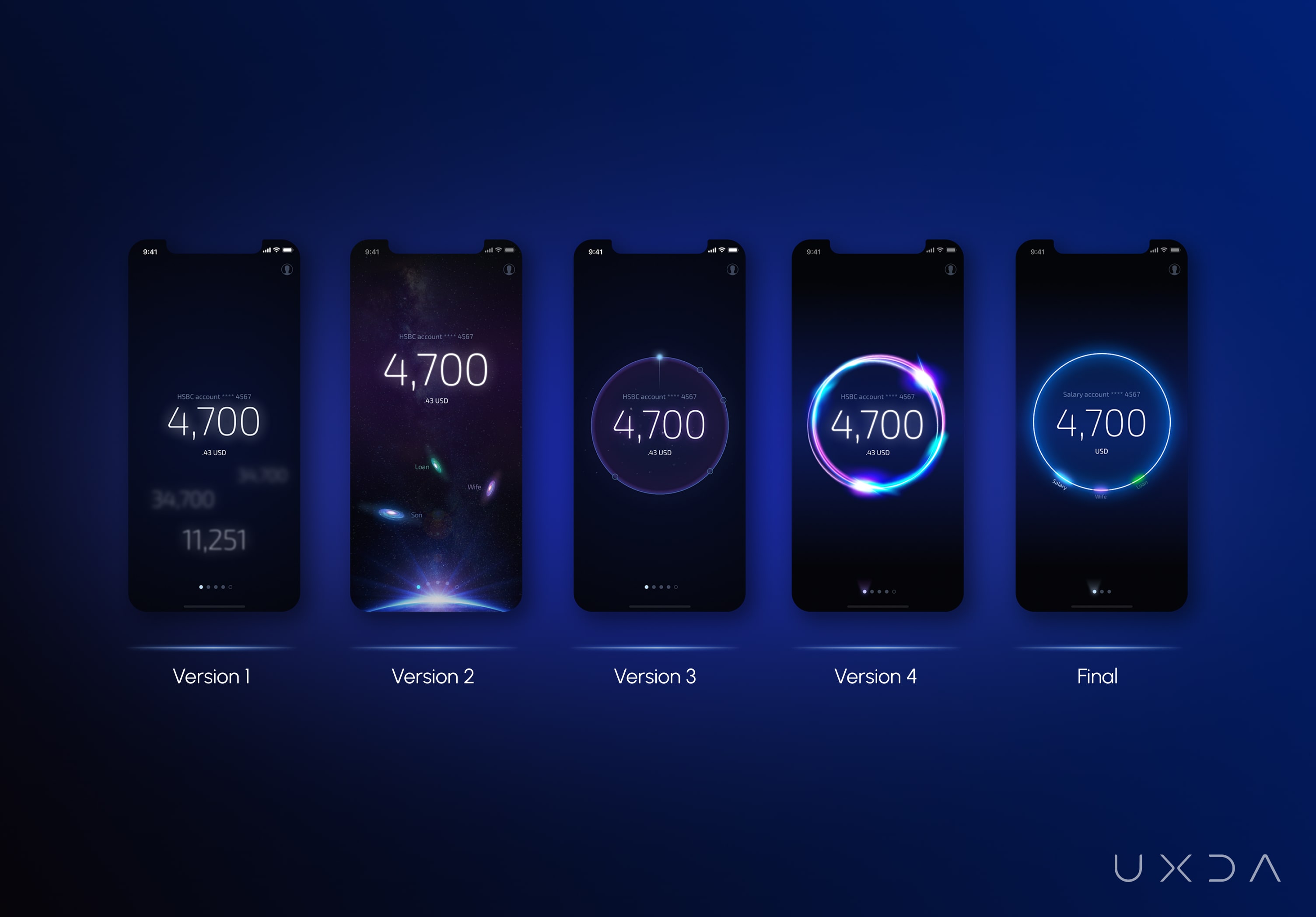
This phase took a week, during which the financial app design idea went through many transformations and became very different from its initial version. The design process continued until the best possible outcome was reached.
Step 9. Create Proof of Concept
Our goal was to prepare a concept of a visually stunning banking UX design displaying the implementation of the most important and basic user scenarios. A total amount of 30 screens were prepared and integrated into a clickable InVision prototype. Also, a motion design video was created specially for this digital banking case study.
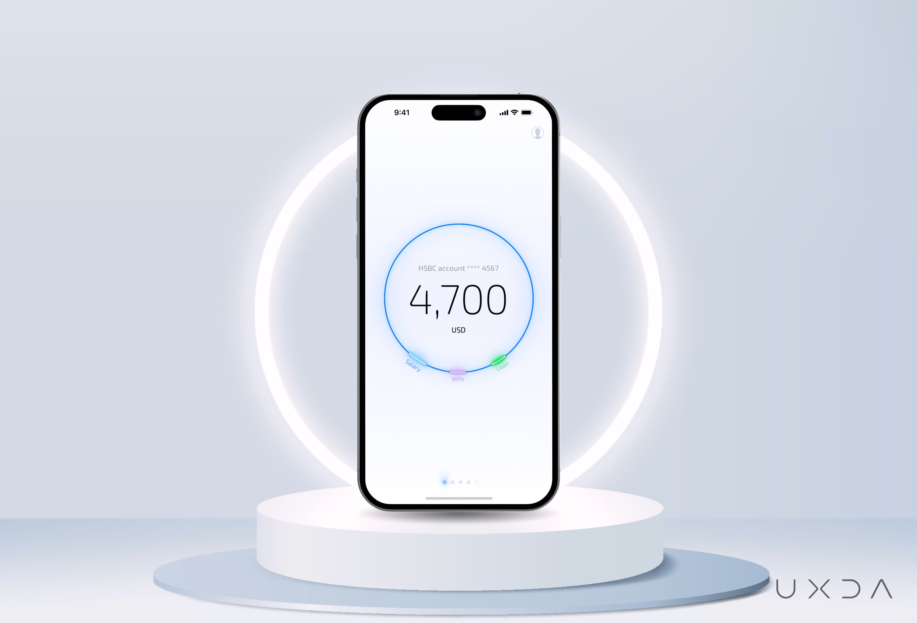
Endless Accounts
The journey of using Light Bank begins with 30 seconds enrolment. Later users could sign in using Face ID verification. Users can view the funds available in their main banking account and also view other connected products by swiping the screen. In the next screen the user can see all of his/hers cards, and then the marketplace where the user can apply for any new financial product.
In this scenario users can view their transaction history by selecting an account. During this task, they will see only each transaction’s most essential data, the amount and who received the funds.
When looking through the list of transactions, we can see a date that is located at the lower part of the screen. This also works as a filter. After the user clicks on it, it's possible to choose a time period for the transactions or array transactions, based on chosen criteria.
To see more specific information, such as the time when a transaction occurred, its ID number, location, and previous deals with the same recipient, the user just needs to click directly on the transaction.
Useful Details
For many people, the basic information of the funds available and the transaction history are the most important scenarios. However, some users need to make a more thorough analysis of their funds’ movement.
To accommodate this need we created a section for statistical data, forecast and settings that can be viewed by clicking on the bank balance. Then the user can choose the category of data and time frame that they would like to see.
In the section of details and settings, the customer can view the information about the account and has an option to manage the outgoing money limits.
Rich Opportunities
In the Marketplace section, Light Bank clients are introduced to a broad selection of financial products. In order to apply for a product, the user selects the product category and their main goal. In this example we selected a loan in order to purchase a car. Light Bank immediately offers three choices for this scenario.
The offer is personalized and based on an examination of the customer’s financial data. The user can view the highest amount of credit offered to them and has the option to decrease it. The user can also readjust the loan by choosing a recurring payment or paying the full amount.
Instant Payments
In order to view the options for money transactions, the user has to press and hold on the amount of their balance in the main page. After that, two types of actions appear, Add Money and Send Money. The option of adding money lets us add funds into our existing Light Bank account from a different bank account payment card, divide a bill with friends, send our account information to others in order to request funds, and produce a receipt PIN code for ATM deposits.
Our focus was to create the Send Money option as clearly, intuitively and easily as possible for the majority of scenarios. All the user has to do is to provide information about the amount of the transaction and the name of the recipient. When people make transactions 80% of them are sent to the same beneficiaries, so we made a list of Recent Transactions so users can effortlessly find the recipients of past transactions.
Another great option is the search function. By using the Smart Search, a user is offered a list of favourite recipients form the contact list, payment templates and transaction history. It is also convenient to use the Geosearch option, which helps users find nearby friends who are also using Light Bank in order to send funds to them. If no results were found, a new form of payment is automatically displayed. In order to move money between the user’s own accounts, the user only has to click o the Accounts tab.
When receiving a confirmation that a transaction has been processed, such as a payment, the user has the option to delay the payment by changing its effective date. Another option available for the users is to set repeats for any transaction.
Careful Assistant
A great option included in Light Bank is the voice assistant. It is as simple as saying ’Hi, Light Bank!’ and a voice chat with the app will be accessed. The only thing a user has to do is to name the recipient and the amount in order for the transaction to be created.
But what if you want to send money to a recipient that has more than one account in different banks? In this case, the user can simply select the account that they would like to make the payment to.
Attractive Notifications
It was also essential to understand how to improve notifications, making them more engaging and fun instead of just boring pieces of text that pop up on screen. We wanted to add a positive emotional aspect by creating notifications that are animated and visually more appealing, in that way we were able to attract the user’s attention and get them involved in the product, providing more delightful experience overall.
Customized Appearance
We could not call our product Light Bank if it wasn't connected with the concept of light. Based on the timing and geolocation data, Light Bank knows when the sun has risen and when daylight changes into night light. So the app makes an automatic transition from a lighter background to a darker background according to the time. This setting can be manually adjusted, so if the user prefers one of the backgrounds , it can be set as the default.
Step 10. Create Banking Design System
Finally, we needed to make sure our design concept has the potential for further development and upscaling. This is where the Financial Design System comes in.
Design System could be compared to a map that guides the product developers and stakeholders through a complete collection of UX insights, UI assets, commonly used visual components, design statements and the style guides of the specific design.
Benefits for the customer include using of the same design ’language’ in developing complex banking solutions, and even adding new digital channels. This ensuring the consistency of the design and is crucial for minimizing the cognitive load on the user.
Benefits for the business - it doesn't matter if the team members working on the project are located in various locations all around the world and speak different languages - the Financial Design System keeps everyone involved ‘on the same page’. It provides a rapid and effective solution, upscaling, and also the possibility to easily adapt to the constantly growing expectations of customers.
Advantages for the designers - it is more convenient to construct interfaces piece by piece, rather than designing all of the screens at the same time. This approach allows designers to adapt and test components to make them pixel perfect.
Benefits for the developers - the Design System allows to create an associated element code library to speed up the development process by copy-pasting similar constructs.
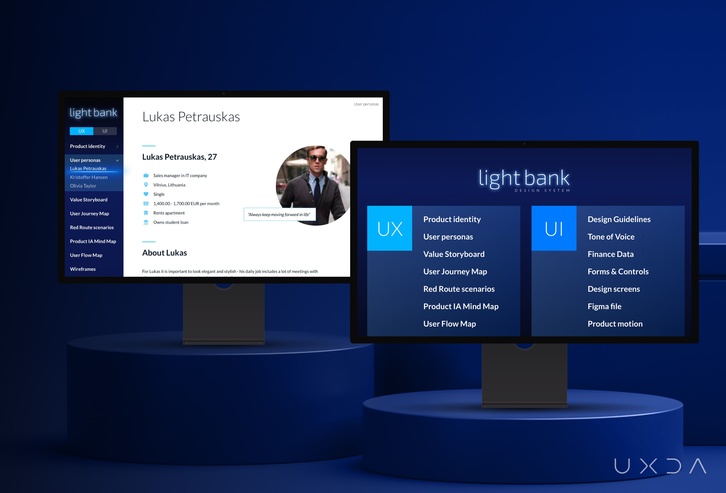
The Financial Design System provides a convenient and quick way to look-up elements, resulting in fast interface prototyping without searching for specific elements or modules in hundreds of already designed screens. This significantly boosts the speed of product design and development.
VIEW MORE FINANCIAL UI/ux DESIGNS BY UXDA
Afterword
If you look at hugely successful companies that have integrated Design Thinking into their their DNA, they have five times bigger Price/Earnings rates than average.
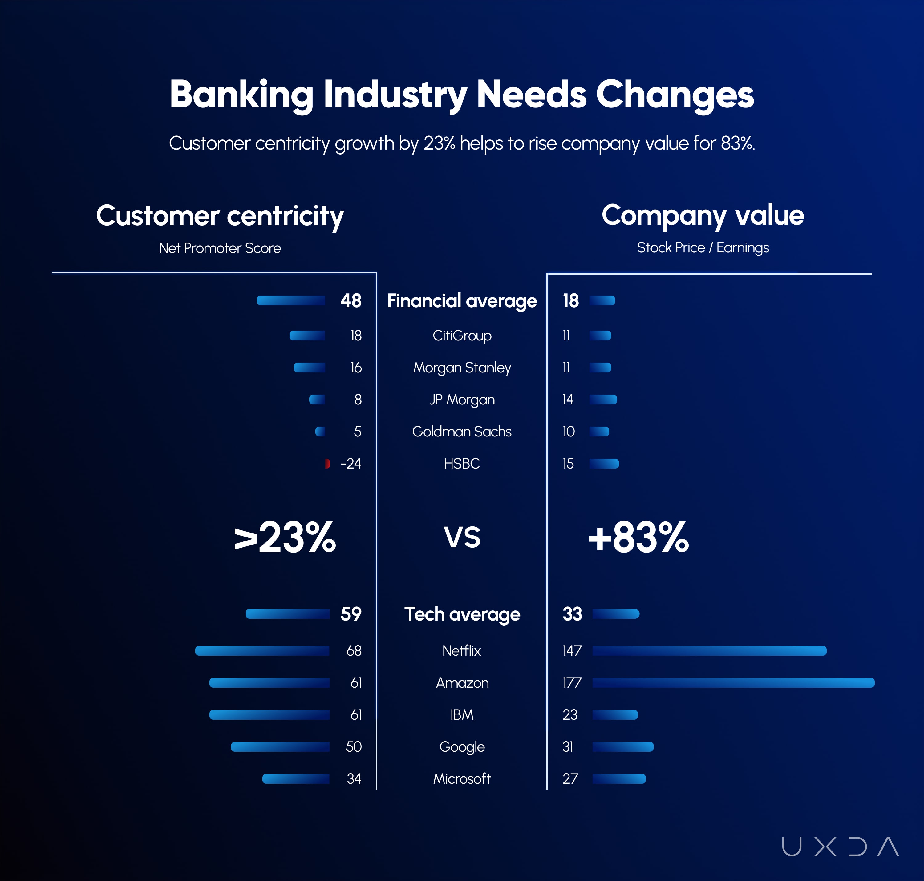
As we can see from the chart, user-experience is what truly makes a difference in the modern digital world. Now you have been introduced to our mobile banking CX case-study of the luxury banking design. This digital banking case-study goal was to show that a customer-centered UX design can significantly improve the value of any financial service. All we need is a user-centered design mindset and a desire to disrupt the financial industry by shifting the main focus to an outstanding user experience.
We encourage you not to be afraid to make a difference, to think ’outside the box, and to climb higher - beyond the average. We hope this UX design case study will empower you to reinvent the banking industry, and we are always happy to help you on your journey.
Here at the UXDA we are eager to solve challenges in transforming complicated financial services into beautiful and user-centered designs. This broadens our clients’ perspectives, not only leaving end-users and industry professionals with the word ’wow’ on their lips, but even more - completely blowing their minds away. Every day, with every project, we strive to accomplish our main mission - transform the mindset of the banking industry. So, are you with us?
Cost for architecture and UX / CX design of mobile banking app UI starts from €250,000 and needed project time from 5 months. Schedule and price depends on solution complexity, UX deliverables and project goals.
UXDA's approach is also described in our other financial UX design case studies:
Banking Super App with Endless Possibilities
Banking Back-Office Transformation that Led Vendor to a Global Expansion
How to Raise the Rate of a Mobile Banking App from 2,8 to 4,7
Light Bank luxury mobile banking case study presentation at one of the world's biggest finance events Finovate:
Explore other of our client's next-gen financial digital products and UX transformations showcased in the UXDA team's latest showreel:
Get UXDA Research-Based White Paper "How to Win the Hearts of Digital Customers":
 If you want to create next-gen financial products to receive an exceptional competitive advantage in the digital age, contact us! With the power of financial UX design, we can help you turn your business into a beloved financial brand with a strong emotional connection with your clients, resulting in success, demand, and long-term customer loyalty.
- E-mail us at info@theuxda.com
- Chat with us in Whatsapp
- Send a direct message to UXDA's CEO Alex Kreger on Linkedin