Is it possible to remove friction and improve fintech app design in just a few days using UX design approach? Many believe it requires a significant amount of time and financial investment. But that's not true. You can instantly increase overall user satisfaction by easing their most common struggles. In fact, by reading this Fintech app design guide with 20 tips, you can fast and easy detect improvement points of the banking user experience (UX), thus achieving great results with little effort.
Fintech app design is the design of user interfaces (UI) for financial technology products and services. This type of design focuses on creating intuitive and user-friendly interfaces for financial mobile and desktop applications, to make it easy for users to manage their financial accounts and transactions.
Best fintech app design effectively meets the needs of the user, while also being intuitive, user-friendly, and visually appealing. Key elements of good fintech UI design include:
- Functionality. A good fintech product should be able to effectively perform all of the functions that it was designed for, without any unnecessary features or complications.
- User experience. A good fintech product should be easy to use and understand, with a clear and intuitive user interface.
- Visual design. A good fintech product should have a visually appealing design that is consistent with the company's brand and aesthetic.
- Responsiveness. A good fintech product should be responsive and adaptable to different devices and platforms, so that users can access it on their preferred devices.
- Accessibility. A good fintech product should be accessible to users with disabilities, and should comply with relevant accessibility guidelines and standards.
Customer demand differentiates successful businesses from failures. That's why it's so important to focus on making the most out of customer interactions with your financial app.
By using Pareto law, we can say that approximately 80% of customers use only 20% of all the functionality a financial app offers.
It means that improving key user scenarios can give you a rapid, significant increase in overall user satisfaction. Moreover, this can be done in considerably less time using fewer financial resources.
Identify scenarios that cause struggles and simplify them with the help of UX design to remove friction from fintech products.
Removing friction will instantly boost the overall experience of the digital financial product and will award you with customer loyalty.
Improving the 20% doesn't mean that we should ignore the other 80%. In the short term, focusing on the crucial 20% scenario allows you to achieve the UX improvement you want very quickly. However, you should keep in mind that long-term, ongoing improvements in the banking customer experience are the key to keeping customers satisfied and loyal to your financial service.
Top 20 Ways to Remove Friction from Fintech App Design
Financial service product design should be customer-centered to provide intuitive and frictionless experience. Over the last five years, our team of UX architects has collected thousands of financial flow examples that create struggles in usability. To guide you through real-life examples, we will cover 20 of the major mobile banking interface problems that could be overcomed through Fintech app design.
We have added a detailed description of each of these examples so you can understand where the usability problem lies and what exact steps you need to take in order to remove friction and turn it into a pleasant experience in your own financial product design.
1. Ensure a Quick and Smooth Login
Customers can get extremely annoyed when they want to quickly check their balance or transfer money, but accessing the financial app is such a struggle that they give up and decide to come back later when they have more time. This certainly is not a way to bond with the customers. They might put up with it in the short term, but eventually users will probably switch to a financial app that provides a quick and smooth login.
From the UX perspective, it is critical that the login is effortless and allows simple access, while keeping security in mind.
From the user’s point of view, biometrics is the best and quickest way to log in, but, unfortunately, not all banks are able to provide this option. Nevertheless, it's possible to ease the login process by applying UX knowledge and a few simple UI features.
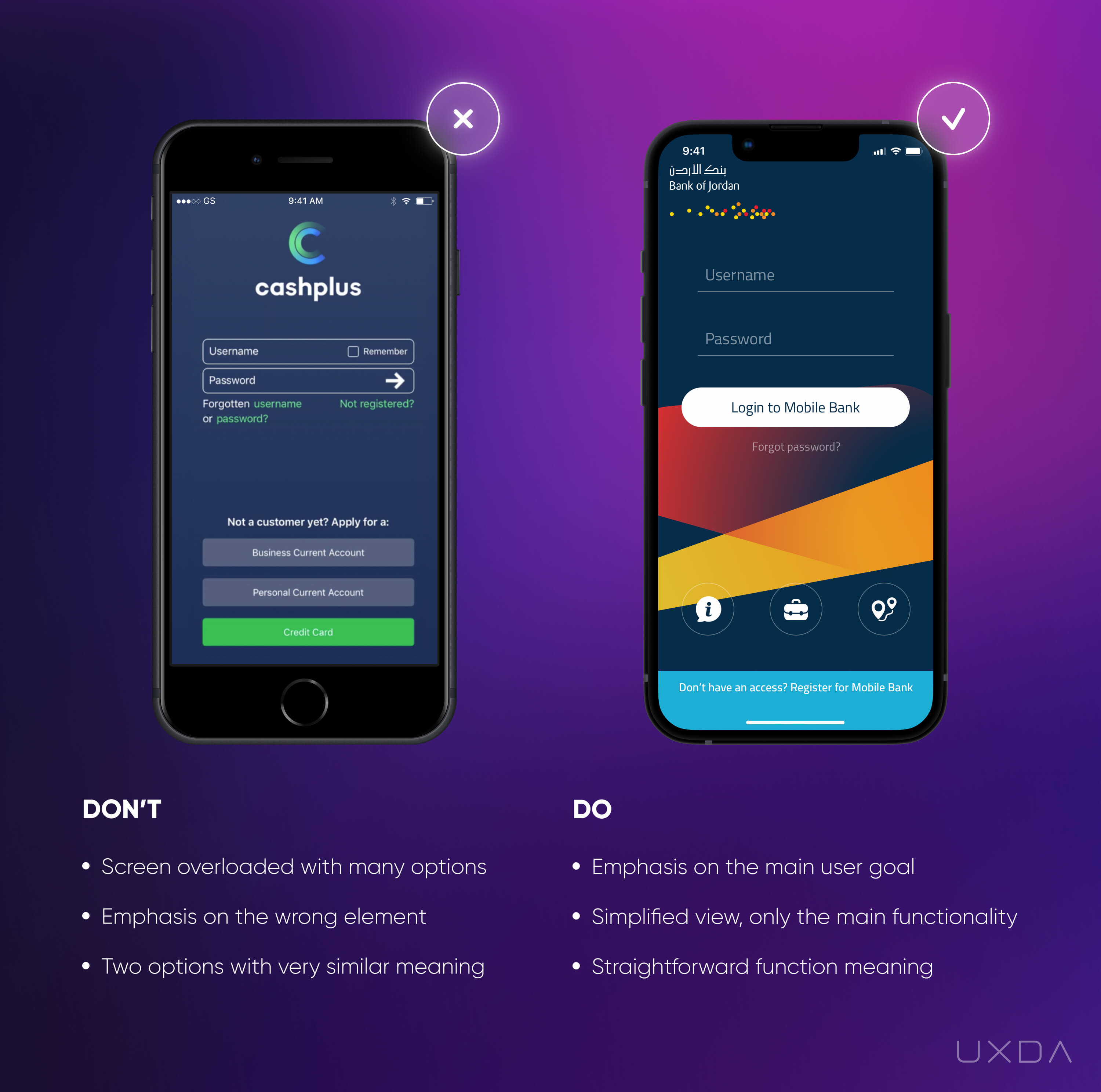
Image source: Cashplus Mobile App, 2018 / Bank of Jordan Mobile App, 2019
Banking usability struggle
If you take a look at the example shown in the left graphic above, you can see quite a wide range of options. Some still believe this is the right way to win the users’ loyalty. But, the truth is too many options and features confuse the users, causing cognitive overload for the human brain. The user automatically analyzes all of the options available on the screen and seeks the one that will help to accomplish the goal. This takes them quite a lot of effort, time and energy.
In the example on the left, the first thing that the user sees is the button “Credit card”. But for most users, the main goal at this stage is to access the app, so they are looking for information and functionality that allows that, not the "Credit card".
Another aspect that can confuse the user in this example is that there are two very similar options for new customers. The user has to choose whether to click on “Not registered” or “Apply for a Business Current Account/Personal Current Account.” The creators of this app probably didn't even imagine that this could actually confuse the users and make them ask, “which option should I choose?” “are those the same or different?” “what will happen if I click on one of them?” etc. That's why it is so important to make it absolutely clear and transparent for the customers to know exactly what to do depending on the specific scenario.
Solve it With Fintech App Design
We shouldn't make our users think; we should give them all the answers before they start searching for them. Too many options cause decision paralysis, and, in the end, nothing gets done.
The design should emphasize the main scenarios that have led the user to a specific screen. It helps to ask yourself, why has the user arrived at this screen? What's the main goal? Ideally, one screen should answer one main question. If you take a look at the example on the right, the UX transformation UXDA accomplished for the Bank of Jordan, you can see the main goal on the screen itself, which is to log in to the service. So, the design emphasis must be on login input fields and the button that gets you there.
Take a look at your financial product through the eyes of the user. Is it easy to log in? Are the correct elements emphasized? What could confuse your users?
When you have defined the primary scenario on the screen, it's also important to pay attention to the secondary scenarios. For what other reason than to log in might the customer arrive at this screen? What struggles may arise for which the customer might need immediate help? Features addressing these questions should also be included on this screen.
Though it's important to ensure that the emphasis is still on the login, it is also critical that you provide your users simple access to support, as well as offering new customers the option to join the financial service. Think about the most important functionality for the user on this screen instead of all the possible options. For example, provide one option to access “Help/Support” instead of cluttering the screen with all the possible options to get help, such as phone numbers and a list of branches.
These simple steps can make a huge difference. You can easily review your current login screen and answer all the questions mentioned above.
Takeaway
Focus on the main scenario of the screen and emphasize it. Don't forget about the secondary scenarios that can be truly valuable. Evaluate which options on the screen are really crucial to reach the user's goals and eliminate the rest.
2. Make Navigation Clear and Intuitive
There are some financial apps that the users compare to a jungle. They have to break through a thick “forest” of dozens of functions to reach their destination. This is not a quick or pleasant journey to take.
One of the main goals of the user experience design in finance is to help your customers achieve their goals as quickly and effortlessly as possible. Here, it's important to evaluate whether your financial app might remind users of a jungle. If so, a careful UX audit and evaluation of all the functionality should take place.
Often, it turns out that the users actually only use one-third of all the functionality available. Removing the unnecessary functions transforms the service's experience into a much more pleasant one.
But, as we are talking about smart changes that can be done quickly and have a great impact, you should focus on at least guiding the users through the jungle with helpful navigation.
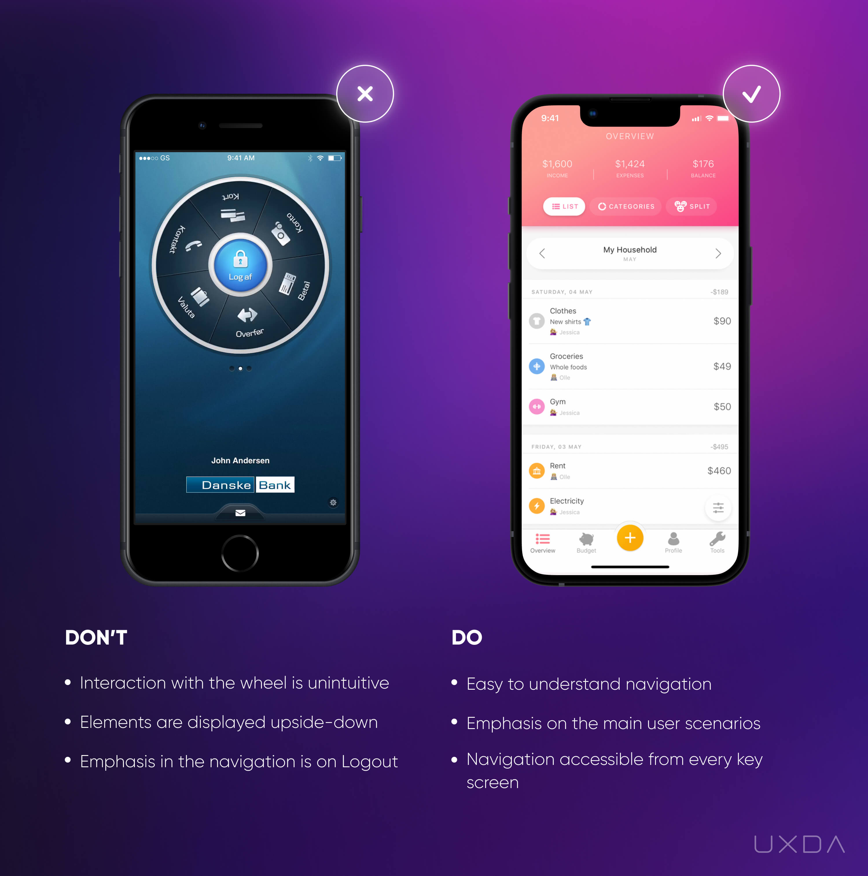
Image source: Cashplus Mobile App, 2018 / Bank of Jordan Mobile App, 2019
Banking usability struggle
It can get very frustrating for users when they can't find the needed information in just a few seconds. Sometimes, the navigation of financial apps is confusing and getting through it is like trying to solve a puzzle.
We advise not to overcomplicate the task; keep the main navigation menu easy to access and simple to understand.
In the example on the left, it looks like there has been a good intention to make the navigation stand out and excite the users. Unfortunately, the end result is difficult for the user to understand.
The navigation is reminiscent of a fortune wheel. From a UX perspective, it isn't comfortable that the text is upside down and only readable if the user turns the wheel or the mobile device.
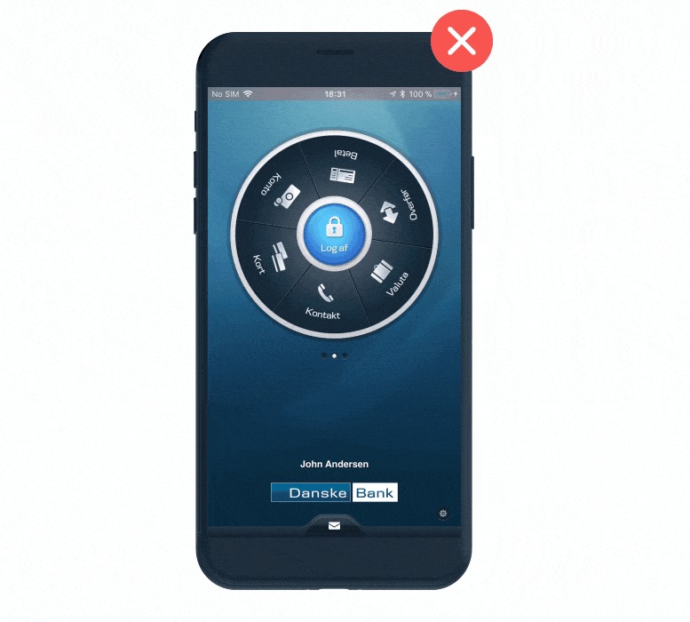
Danske Bank Mobile App Menu, 2018
As this is the first screen of the app, it should meet the user expectations and provide the main information the customer is looking for, at this point, being the balance. Also, the main design emphasis is put on the button inside the circle, which urges the user to log out of the app, though this is illogical as the customer has just logged in.
Solve it With Fintech App Design
An effective UI design requires interesting design elements, but think twice if you are considering an atypical navigation solution. Let the user explore your financial app without any effort, resulting in more positive emotions and motivating the customer to use the app more often.
Make sure that your navigation is easy to access. At the same time, it shouldn't be intrusive. The users should feel that the main menu is always there to guide them without requiring a lot of their attention.
Also, make sure that the navigation menu titles are formatted correctly and are easy to understand. When the users read them, their mind automatically generates possible functionalities under those titles, so it's important that they meet the customer expectations.
Takeaway
Users should feel like the main menu is always there to guide them but at the same time it's not intrusive and doesn't steal a lot of attention. Pay attention to the menu titles, those should be formulated correctly not to mislead the users.
3. Don't Bury the Balance
For many users, the most important purpose of a financial app is to check the balance. This allows them to feel in control of how much money they have left and make decisions about future spending.
Often, the balance needs to be accessed ASAP, such as while a user is waiting in line at a shop and wondering what they can afford. Nevertheless, there are many financial applications that have made this critical scenario unnecessarily difficult. If users aren't able to access their balance quickly, it can result in a lot of frustration.
Psychologically, it triggers uncertainty about how much money is available and concern about getting embarrassed at checkout when their card is denied.
Another common pain point for the users is that often the balance is not only hard to find but also confusing. The user needs to quickly find out how much money is available for spending. Unfortunately, some banks show the balance with the credit limit and reserved amount, which can make it really difficult to understand how much is available for spending and how much is the borrowed amount.
Banking usability struggle
The information that is most important and commonly used should be accessible in just seconds; the users expect to find their balance right after login.
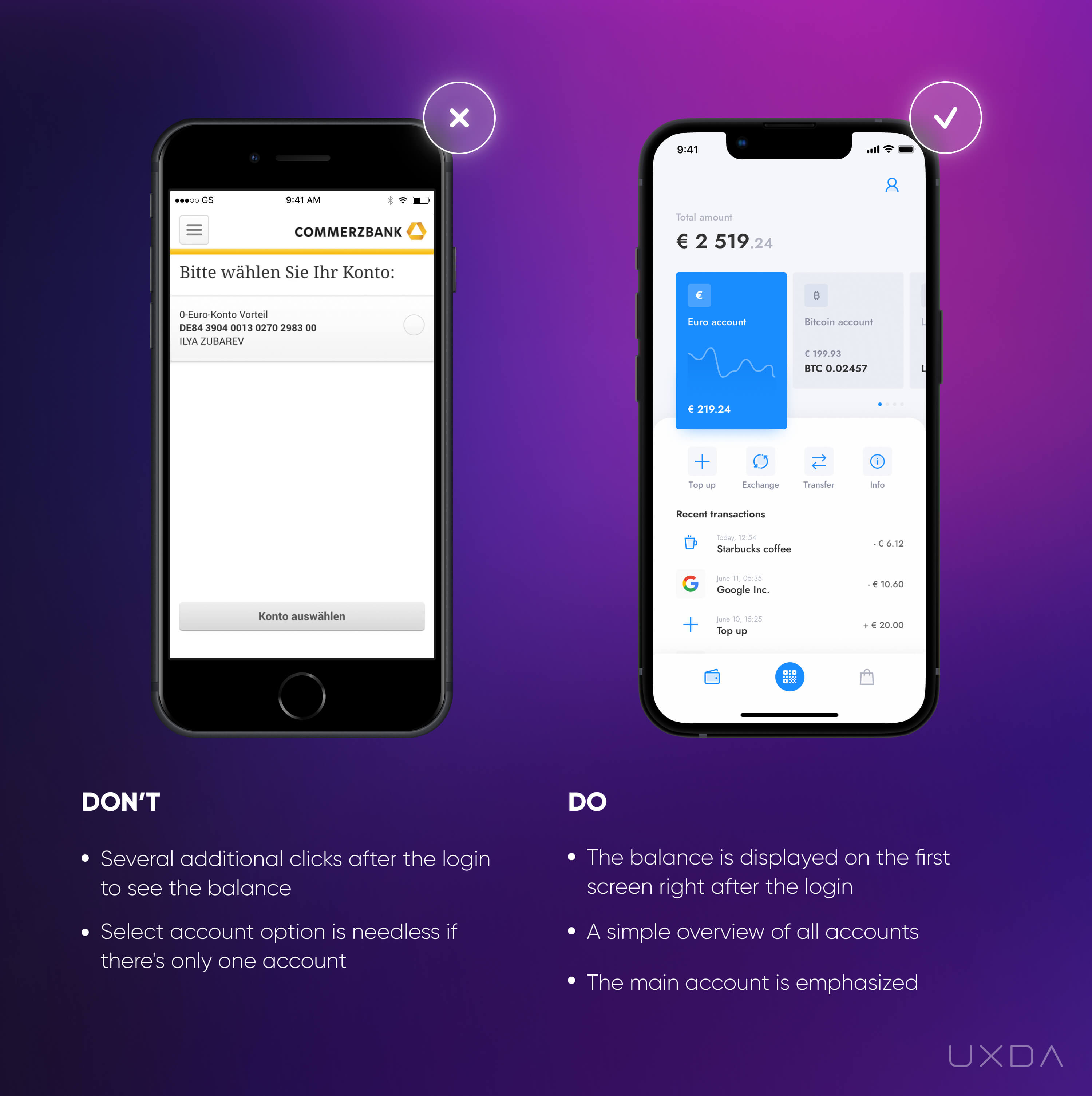
Image source: Commerzbank Mobile App, 2018 / Unbank Mobile App, 2019
In the example on the left, we can see the first screen after the login. The user needs to select an account and press the call-to-action button “Konto auswählen" or "Choose an account". Only then will the balance be displayed. In this case, in which there is only one account, the steps of selecting the account and accepting this choice with the button are totally unnecessary.
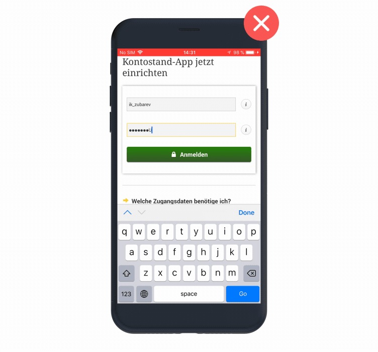
Commerzbank Mobile App, 2018
Most users view their account balance every day, often multiple times a day. If gaining valuable and frequently used information takes effort and time through unnecessary clicks, it can make the whole app experience feel complicated and unpleasant.
Solve it With Fintech App Design
Provide users with the most important information as quickly as possible. Don't hide the balance and make your users click through unnecessary screens to see it.
In the example on the right, you can see the first screen after login on which the user is able to see all the main information regarding the account. Often, this exact screen is the reason why users login to their bank at all. Make sure that the customers can find out how much money they have in an instant and also provide a simple overview of their recent transactions.
Other information displayed on this screen can vary according to the specifics of your financial product. Here, it's important to do thorough user research to find out the most important information that they need to access the quickest.
If your users have several accounts, be sure to show the balances of all those accounts on the dashboard. There is also an option to sum up all the balances and show a total amount, all based on the unique needs of your users.
Make a small audit of your financial app's first screen after login. Does it provide insights about the user's finances? Do the users immediately understand how much they can spend? Does it meet the user’s expectations about this crucial scenario and not make them frustrated by complicating the access?
Takeaway
Make sure the most important and commonly used information like balance and the latest transactions is accessible in seconds - right after the login. Don't frustrate the users and steal their time with unnecessary actions.
4. Make Sure Money Transfers are Effortless
One of the most important functionalities in financial apps is the ability to transfer money. This is one of the key scenarios that determine whether the users will stick with your financial application. It's vital to make it as simple and effortless as possible.
Users expect to execute these kinds of common scenarios in just a few seconds. Most likely, they won't be forgiving if it is complicated to make a payment and consumes a lot of their time and energy. The less time your users will have to think about it, the more thankful they will be to your financial service.
Banking usability struggle
Creating a payment is a task of high responsibility. When the user decides to make a payment, he or she already knows who the beneficiary will be and what amount of money they will send. These are the two most important elements that the user expects to see when they want to transfer money.
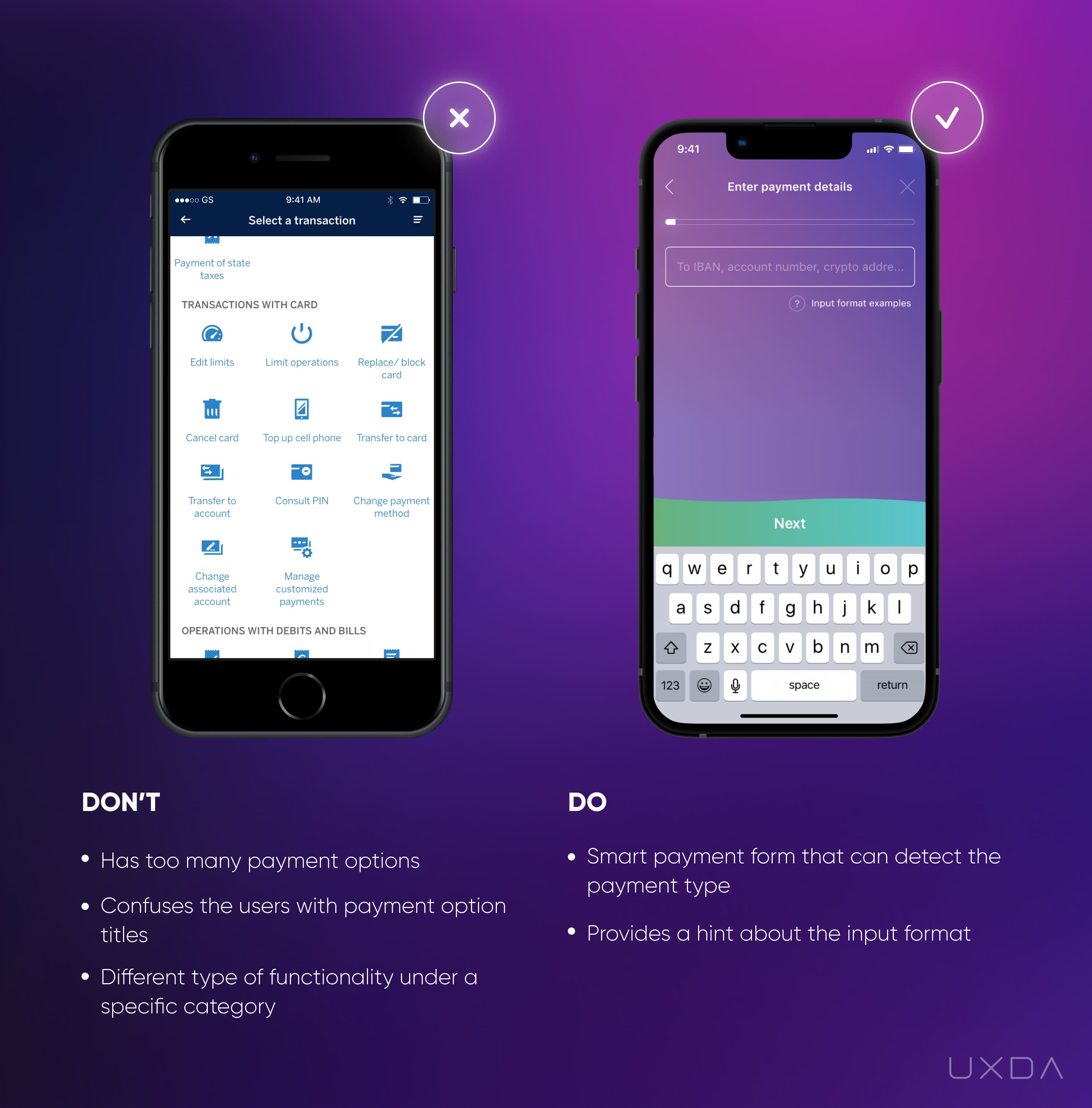
Image source: BBVA Mobile App, 2018 / Saifu Mobile App, 2019
In the example on the left, there are 27 options provided under the section, “Select a transaction.” Moreover, most of these functions do not even match the title and apply to totally different categories of functionality like “block the card” or “edit limits.” This puts an extra cognitive load on the users. First, they get overwhelmed with all the information they see on the screen, and then they are required to sort through all the options to find the right one.
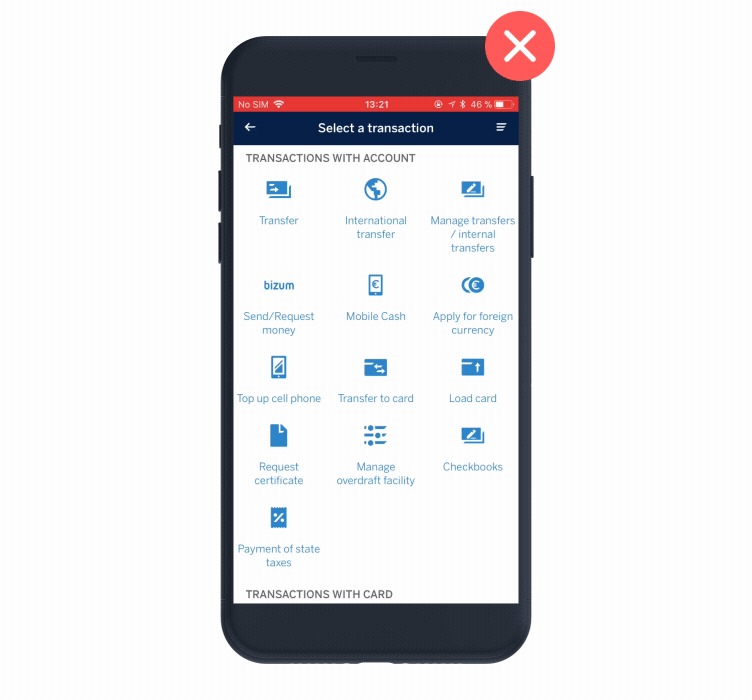
BBVA Mobile App, 2018
In this example, the first option is “Transfer.” It would seem universal as all kinds of payments could be considered Transfers, and the user could probably decide to choose this one. The second option is “International transfer,” and here starts the confusion. If the user really needs to make an international transfer, he or she could select the first option as well. Here, the customers start to wonder whether it’s valuable to read all the options on the screen since they just experienced confusion. This takes quite a lot of time and effort while the user expected to make only a few clicks to accomplish the task.
Solve it With Fintech App Design
Many different payment options demonstrate that a bank wants to provide a wide range of functionality to its users, believing it is doing their users a favor. But, instead of the value that banks intend to offer, the user gets very confused and impatient when presented with a list of too many options.
Don't just display all of the options on one screen as this causes confusion for the user. Think about the possibility of removing this step, ensuring simplicity.
Acknowledge all the payment options that your bank offers to the user and try to find common features. For example, both domestic and international payments require an account number or IBAN (depending on the region). So we shouldn't make the user decide whether it's a domestic payment or an international one. The user wants to transfer the money, and do it as simple and easy as possible.
How can you solve this? Ask the user to fill in the account number, and, based on that, provide the ability to fill in additional fields that are required based on the transfer type.
Also, if the current screen is dedicated to conducting the transactions, try not to confuse your users with functionality that doesn't apply to their situation. For example, keep options like “Transfer” and “Edit limits” in separate categories. If the users navigate to the “Transfers” section, they are looking for transfers not editing limits or something else.
Takeaway
Don't confuse your users with a ton of options that they don't know how to sort. Ask the user for the beneficiary's account number and identify the type of payment the customer is trying to make. Make sure the money transfers are quick and effortless.
5. Provide Clear Feedback After the Payment
When making a payment, users have a feeling of responsibility and also a bit of anxiety about whether they will send the right amount to the right person. If everything goes as planned, the user is relieved. If, for some reason, it wasn't possible to make the payment, the user's anxiety rises. Here, the financial app should definitely reassure the user and guide them through any problem that might potentially arise.
Take a moment to think about the last step of the payment process that you provide to your users. Is it reassuring?
Banking usability struggle
The first thing the user expects to see after making a payment is approval from the financial app that it has been successful. That is the point when customers feel like they have achieved their goal.
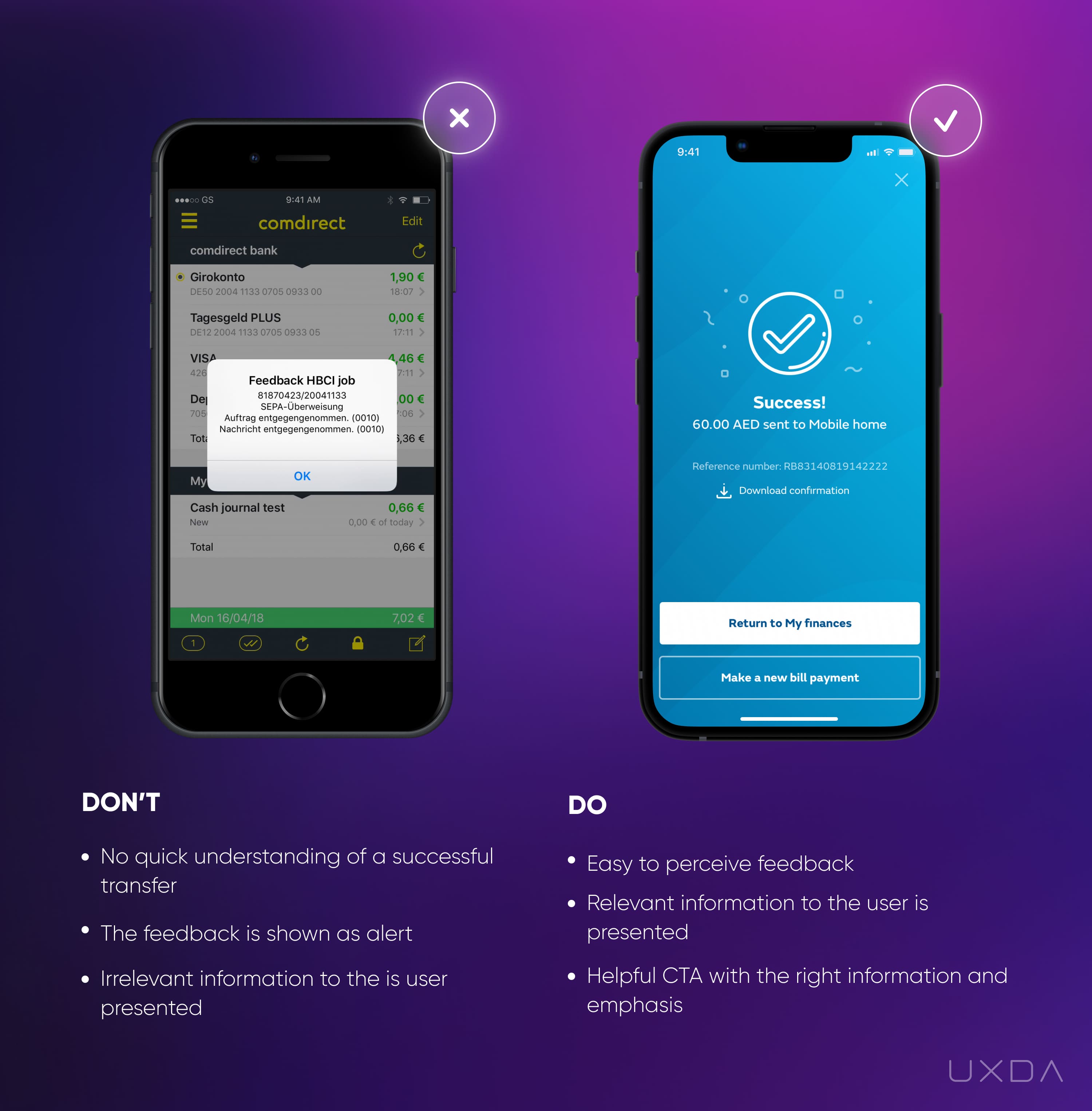
Image source: Comdirect Mobile App, 2018 / Banking Mobile App design by UXDA, 2019
In the example on the left, we can see that the payment confirmation is presented in the form of an alert. When a user sees it, the first thought that might come to mind is that something is wrong.
The user has to read through the information to understand that this is great news. As you can see in the example, the information in the alert contains incomprehensible numbers that are irrelevant to the user and offers no value. It doesn't demonstrate the exact purpose, so the user can't intuitively link it to the payment without careful reading.
However, often the users are busy, and they don't have the time to read all of the text that appears. Instead, they scan the screen to try to find any clues as to what the message is about. If there is no easy way to perceive the message that the payment has been successful, then the user might think something went wrong and try to make the same payment again. This can lead to frustration and financial losses, although these troubles for both the user and the financial business can be avoided.
Solve it With Fintech App Design
Show your users they can relax after they have made a payment by providing straightforward feedback about the process. Try to make it look as clear and simple as possible. Whether or not the payment status is successful puts a design emphasis on it. Also, provide context for the feedback: display information about what exactly has been successful or unsuccessful by providing a short summary about the payment.
Try to think several steps ahead and provide your user with the options they will need in advance. If the payment processing has been successful, provide the user with the next possible move on this screen - either “go to the dashboard” or “make another payment.” This depends on your user research; it could be some other action that is important for your users once they have made the payment.
If the payment processing wasn't successful, provide more details about it. The user will always search for the reason why. Clear feedback about what went wrong relieves the user’s anxiety. Provide a clear action plan; otherwise, the user will look for your support team and ask for the information you could have provided right in the app.
Takeaway
The financial app should reassure the user and guide him through if any problem arises. Provide clear, straightforward feedback about the payment process and display the next possible steps.
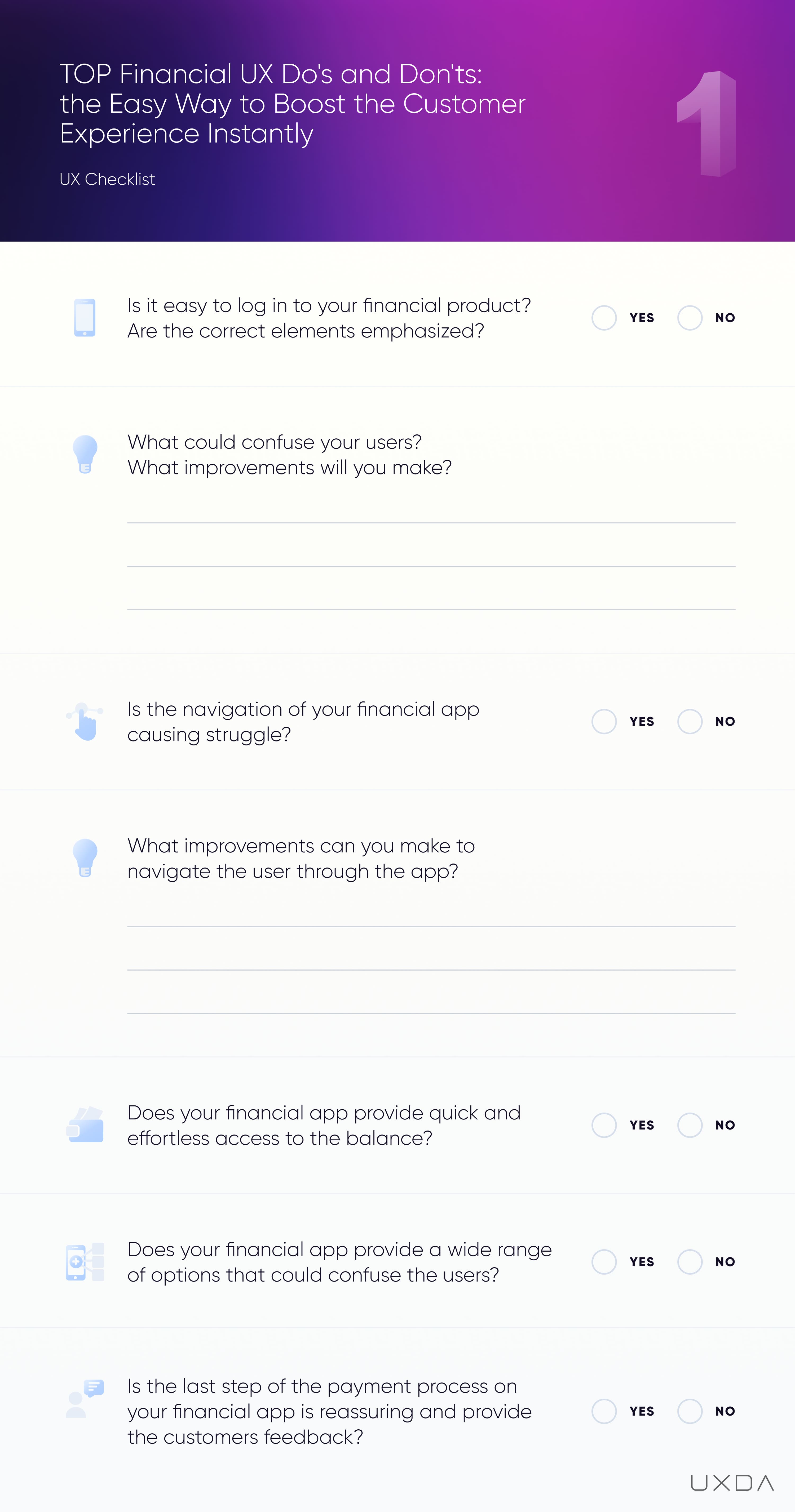
#1 Checklist For Usability in Mobile Banking Design Solutions
This sums up the first five user pain points your financial service can solve quickly and without a huge effort. Fill in this checklist to find out in what areas you could improve the UX of your financial service. For your convenience, it's also available in PDF format to print out and share with your colleagues.
6. Security First: Make it Quick to Block the Card
Most users spend their money using payment cards, so all operations regarding cards should be easily accessible through every channel. This is especially true when it comes to nerve-wracking security situations in which immediate action is required, such as losing a card or getting robbed.
Banking usability struggle
More and more banks allow users to manage their payment cards from the financial app. Here, it's crucial that the scenarios with a huge impact are accessible in an easy way. The card allows direct access to the user's hard-earned money. So, for the customers, it's very important that they are able to manage the security settings.
Imagine the user’s feelings and reactions if the card is stolen. First of all, the user is very anxious about his or her finances thinking what if somebody accesses their account? Imagine them being worried that a random stranger will withdraw all of the cash they have and or even make fake reservations using their card.
In these cases, the users should have the ability to immediately block the card. Card theft is a very stressful experience, so card blocking should be quick and immediate and not require any additional thinking, since it’s hard to be rational when you’re in an emotional state.
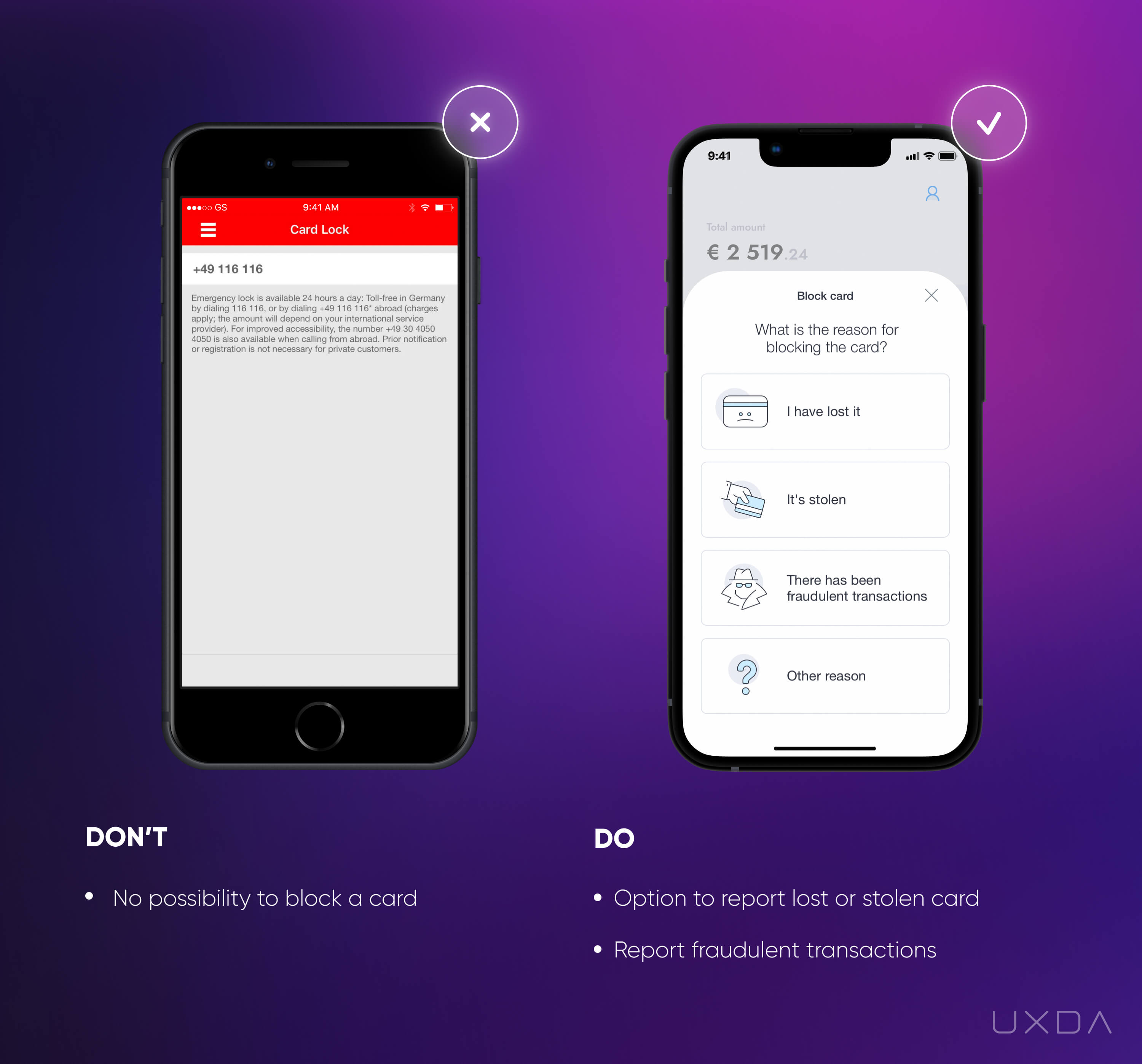
Image source: Sparkasse Mobile App, 2018 / Mobile App design by UXDA, 2018
In the example on the left, we can see that the bank offers the functionality to lock the card. But, when a user actually wants to accomplish this goal, he or she finds out that it is necessary to call the bank to do that.
We can only imagine the stress this causes the user when he or she was hoping to block the card quickly from the app but now has to wait in order to be connected to the bank through a call.
Solve it With Fintech App Design
Give the user the ability to manage his or her card freely. If the user can’t block the card quickly, it can have a big impact on the user’s life. Think about how else you can support your user in this unpleasant situation. In the example on the right, we can see that the bank provides the opportunity to choose the reason for blocking. This can be insightful for your financial business to understand how else you can help the customer. For example, if there have been fraudulent transactions, you can ask your user to identify them after the card blocking to facilitate the investigation.
Provide users with the ability to control their credit card settings since it will give the users a powerful sense of being in control of their own finances. Be the ally who supports the users in stressful situations and helps them to regain a sense of peace about their finances.
Takeaway
Give users the ability to manage their own cards. Allow them to quickly block the card right on the mobile app. Ask additional questions about why the card has been blocked and seek additional ways to help your customers out of this stressful situation.
7. Don't Overload the Dashboard
Our everyday lives are more saturated with information than ever before. On one hand, this provides us with a wide range of opportunities. On the other hand, navigating oneself in the midst of such information overload can be exhausting and overwhelming. That's why simple and easy to understand financial services are in great demand.
People expect that the digital tools they use will ease their lives and reduce their daily stress and anxiety, not increase it.
If your financial app takes too much effort to understand, the users might choose a simpler alternative. Remember users want to invest their time in their priorities so try to simplify your financial service and create an understanding environment for them.
The dashboard is the screen most often used, so it is vital that the user can easily overview the most important information in one glance. Users expect to easily access the summary of their finances, such as available account balance, list of latest transactions, upcoming payments, the performance of savings or investments and debt amount. They also need access to urgent information that the user needs to act upon, such as bills that are due, money requests, automated payments that don’t go through or important announcements from the bank.
Banking usability struggle
The main purpose of the dashboard is to quickly check in with the users’ overall financial situation to make sure that everything is under control. Unfortunately, sometimes when users arrive at the dashboard, they have to take unnecessary steps to get the information they are looking for.
Typically, the reason for this is that banks want to impress their users with the number of features, options, and products they have, but, in this case, it does the opposite, creating not the best first impression and ensuing frustration. Due to the information overload, it's difficult for the user to find the most important information, which can result in stress.
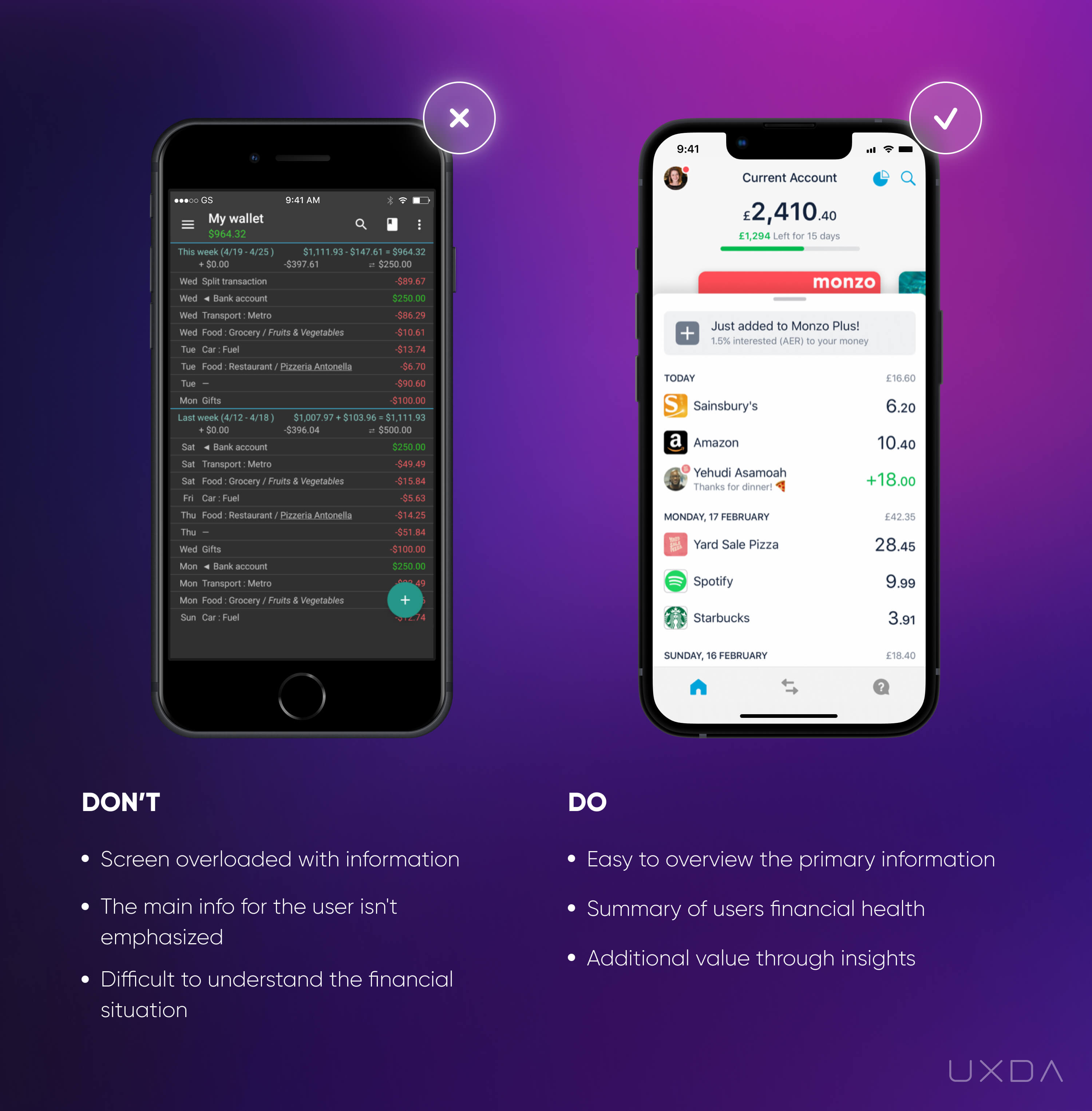
Image source: My Expenses Mobile App, 2020 / Monzo Bank Mobile App, 2020
In the example on the left, the financial app dashboard is overloaded with information. In a single screen, the user has access to their balance, all the transactions for the last two weeks and some calculations that don’t include any helpful explanation. The user automatically starts to process all of this in his or her mind and seeks to identify and sort out the information he or she is seeking.
In this example, there is no straightforward information about what is happening with the user’s financial situation and no focus on the main element that the user is looking for─their balance. Consequently, the user then needs to find the balance on the screen and analyze all the accessible information to get a sense of the overall situation. This is energy and time-consuming and not something the user would enjoy in light of their fast-paced routine.
Solve it With Fintech App Design
The urgency to log in to the banking application depends on the situation and the environment. It can be done at home, on public transportation, on the street or in the shop. That's why we should provide users with the most important information ASAP, right after login.
In the example on the right, you can see that the account balance and the latest transactions are easy to overview without any effort.
This provides the user with a sense of control and eases his or her mind because they can simply review the incoming and outgoing money flow.
Think about contextual insights that could help your users. In the example on the right, you can see that, under the main balance, there is an amount colored in green, as well as the day’s count. This is a sum that the Monzo app calculates by looking at how much of the user's monthly cash is left compared to the number of days remaining in the month. This helps the users keep track of how much they could spend today and still stay on track for the rest of the month.
When it comes to dashboard insights, another great feature is the “Safe-To-Spend” option featured in the Simple app.
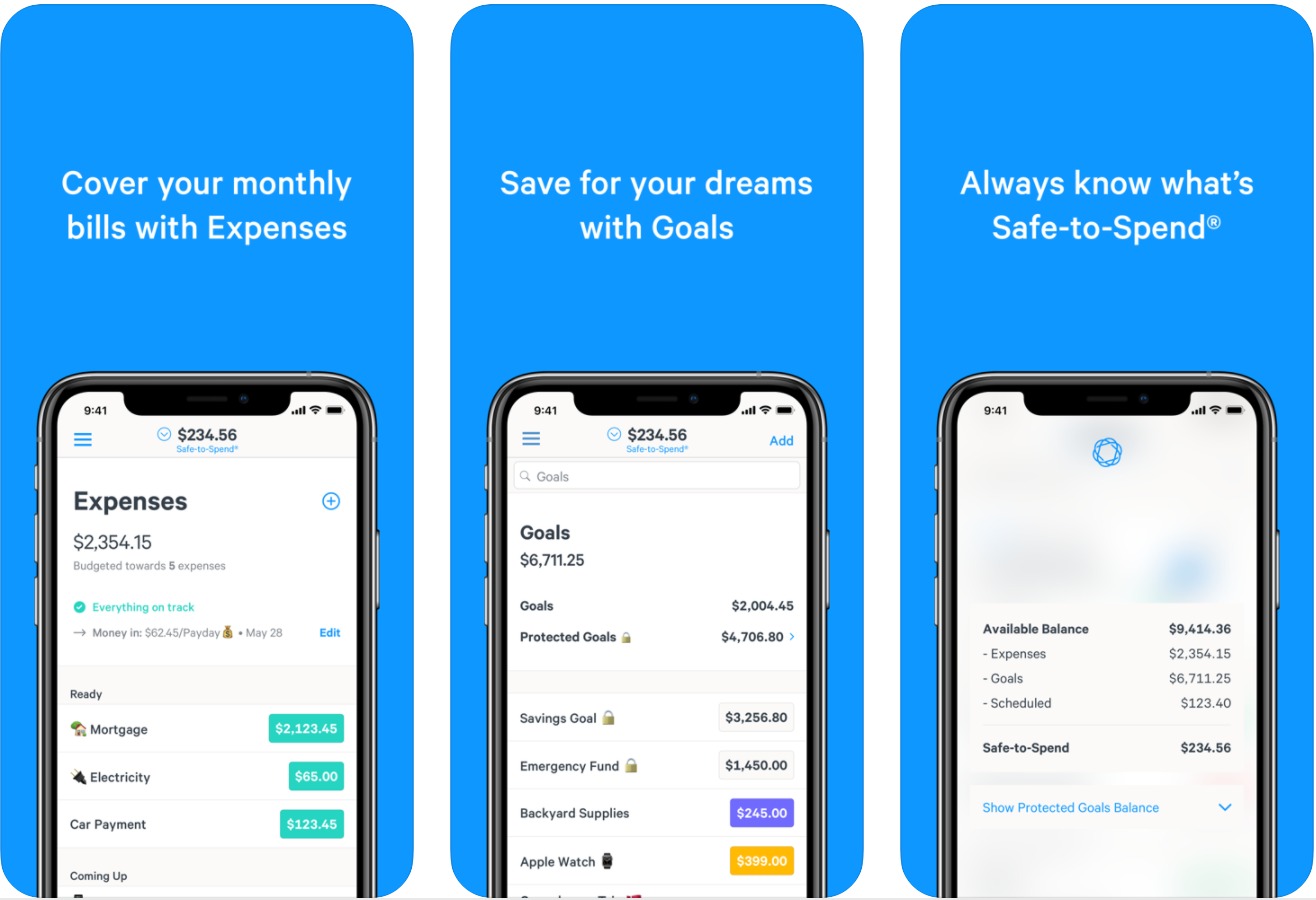
Simple Banking Mobile App, 2020
It can be uncomfortable for users to follow up on all the bills and regular payments because they receive them through different channels like e-mail, as well as directly through the bank or biller's system. The due dates also differ. Safe-To-Spend solves this by providing clear insights of how much money will be left after paying all the bills and regular savings each month. This is exactly what customers try to figure out themselves, delivered by the financial app in a clear and easy way. This is a great example of creating a pleasant banking experience from the user's perspective.
Takeaway
Provide a quick and easy overview of the most important information, such as the balance and the latest transactions. Avoid causing stress to your users by cluttering the dashboard with all kinds of unnecessary information. Figure out what insights could simplify the user's life.
8. Put Yourself on a Map and Let Customers Find You
We are moving toward a cashless economy. More and more customers are choosing to pay using a credit card or other technological advancements like Apple Pay because it's simple and quick, and they don't have to worry about carrying wallets stuffed with cash.
Nevertheless, there are still situations in which cash is needed. As banks are trying to reduce the workload of the branches, ATMs can help with that. Users can not only withdraw and deposit cash but also pay the bills or even apply for bank products. As users are often busy and on the go, it's crucial to offer a quick and convenient way for them to reach the nearest ATM right from their location.
Banking usability struggle
Unfortunately, many banks still don't provide an option to find ATMs and branches on the financial app. Or, even if the functionality is available, it is not working properly.
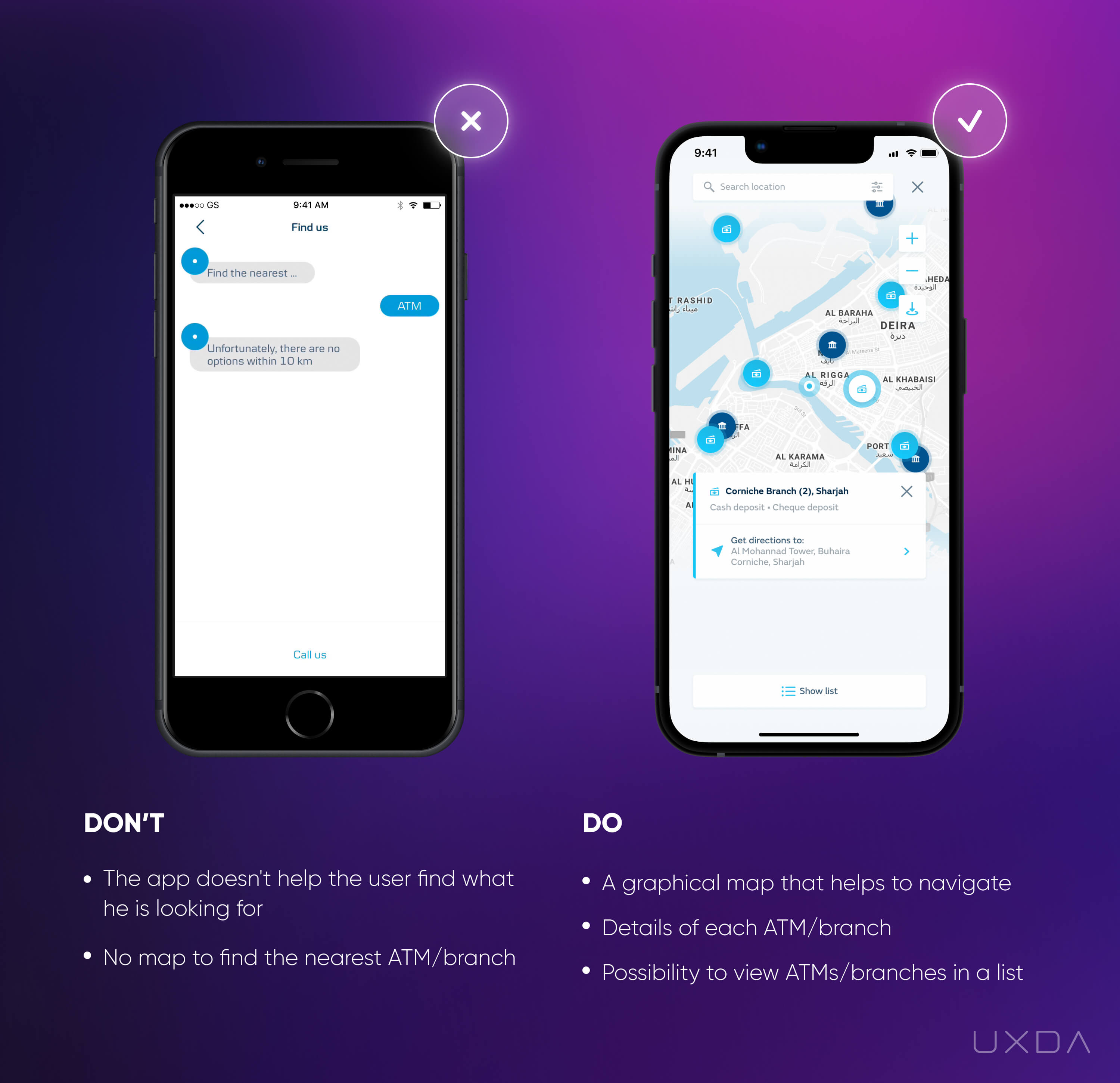
Image source: Danske Bank Mobile App, 2018 / Banking Mobile App design by UXDA, 2019
In the example on the left, we can see that, to get information about the nearest ATMs, the user has to chat with a chatbot that eventually provides an answer such as “There are no options within 10 km.”
This example demonstrates how the innovative chat functionality itself is integrated into the financial app, but, at the same time, it does not meet the user’s needs. This same case can be applied to a lot of other functions in many financial applications. This is inefficient, it wastes the user's time and, in the end, doesn't move the customer any closer to his or her goal.
Solve it With Fintech App Design
Make sure that the user can access the location of your ATM or a bank branch as quickly as possible. That will reduce the workload on your branch and/or call center.
When the user is seeking the nearest location of something, first he or she will need to identify their current location. After that, the mind will start filtering the information about locations in your app and decide which one is the most convenient. To make it effortless and intuitive, provide the user with a map that conveniently displays all locations of your branches and ATMs.
Often a long list of street names does not prove to be helpful, especially if the user is out of town or abroad and isn’t familiar with the region.
For people, it's much easier for the brain to perceive visual objects than text. When it comes to actual navigation, this is especially important.
Also add up-to-date ATM/branch details so the user won't find themselves in a situation in which he or she finds an ATM but there is no ability to cash in or the ATM is available only during specific hours, for example.
For the user, it is important to know the details about the specific ATM/branch, including the name, address, operational features, working hours (especially during holidays), and other information that's relevant for your users.
Accessing the bank in an easy way via any channel instills trust in your financial company. Trustworthiness is a vital factor when it comes to the financial sector. Make sure to provide your clients with reasons to trust you, even in the smallest details.
Takeaway
Provide a map that conveniently displays all locations of your branches and ATM's, instead of a long list of addresses. Include important details about the working hours and operational possibilities.
9. Be There for Your Users With Accessible Support
Financial companies might often hide their contact information or provide just a single contact option in order to avoid incoming message overload. If only a phone number is provided, the user isn't able to send any attachments like screenshots, or he's not able to talk at that moment and would prefer chatting. Moreover, often the phone operators are so busy that the user has to wait quite a while to reach support. All of this results in a combination of negative emotions and feelings toward the financial service.
Even if you create the most user-friendly app, there still needs to be an option to contact the financial service. Providing quick and easy access to a live person at the other end definitely increases reliability and a feeling of reassurance. This way the user will know they will always be able to contact the bank almost immediately whenever a problem arises.
Banking usability struggle
Almost anyone can remember a situation in which there was no way to contact the financial company. This can get nerve-wracking as people have entrusted the financial service with their funds, and it's impossible to reach them when in need.
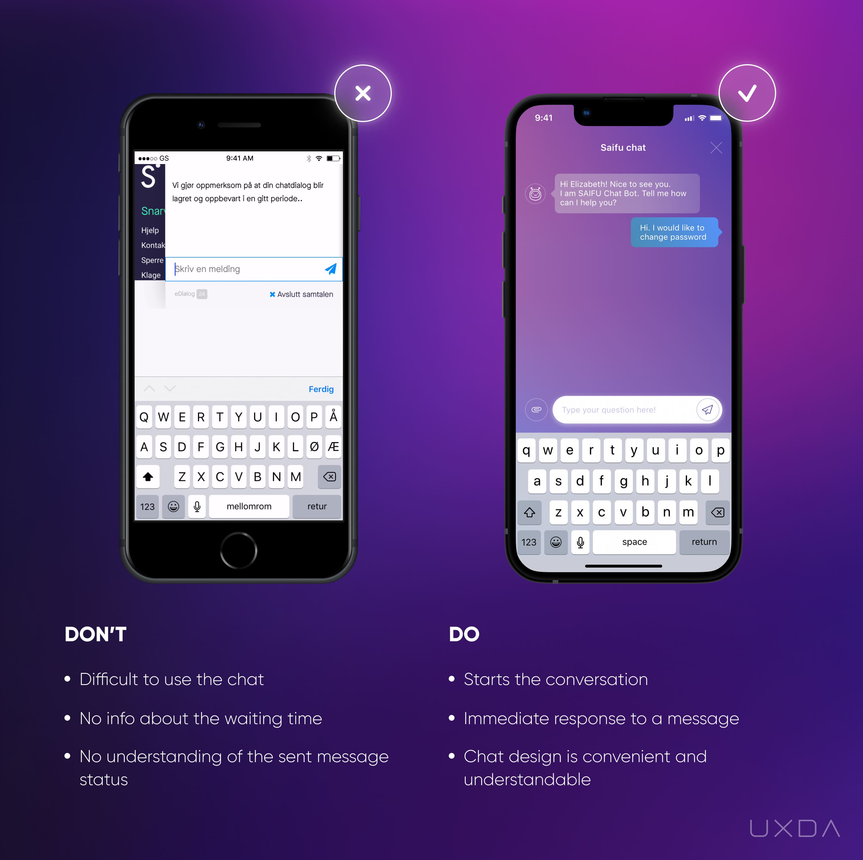
Image source: Sbanken Mobile App, 2018 // Saifu Mobile App, 2020
In the example on the left, we can see that there is a chat option provided to the user. Overall, this might be a convenient way to quickly solve a problem that is not complex.
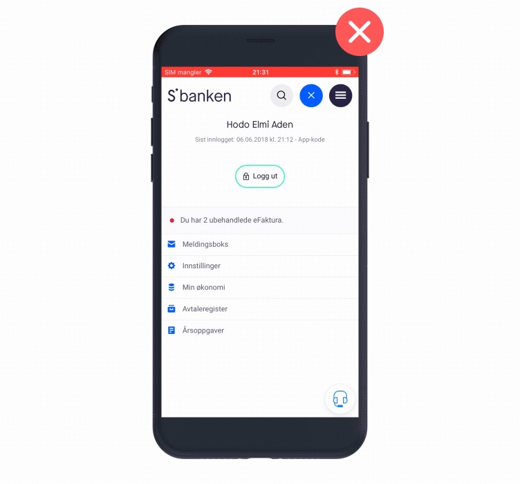
Sbanken Mobile App, 2018
In the example, we see that a user has written his message in the chat, but, instead of being connected to an operator, he's placed in the queue. This might not be anything unusual as there are often quite long queues to contact the bank either by phone or through the app, but, if we look at it from the user perspective, this struggle can damage the overall experience quite badly.
In this case, as with a phone chat, the app notes that there are already 6 people waiting in the queue. It's good to know how many people are in front of the user, but it's difficult to calculate the approximate time it would take to move up to the first place and get to chat with the support person.
It would be helpful if the app calculated an approximate waiting time. If the problem is urgent, most likely the user will look for their phone number and call the bank.
As a result, chat functionality is not valuable in many important and critical user situations, for example, to block the card (if this function is not available for the users themselves).
Calling a financial service digitalized and user-friendly is not a bad thing at all, but we should always keep checking ourselves to make sure if they truly offer great customer centred solutions or just a modern-looking app design.
Customer support plays a very big role in the overall experience. In situations like this, in which it’s almost impossible for the user to find the contact and then has to wait a long time to be served, frustrations ensue and damage the user experience.
We should also pay attention to the confusing design of this screen. When the user starts the chat, it opens an additional window in the app and changes the location on the screen when the user starts to type. Also, the chat window is so small that the user can only view part of the message and needs to keep scrolling.
Solve it With Fintech App Design
In the example on the right, the mobile banking app is immediately generating a message to find out the topic of the conversation. If you know the most common questions the users ask, you can offer them the appropriate option to select. That will make it faster for the support specialist to understand what they will be discussing.
If your bank is mid-sized or large, you may not be able to provide an opportunity for the support specialist to join the chat immediately. In this case, you can offer an understanding of the status of the user’s message, such as whether it has been received or seen. Secondly, you can let them know the approximate time it will take to get an answer.
It is also important that, as in the example on the right, there is a friendly message, greeting the user by name, that gives personalized communication and a friendly attitude.
The user will have the feeling that the bank cares about their financial situation, and they can trust that the bank will always be there to help him.
Takeaway
Show the users that you care about them and make the support easy to find and reach. Be friendly and inform the customers about the status of users' messages, and give them an ETA on when they might expect an answer. It's not about technology, it's about execution.
10. Make it Easy to View and Copy Credit Card Details
In the digital age, people make online purchases almost every day. To execute this common scenario, the user usually needs to enter the payment card details every time. The bank card number consists of 16 digits, which is typically not an easy combination to memorize. Add to that the expiration date and CVC code. If a user has to get up from his or her comfortable sofa to look for his wallet with the credit card information every time they want to buy something online, it can get uncomfortable.
Users typically have mobile phones by their sides 24/7, so this information should be easily looked up in the financial app with no need to retrieve a physical card.
Banking usability struggle
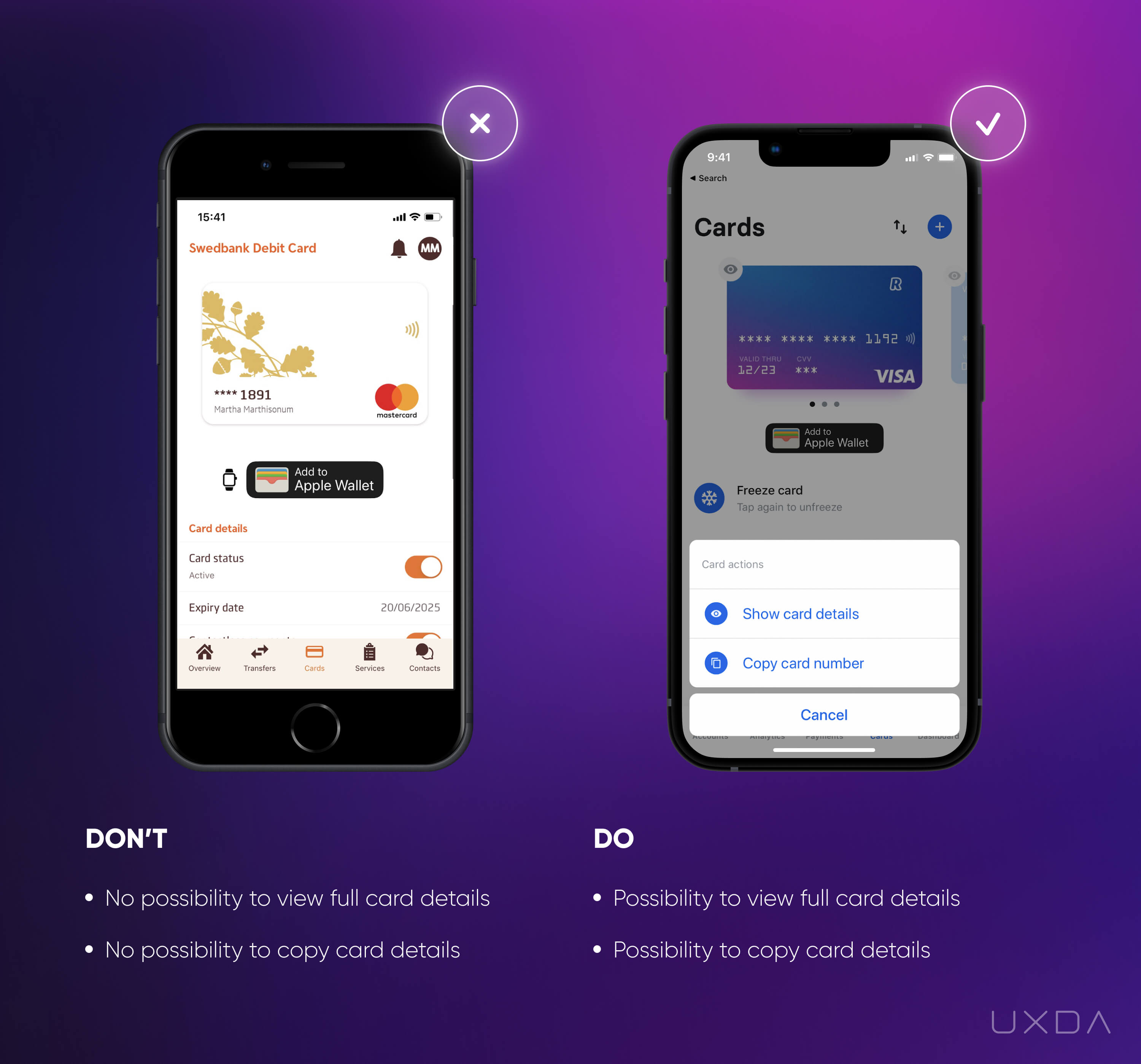
Image source: Swedbank Mobile App, 2020 // Revolut Mobile App, 2020
In the example on the left, we can see that there is no option for the user to view the bank card details, such as full card number and CVC code. Every time a user makes an online payment and applies for online subscriptions, he or she has to find the physical bank card. The users have stated that they definitely expect their financial app to offer such an option to avoid this time-consuming and frustrating task.
Even if the bank allows you to view the card details, there might be no option to copy them. If the user is making a purchase on their mobile device, there could be a situation in which the user must switch between apps to fill in all the card details. This results in a manual task that is inconvenient and very annoying, especially in an age in which everything is automated.
Solve it With Fintech App Design
In the example on the right, the user is able to view the full card details, including card number and CVC, so there is no need to look for a physical card. Also, the app provides an opportunity to copy the card number, so the user can paste it in whenever needed.
The Revolut app has also considered security as all of this private information is available only on request and after the user is identified.
Offer your users the most convenient way to use their payment cards. It seems to be a trivial detail, but the users will feel that the bank cares about them, which results in large rewards for the bank.
Takeaway
Offer your users the most convenient ways to use their payment cards. Provide the possibility to view and copy the card details right from the financial app.
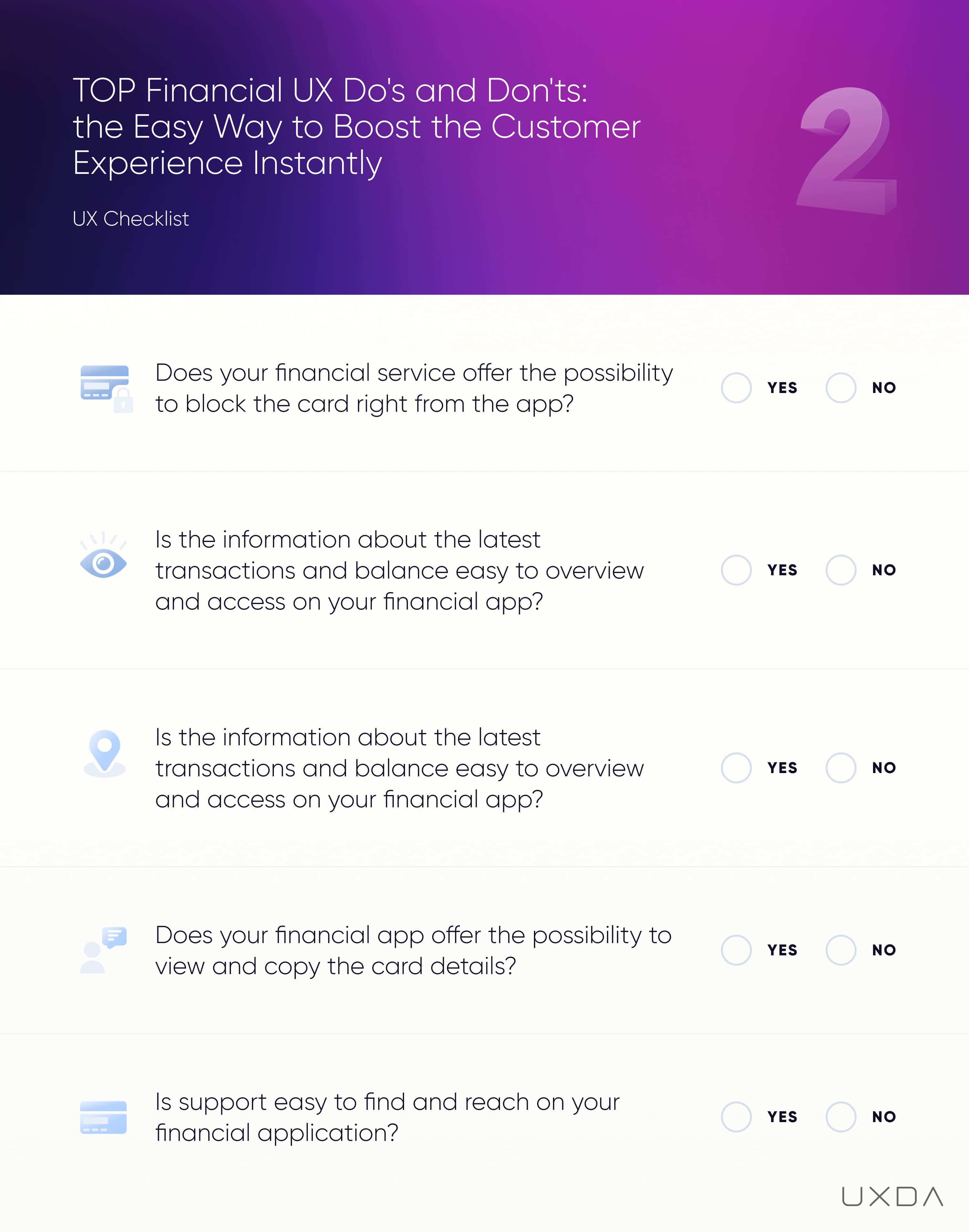
#2 Checklist for Usability in Fintech App Design
This sums up the next user pain points your financial service can solve quickly and without huge effort. Meanwhile, please fill in this checklist to find out the areas in which you could improve the UX of your financial service. For your convenience, it's also available in PDF format to print out and share with your colleagues.
11. Make it Easy to Filter and Search Transactions
The transaction overview is one of the most popular user scenarios. The information about the transactions is very important for the customer because it provides an overview of where the money has gone.
Transactions that are easy to access and manage increase the trust level of the user in his/her financial app. That's why it's crucial to make this step simple to review and understand.
Banking usability struggle
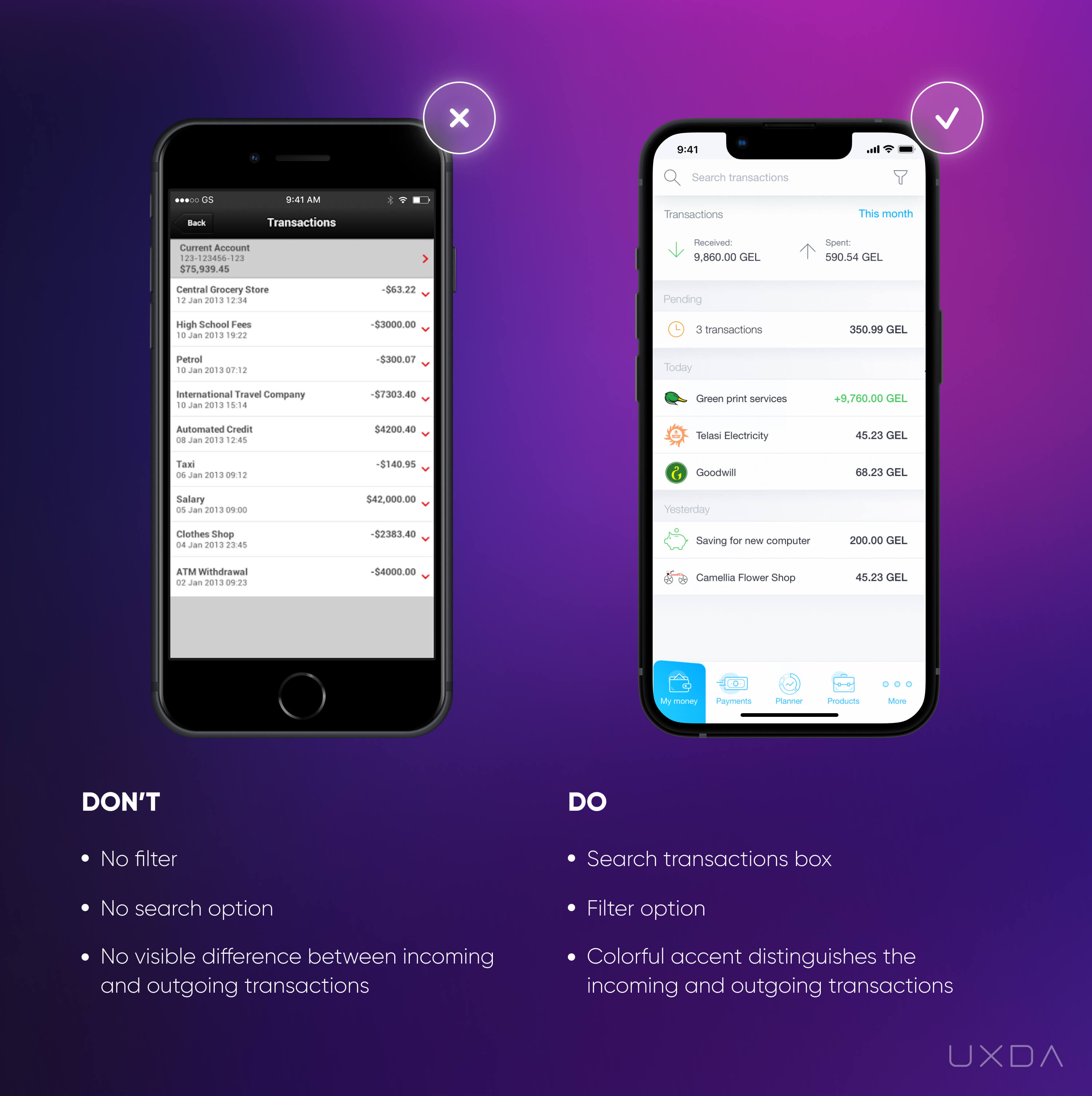
Image source: HSBC Mobile App, 2018 / Famacash Mobile App, 2019
In the example on the left, there is a transaction list that gives all the necessary information. But we advise you to ask a question; what can the user do with it and what insights can be gained?
By a quick look at the screen, there is no clear differentiation between the incoming and outgoing transactions. The user must study each of the transactions carefully to extract at least some insights.
The user also has no option to search the transactions by entering a keyword or using a filter. If there is a need to find a specific transaction, the customer has to scroll through the transaction list. If the transaction was made a year ago, it could take a lot of time and effort to find it.
Solve it With Fintech App Design
It's vital to provide your users not only with self-evident facts like a long list of transactions but also valuable insights that this information can provide. After all, that's the main reason they have chosen your app.
Make the transaction list easy to review and manage. Let the user gain insights about incoming and outgoing transactions from just a quick glance at the transactions, using color accents. Also, visual grouping by day will help you quickly navigate.
Since we want to increase the user’s positive emotions, highlight the incoming amount very subtlely and keep the outgoing transactions in your current design style. Most often, incoming transactions are fewer in count compared to the outgoing, so you probably won't have a transaction list on which all transactions will be accented.
Provide your users with an ability to search specific transactions by a keyword or filter. We have all had a situation in which we are looking for a specific transaction; it is critical that this common scenario is easy to execute.
Make sure that you don't disappoint your users by providing a list of only the recent transactions. It's crucial that the customers can access the full history of transactions right from the financial app, without the need to visit the desktop version.
Takeaway
Create a transaction list that's easy to overview and manage. Provide users valuable information and insights. Use accents that distinguish the incoming and outgoing transactions.
12. Ease the Setup of Recurring Payments
In our everyday lives, users are thankful for services and tools that helps them ease their lives. When it comes to financial services and banking, a feature that often reduces the user’s anxiety is recurring payments, as it makes it easier to manage their monthly bills.
Unfortunately, in some cases, due to the features being complex and not user-friendly, this can cause users additional problems instead of helping to solve them.
Banking usability struggle
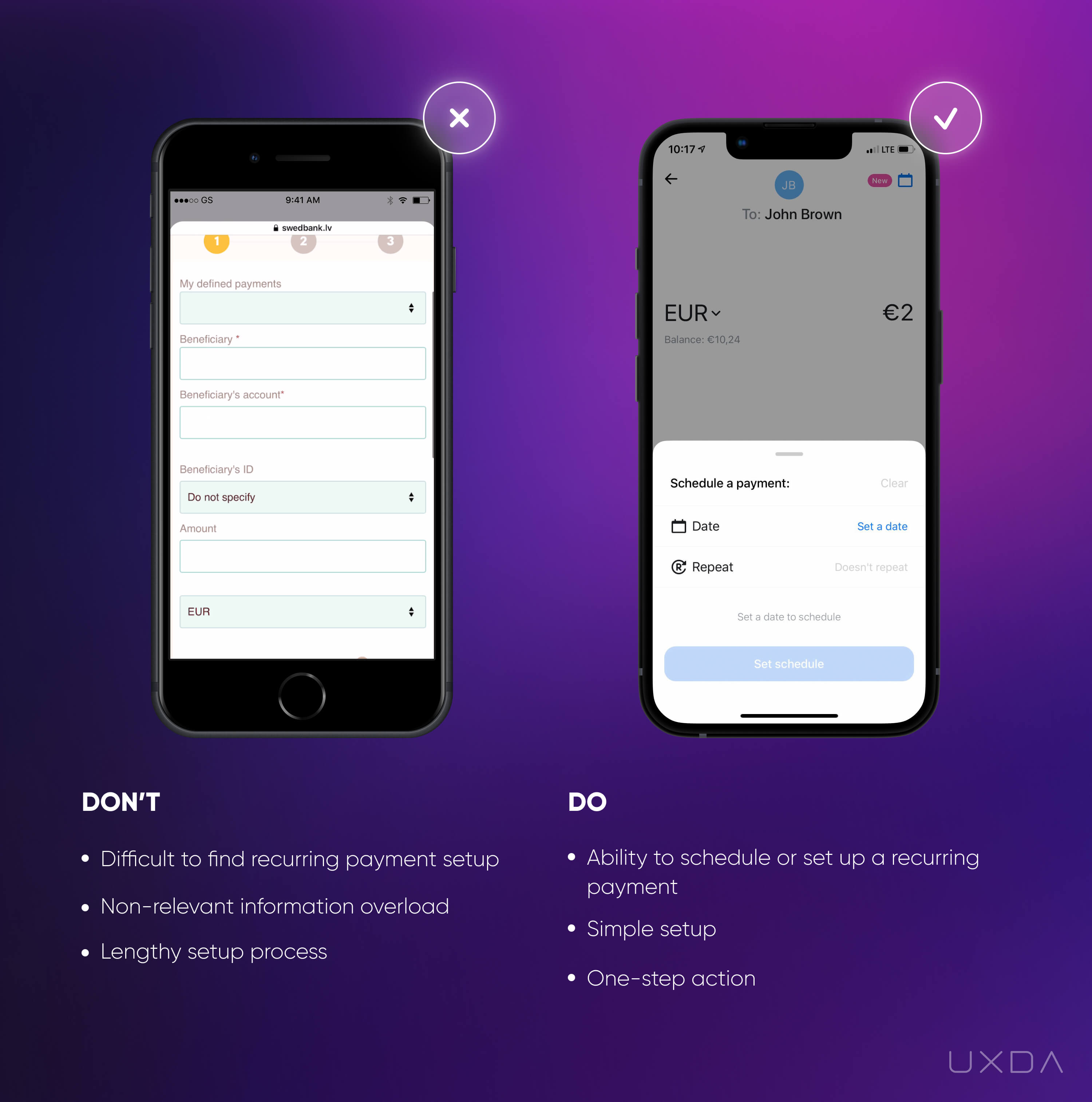
Image source: Swedbank Mobile App, 2020 // Mobile Banking App design by UXDA, 2018
In the example on the left, it's a long journey to get to the recurring payment form.
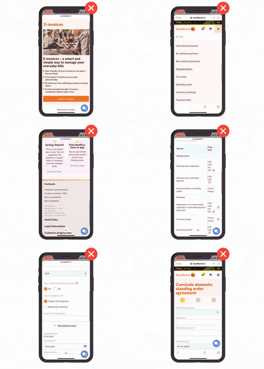
Swedbank Mobile App, 2020
Moreover, the app redirects the user to the mobile responsive version out of the application. This creates fragmentation that breaks the digital banking customer experience, because the human brain perceives the whole process as a continuous flow. When a user is redirected, the flow is broken, which causes confusion. In this article you can read more about why it's so important to eliminate fragmentation and substitute it with flow.
When the user gets to the mobile responsive form, he/she has to go through several screens filled with information and long descriptions about the product. But most likely the user won't need all of this information if they have already decided to quickly set up a recurring payment.
Instead of instant access to the recurring payment form, the user has to carefully study multiple colorful call-to-action (CTA) buttons, pictures and bullet points displayed on the screen, analyzing where they should click to reach their goal.
When the customer finally figures out where to set up the recurring payment, he/she is presented with a lengthy form that requires a lot of information. The form has many different elements that consume the user’s attention, such as inputs, drop-downs, radio buttons and CTA buttons.
There is also a progress bar at the top of the screen showing that the user is only on the first step. This also creates a feeling that the recurring payment setup is a long process.
Often, in a situation like this, the users decide to give up and come back to this later when they have more time. As we all are so busy, this often never happens.
This is a clear example of how easy it is to disappoint the customer when they look to a financial app to help, but it seems to make his/her life even harder instead.
Solve it With Fintech App Design
If you offer any kind of functionality in your financial app, make sure that the user can access it quickly and easily. Provide an option to fill in all the details first and maintain the ability to read additional information after that.
Often, a user will choose the recurring option for a payment already made in the past. To avoid frustration, all the previous payment details should be easily accessible. For example, when the user starts to type in the beneficiary, the app finds corresponding payments that have previously been made using a smart search feature.
If the user fills in all the details from scratch, try to simplify the form. In the Revolut example on the right, we can see that the recurring payment set-up process is split into several logical steps. The user only has to pay attention to one action in each step, which makes the process easier since it doesn’t split his/her attention. It is also quicker and easier to navigate than a long form filled with many confusing fields to input.
Before the confirmation of the recurring payment, allow the user to review all the main details of the payment in one screen.
Takeaway
Give the users instant access to the form. Split it into several logical steps in which one step requires only one action. This makes the whole process easier and quicker for them as their attention is not split amongst several input fields.
13. Don't Make the Terms and Conditions Look Like the Chinese Alphabet
Every bank has different Terms and Conditions for each of their products. We all know that, in most cases, people are not reading them properly due to lengthy, unreadable text. Taking that into account, the bank should provide an easy way to review the Terms and Conditions to avoid any misunderstanding between the bank and the user.
Banking usability struggle
Usually, the Terms and Conditions contain a lot of information. If it is possible to reduce it to fewer words, that's where you should start. Often this is not the case as there are many products and regulations that have to be outlined, but we can still ease the pain by making it much easier to read.
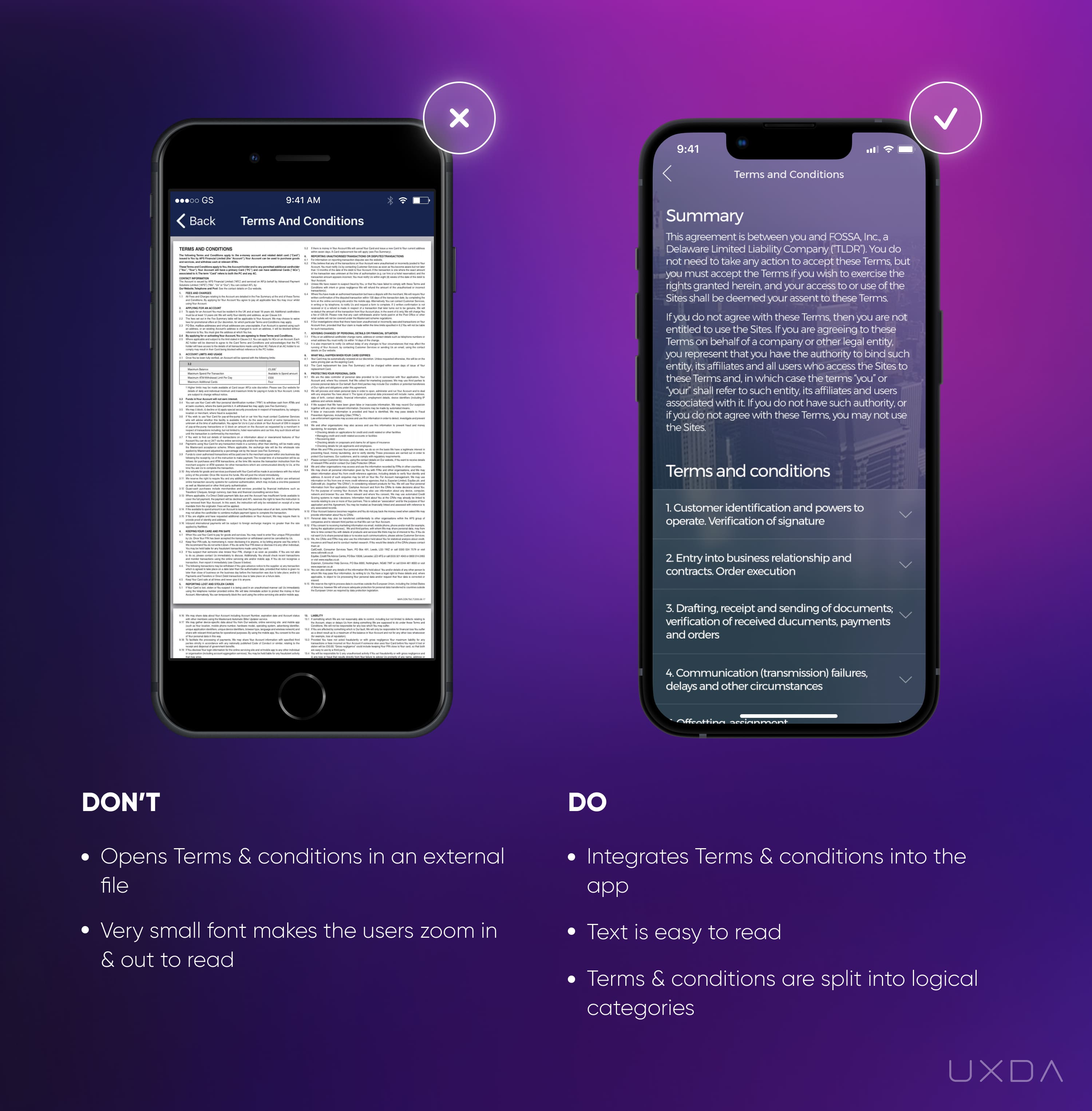
Image source: Cashplus Mobile App, 2018 / CR2 Mobile App, 2018
In the example on the left, the user sees a document filled with a ton of information that is not easily readable.
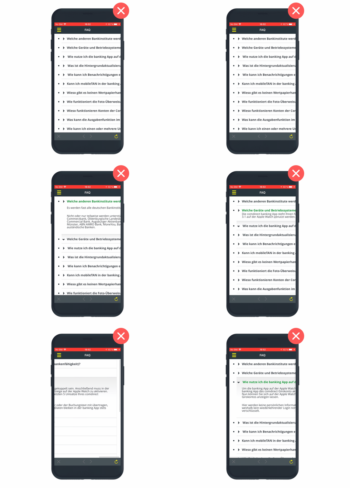
Comdirect Mobile App, 2018
First, the user needs to figure out a way to technically access this text. After a few tries, the customer usually figures out that it's possible to read all the information by zooming in on the screen. However, that seems like quite a bit of struggle that will make the user doubt the decision to read through it all. At this point, the customer will probably decide to leave this for later (most likely, never) when he/she has more time for it.
Solve it With Fintech App Design
Provide your users with the ability to easily access information that is important for them. Avoid using third-party solutions, such as a PDF, to add Terms and Conditions to your app .
In the example on the right, you can see that the Terms and Conditions are integrated into the app. The user is able to see all of the text without any additional effort, and all that is required from him/her is to simply scroll down.
Another way to reduce the huge amount of information is to divide the content into categories. Usually, the Terms and Conditions are already split into logical categories. In this way, users are not overwhelmed by a large amount of text and can also go directly to the category that's relevant to them.
Takeaway
Provide an easy way to read the terms and conditions to avoid any misunderstandings between the bank and the users. Integrate terms and conditions into the app, make it readable by choosing the right font, and divide the content into logical categories.
14. Don't Mislead Your Users With Incorrect Button Placement
By analyzing different financial services, we often see that the financial company isn't even aware of the scenarios that cause real headaches for their users.
The wrong use of design accents and CTA buttons is one example that usually goes unnoticed but tends to cause quite a lot of trouble, not only for the users but for the financial company as well since the number of support calls increase.
Here, we can see the painful user journey of making a payment when the placement of CTA buttons is counter-intuitive and leads to a lot of trouble.
Banking usability struggle
The wrong CTA button can lead to harmful consequences for both the user and the financial company. When making a payment, the user focuses on the details of the payment (e.g., the beneficiary, amount, etc.) All the options on the screen in this process should be very intuitive, leading the user to his/her goal.
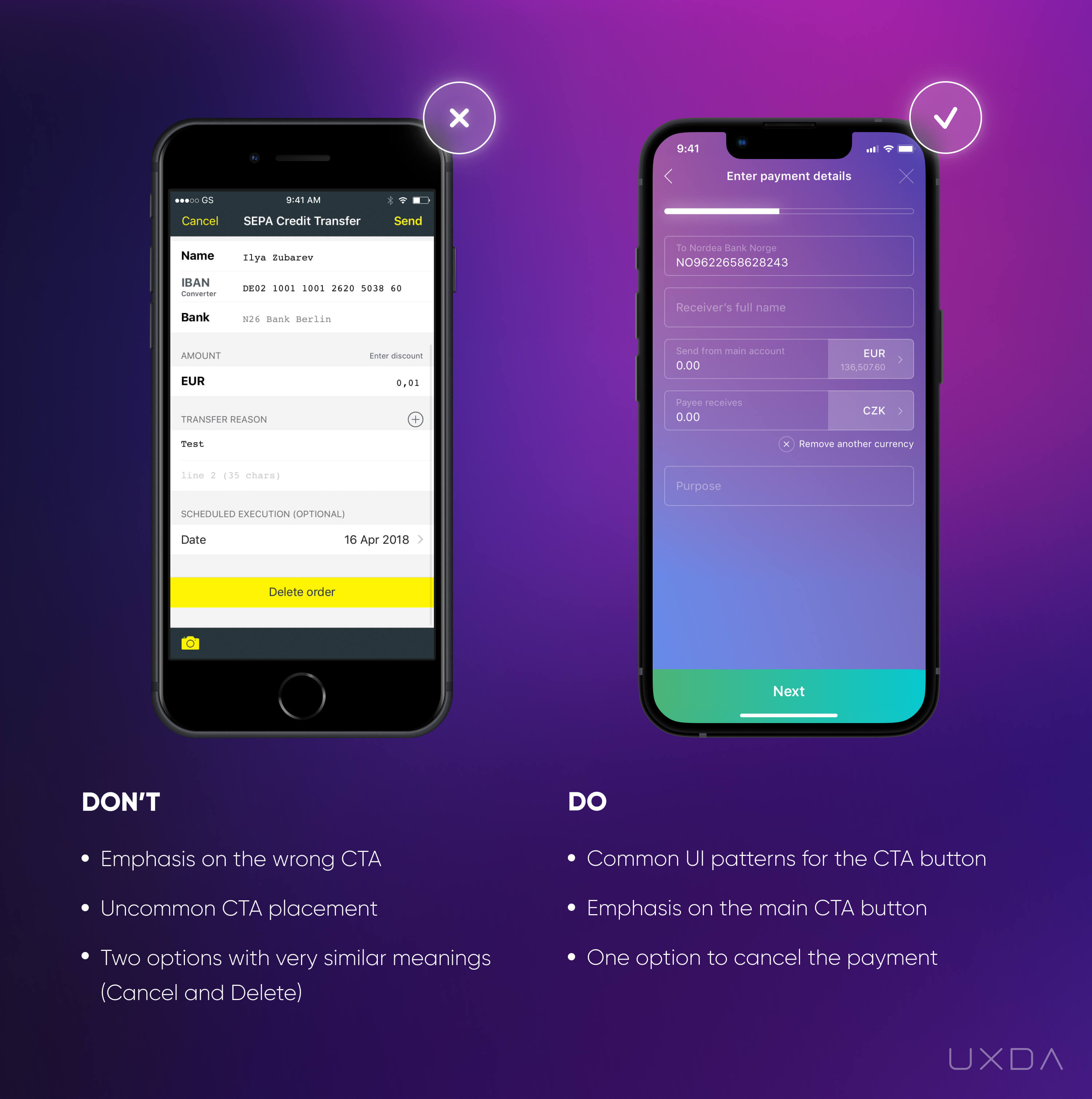
Image source: Comdirect Mobile App, 2018 / Saifu Mobile App, 2020
The example on the left shows a payment form that is already filled out. Users intuitively assume that the button that leads to the next phase of the payment process is located right under the payment form, and they expect it to be highlighted.
In this example, the highlighted button on the screen is “Delete order,” which will cancel all the fields that the user has already filled in. From the user experience perspective, this is illogical and can cause immense frustration.
In this case, the user is likely to automatically click on the highlighted button without any thought, thinking that this will logically take them to the next step of the payment. But, to their surprise, all carefully filled information on the payment form will be lost. We can just imagine the user's feelings and attitude toward the financial app in a situation like this because they have to restart the whole process, wasting their time and energy.
You can probably recall a similar situation in which you just pressed a button that seemed to have an obvious meaning but, instead, something totally different happened.
The worst part is that the button placement is so counter-intuitive that there's no guarantee that the user won't end up with the same result the next time! This is also likely to recur if the user doesn't make the payments very often and forgets that this screen needs extra attention.
People quickly scan the screens instead of carefully reading all of the information provided. Our perception is selective; otherwise, we couldn't process the mega amount of information that floods our brain every day.
In the example on the left, if we look really carefully, we notice that the “send” button is actually located in the right upper corner in a small font. To spot it, the user has to intentionally search for it.
From the banking CX perspective, this is not the right way to go, as it requires additional effort from the user, instead of providing an easy and intuitive solution.
Another thing in the example on the left that can confuse the user is that there are two very similar (probably the same) options─“Cancel” and “Delete order”. Once again, the user must stop for a while and think, If I don't want to make this payment, which button should I click?
This causes excess cognitive load as the user tries to discern the difference between these two options and the consequences each would have. That's why it's so important to reevaluate all the features provided and select only one option if they both have the same functionality.
These kinds of banking CX mishaps often drive the customers crazy, leading to lost time, energy and negative emotions. The good news is that it doesn't demand a lot of effort to change this scenario and rework it to be easily understandable for the user.
Solve it With Fintech App Design
Confusing button placement can mislead the users. If you place the button that leads to the next step intuitively, right after the payment form, it simplifies and brightens customer experience. Remember that the user fills in the payment form from the top down, and after the last input, he/she expects to find an easy way to move forward. Highlight the main button of the screen, and make it easy to find, as you can see in the example on the right.
Keep the secondary scenarios in mind, such as canceling the payment. Don't provide multiple options with the same meaning. In the example on the right, you can see that the primary option “Next” is emphasized, but there are two secondary options─ the ability to go back to the previous screen and the option to close the payment (with the “x” in the right upper corner).
This is an intuitive and common placement of the “exit” function, which, in this case, means “cancel the payment.” Here, it's very important to make sure that the user doesn't click the “close” button by accident. To avoid that, always provide the user with a confirmation message to make sure that he/she really wants to cancel the payment.
Takeaway
Don't mislead the users with confusing button placements. Use an intuitive button that leads to the user's goal instead of causing an unexpected and frustrating outcome.
15. Ensure Full Functionality on Every Channel
Very often, financial apps exclude functionality that's accessible via the desktop version of online banking. In the digital age, it's critical that a customer can get everything done right from their mobile devices.
If something is still only available on the desktop version of your financial product, you should pay serious attention to this matter as it might be a red flag when it comes to a great digital customer experience in banking.
It can be a very big pain if the financial app doesn't offer the same functionality as the desktop version. An example is the option to review the account statement, which is often unavailable through the app. A few years ago, it was not a big problem. The customers were used to accessing this scenario from the desktop version, but times have changed in the digital age.
Account statements are often required as an official document to prove financial stability, for example, when a user applies for a Visa card or when a user wants to rent an apartment in another country.
As there are so many financial app alternatives on the market, users are becoming more demanding. That's why it's so important that the mobile application ensures the same functionality and convenience as the desktop version. This might require some deeper-level improvements, but there are steps you can take right now to improve this scenario.
Banking usability struggle
Often, the users aren't able to access account statements through the app, which can result in much frustration. First, the user might waste a lot of time searching the app for this feature, only to find out that there's no such option. Or, the user might find the option and make several more clicks to access the statement just to discover the unpleasant news that he/she has to visit the branch in order to get this done.
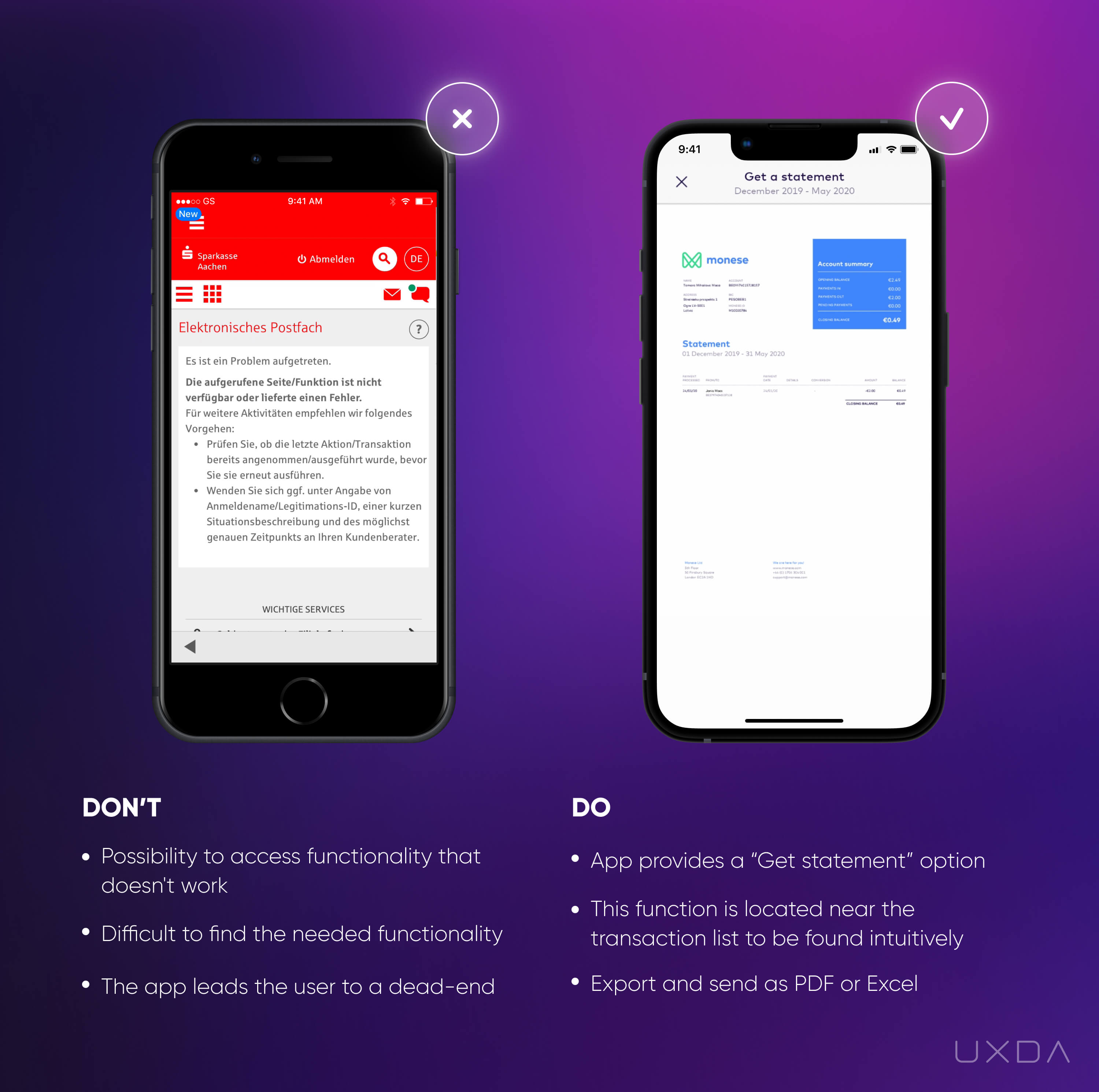
Image source: Sparkasse Mobile App, 2018 / Monese Mobile App, 2020
This can lead the users to negative emotions and frustration because they feel they were misled. In the example on the left the user needs to take several steps to find this option, then some more clicks just to end up with an announcement that this request cannot be fulfilled, and they have to visit the branch to complete this task. You can only imagine what kind of emotions are going through the user’s mind.
Solve it With Fintech App Design
To provide the best possible banking experience for your customers, implement an omnichannel strategy. Create an exceptional financial service experience connected across all digital banking ecosystems used by your customers.
If your customers have to explore both the desktop version and the app in order to know which functionalities are available on each of the channels, it might frustrate them.
Guide users to the function that they are seeking, if your financial app already provides this option. In this case, the account statement contains a transaction list, so we understand that, intuitively, the user will look for this option somewhere near the transactions. Provide users with the opportunity to do it with a few simple clicks.
First, the user can use filters to include only the needed information, then provide the customer with a statement preview, and, finally, let the user decide in what format he or she wants to export it according to their own preferences.
You can add additional value for your users by offering an option to send the statement right from the app via messaging, WhatsApp or email. Remember that users don't want an account statement; they probably just want to make sure that it will be received by the person who asked for it.
This is actually a great tip from the digital banking CX perspective - always try to explore the user's goal for any action on your financial app. In this way, you can get a lot of additional ideas on how to take the banking CX to the next level by making it even more pleasant.
Takeaway
To provide the best possible experience for your customers, implement an omnichannel strategy. Generate an exceptional financial service experience connected across all platforms used by your customers.
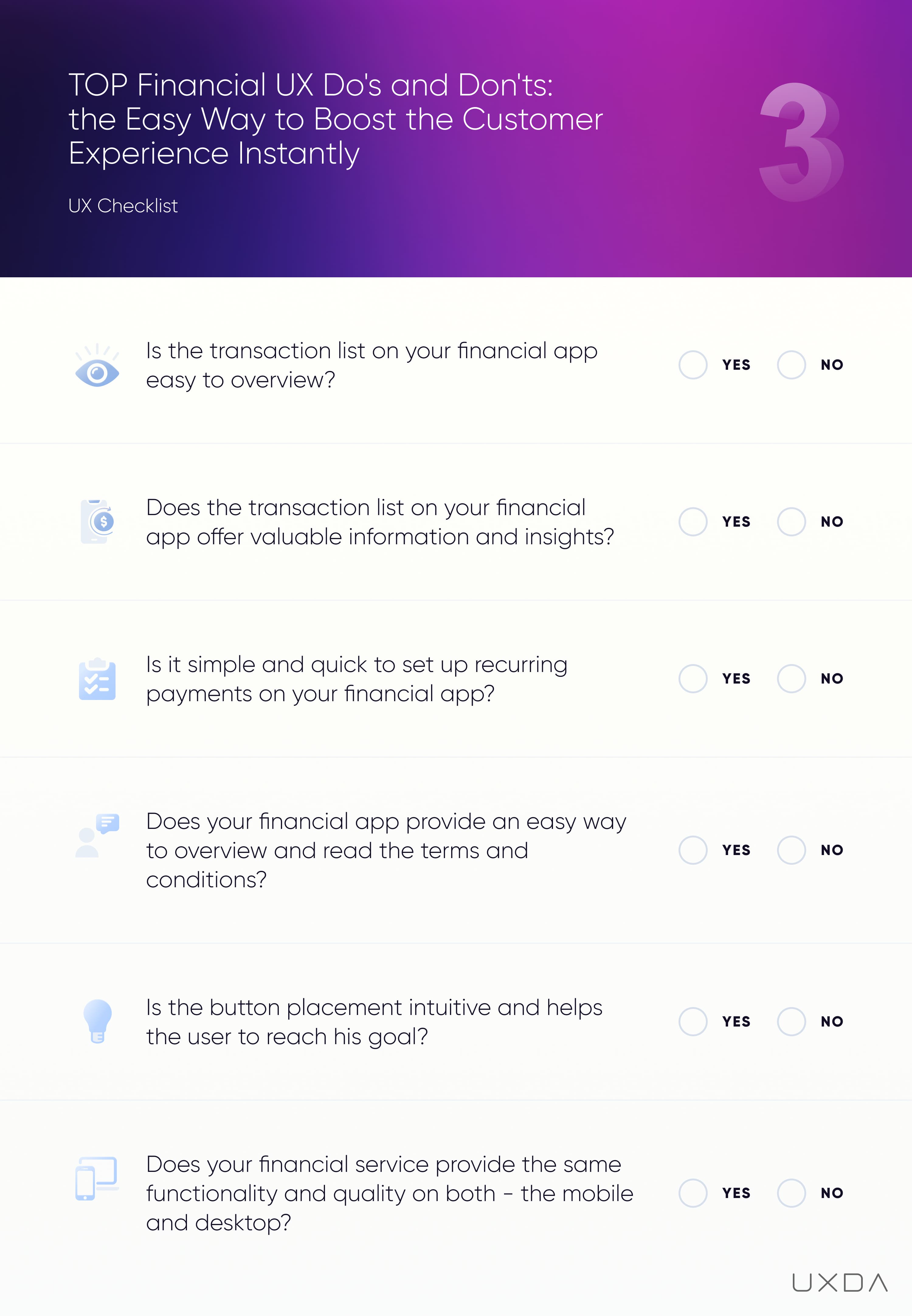
#3 Checklist for Usability in Fintech App UI Design
So far, we have explored 15 user pain points your financial service can solve quickly and without huge effort. Meanwhile, please fill in this checklist to find out the areas in which you could improve the UX of your financial service. For your convenience, it's also available in PDF format to print out and share with your colleagues.
16. Help Your Customers Increase Their Savings
Savings are an essential part of almost every person’s life. Many are saving for rainy days or their future, such as sending kids to college or buying a car or a house. Some people are savers by nature, but most of us are not, which creates a pain point.
On one hand, it's important to have savings; however, human nature is more oriented toward instant gratification, which is why it's often so difficult to set money aside.
Here is where the financial products can offer an effortless way to help people save money easily, making it almost unnoticeable and eliminating any frustration.
Some banks have started doing that, but unfortunately some still offer their users the option to open a savings account or term deposit to which they can make payments from their current account. There's only one problem: the customer has to figure it all out and also execute it him/herself. It's not intuitive, easy or effortless. A person already struggling with his/her finances most likely wouldn't want to choose such a path.
In the meantime, challenger banks have gotten ahead of the traditional players by offering their customers convenient ways to save.
The Fintechs are changing people's perception of savings as something dreadful. They are making this feature fun and motivational, encouraging people to start saving with seemingly tiny amounts of money.
Banking usability struggle
As we know, saving means dedicating a part of the user's income for some long-term goal, which is often accompanied by a dilemma─choosing between instant gratification and long-term benefits.
Many banks promote the importance of savings, but, at the same, often this service is difficult for the users to set up and manage on their own.
The users have to be quite self-motivated to start saving and adding money to their savings accounts on a regular basis. They have to explore how a savings account works and what features it has.
It's also important to take into account that users have different needs depending on the amount available to them to start saving. Some want to deposit a large sum, while others are interested in saving up gradually by adding a small amount each month. Some banks offer only the deposit function without the ability to add money regularly or create a separate savings account for this purpose, which can cause struggle if the user intends to save small amounts at a time.
When it comes to savings and/or deposit accounts, even more problems arise, such as potential restrictions on the movement of money. For example, the users can't withdraw money immediately without a fee, or they might have to request a money withdrawal 7-10 days in advance in order to avoid a fee.
On one hand, this could be good as it might motivate the customer not to spend his/her money. On the other hand, this can get quite unpleasant if the users know that they can't instantly access and control all of their money or have to pay an additional fee to do so.
Setting up a savings account is a feature that's often only available on the desktop version and not on the financial app. In the previous article of this series, we already covered why it's so important to have a multichannel strategy so as not to damage the customer experience.
All of the aforementioned factors might create quite a lot of difficulties. This is the reason why many customers choose the option to simply create another standard account and dedicate it to savings. We can see such a case in the example on the left. The only aspect that differentiates the current account from a savings account is its name.
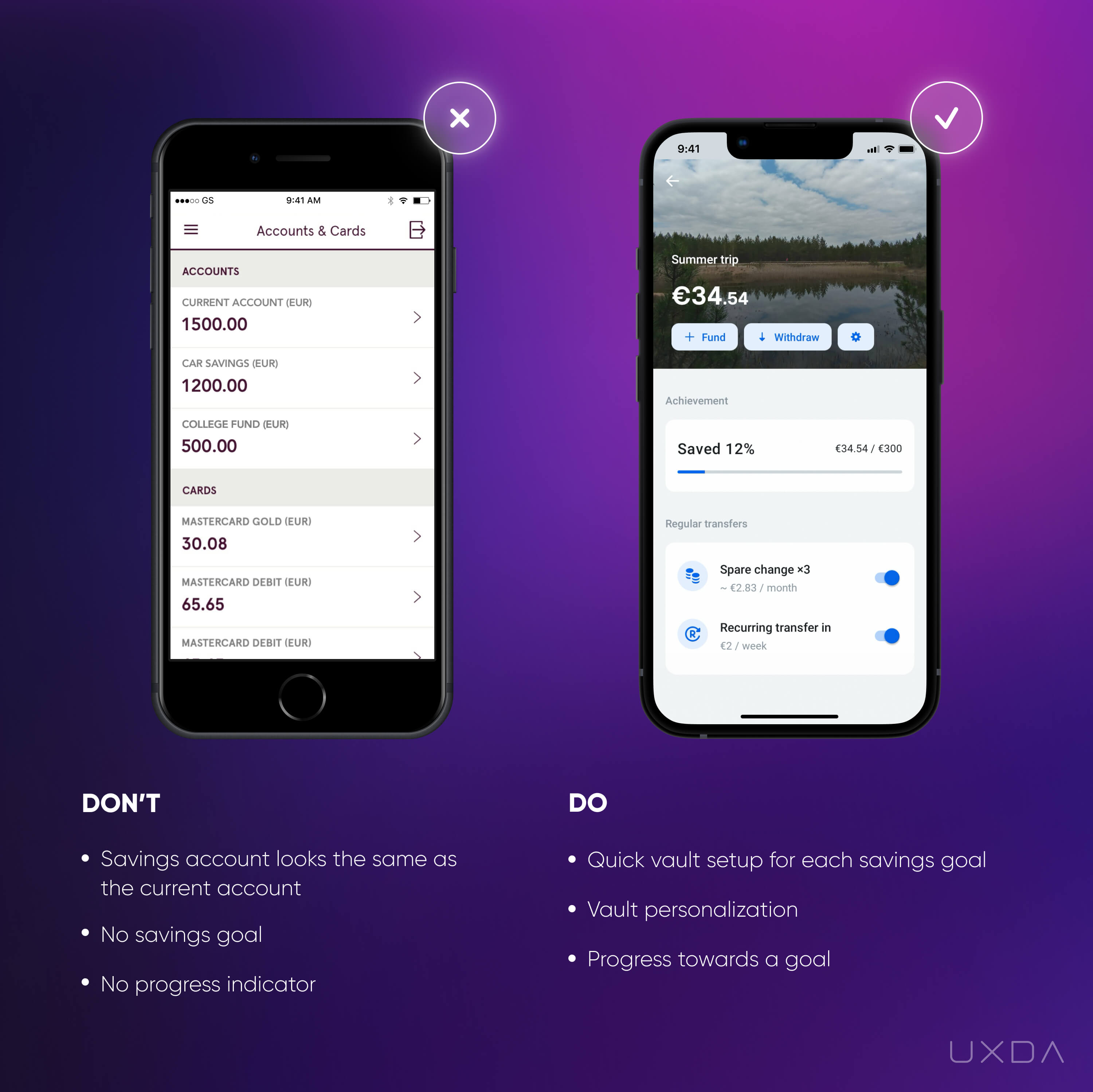
Image source: Luminor Mobile App, 2020 / Revolut Mobile App, 2020
In this case, first the user needs to go through the process of opening a new account (let's keep in mind that the process in some banks still isn't simple) and transfer money to this account. Secondly, the priorities might change in the user’s life, and there may no longer be a need for the additional current account to save money. What happens then? The users don't use this account anymore and aren't even aware that if the account is not used for a longer period of time, the bank applies a fee for the inactive account administration.
How are the users informed about it? Sadly, they usually aren’t. It can be a very unpleasant surprise to suddenly be charged by the bank, which results in negative feelings toward their financial institution.
To avoid such disappointing situations, think about how easy it is to close the account in your financial application. And, how many inactive accounts do you have? Inform users about the applicable fee and provide guidelines about any potential actions with the account. The users will feel cared for and supported and appreciate this kind of support from their financial institution.
Solve it With Fintech App Design
Following up on how regularly your users add money to their savings accounts can help you understand your customers.
See if they can easily find this option in the application. Paying attention to the smallest details can help discovering the pattern of how your customers are using the saving option on your financial product
Knowing that most humans, in general, are not good at saving their money, what could be the best way to remind them about savings? And, even more, how can you encourage and motivate your users to start saving?
Your financial app has the power to provide your customers with a feeling of satisfaction in managing their money. Use it, and the customers will reward you with loyalty.
Just imagine the feelings of your users when, thanks to the help of your financial app, they have saved money to fulfill their dreams: buy a family house or afford a great university for their children. They will experience pride and happiness with your application in hand. This is how financial services can improve people's lives.
Provide the ability to create a savings account quickly and easily for different savings goals. On the Revolut app, for instance, users can create a savings vault with only a few clicks. The customer has to state the name of the goal, and then the app guides him/her through the features related to the vault.
Think about the reason why customers use the product. Are they interested in depositing a large sum instantly, or is it important for them to set aside smaller amounts regularly? There should be an ability to add money to the savings account if that's the main reason why the customer is creating it.
As you can see in the example on the right, the Revolut app offers regular transfers with a fixed amount and frequency from the current account, as well as an option to save the spare change from each credit card purchase.
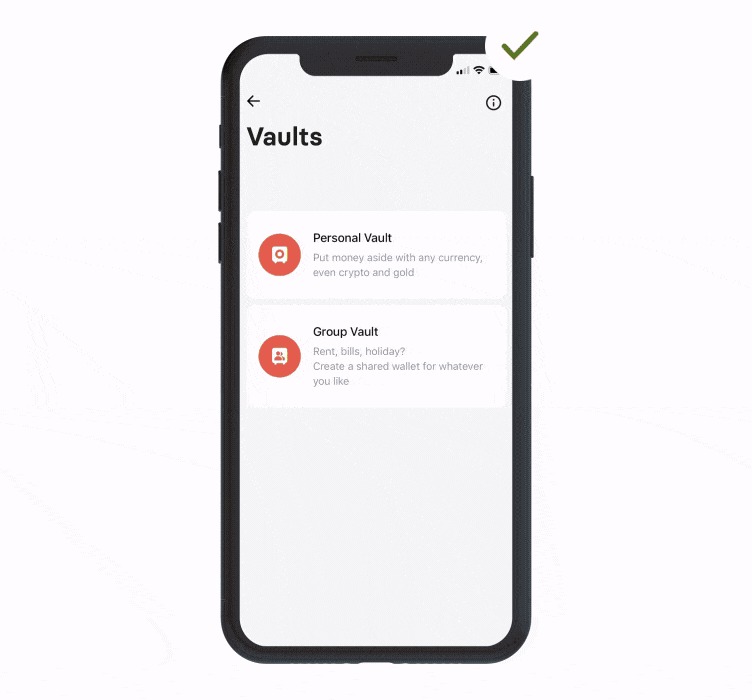
Revolut Mobile App, 2020
From a banking CX perspective, saving money using the spare change option is a good strategy for those users who have difficulties saving. It might be painful to consciously set aside some part of their monthly income, but, by using spare change, it becomes almost unnoticeable. By using the option to accelerate the difference two, three, five, times, the savings amount increases exponentially. The users get a pleasant surprise after they see that these small amounts combined actually move them closer to their goals much quicker than they had hoped.
Locating the savings account separately from the current accounts list makes it easy to find and manage. Make it intuitive to add or withdraw money from the savings account as these are the main actions in this scenario. In the example on the right, you can see that the Revolut app offers actions related to the savings in the view screen, such as fund, withdraw and enable/disable regular transfers.
If the savings account is displayed together with the current accounts, make sure you differentiate the two accounts by using visual elements to demonstrate the purpose of the account.
Another motivational element is the progress bar that displays how close the user is to reaching his/her goal. This provides a quick insight about how quickly the user is moving toward the goal and creates an additional motivation to reach it.
From the digital banking customer experience perspective, it's always a good idea to add emotions and personalization to the financial products. In the Revolut example, there's an opportunity for the user to add a picture of their choice to the vault.
The visual aspect is very important as it stimulates the user's imagination of already having the goal achieved. This increases their motivation to make their dreams come true, turning the process of saving into something exciting.
Takeaway
Help people save money easily by providing a savings feature that's fun and exciting. Personalize the savings experience and add emotions to it, so it becomes effortless and motivational.
17. Provide the Option to View and Copy Account Details
Viewing and copying the account details is a common pain point for users. There are often situations in which we need to quickly provide our details to receive a payment, or we need the details for a contract or an invoice. But, to the surprise of many users, the option to view the details often isn't available, not even talking about the possibility to copy it.
Banking usability struggle
The first struggle arises already when a user tries to find the account number. In some cases, this results in a disappointment since, after a period of intense searches, the customer discovers that there's no such option. In a slightly better scenario, the user would finally find it but end up disappointed anyway, as there's no way to copy the data.
Try to image what this scenario looks like: the user has his/her phone in one hand and a paper and pen in the other to manually write down the numbers and then type them in wherever they are needed. And try to ask, would this reflect the era of social media and digitization?
Even worse, if the account details aren't available on the app, OR if those are hidden like a very precious gem and impossible to find, the user will have to turn on his PC and login to the desktop version to access the necessary information. Just think about how many inconveniences this causes for the customer and how much unnecessary effort and time is dedicated to finding such basic information.
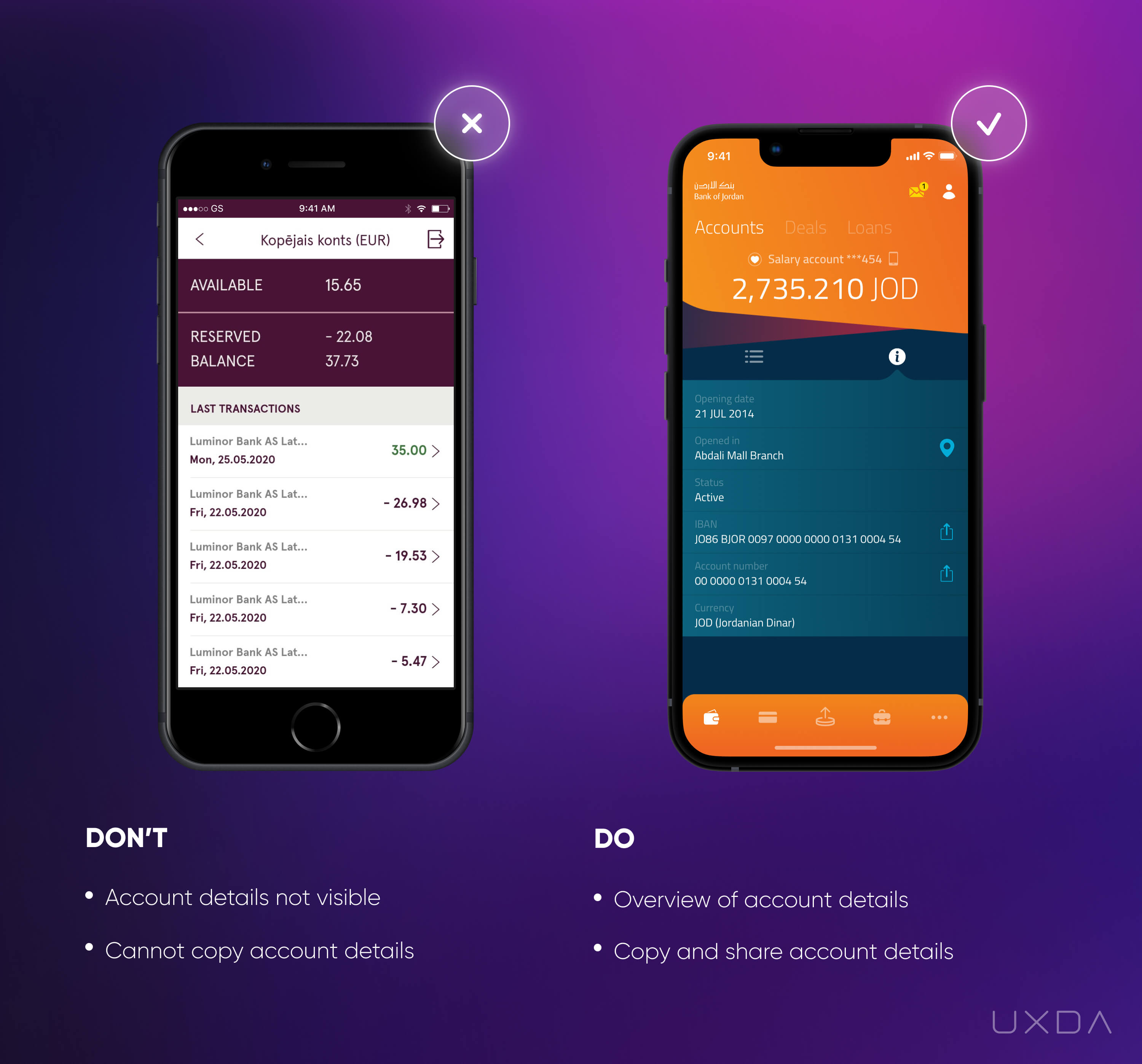
Image source: Luminor Mobile App, 2020 / Bank of Jordan Mobile App, 2019
In the example on the left, there is no ability to view or copy the account number. In some cases, it gets even worse if there's no option to name an account. Then the user has to distinguish his accounts only by their balances or by remembering the account number, which is definitely not a user-friendly solution!
Solve it With Fintech App Design
Help your users by providing the essential information of the products they own. Account numbers and bank details should be visible to the user so he/she is able to navigate the account freely and easily.
If the user has multiple accounts, in addition to displaying the account number, the users should have an option to name each of the accounts. This makes it much easier to quickly distinguish them.
In the example on the right, under the information about the account, there's a “share” button next to the user's account and IBAN number. By clicking on that button, the customer can easily copy the account details and share them via multiple channels. Here, the financial app has considered the “job” for which the users have “hired” this option. If the customer seeks the account details, then most probably he/she wants to share them with someone. This creates positive emotions to the users as they can quickly and easily send the account details through Airdrop, messages or social media.
Takeaway
Make it easy to find, view and copy the account details. Provide an option to send the account details instantly, right from the app.
18. Make it Clear How to Review the Scheduled Payments
One of the pain points that the customers often cite is that they feel anxious about all of the regular payments they have to make every month. As there are many utility bills received through different channels, as well as other regular payments, they worry that they might accidentally miss some of these or they might be afraid that something could go wrong, and the scheduled payment wouldn't go through. This anxiety is normal, as a delayed regular payment can result in a fine or, in the worst case scenario, lead to the heat, electricity or phone being disconnected.
To feel in control and gain a sense of calmness, the user wants to know that everything is in order: the payments are scheduled, and it's easy to review which ones are already safely paid and which ones are in the queue for payment.
By providing such an option, the financial service offers the users a feeling of relief and satisfaction that it's all taken care of, and the customer doesn't have to worry about it.
As we know, having all functionality easily accessible from the mobile device is necessary to ensure a great user experience, especially in a scenario that has so many emotions attached to it. Unfortunately, not all banks offer the option to review the scheduled payments on the app, but it’s available on the desktop version.
Another problem that arises is, even if the financial app provides a list of scheduled payments, it is often not intuitive and is difficult to read and understand, providing little value to the customer.
Banking usability struggle
It can cause a lot of negative emotions if the customers can't review their scheduled payments quickly.
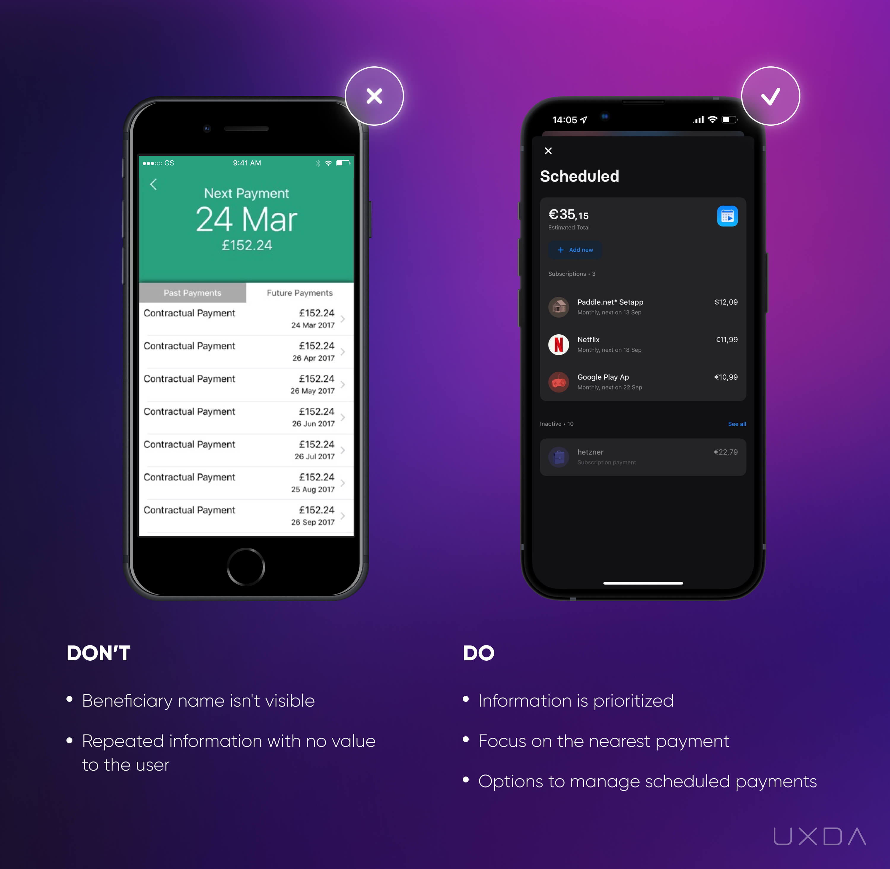
Image source: On Stride Financial Mobile App, 2017 / Revolut Mobile App, 2020
As you can see in the example on the left, there is a list of scheduled payments, but the users need to click on each payment to get information about the recipient. This is a time-consuming process, especially if the users have many payments on the list. Don't hide essential information like the recipient's name; show it instantly and eliminate unnecessary steps to find it.
Try not to confuse your users with information that's unnecessary for them. In the example above, all of the payments are named “Contractual Payments,” which doesn't provide any value to the user whatsoever. Instead, the name of the recipient would provide instant insight. In this case, it's good that the financial app at least displays the date of when the scheduled payment would be sent out.
Solve it With Fintech App Design
Help your users save time by clearly displaying the most important information about scheduled payments: name of recipient, amount and date when the payment will be made.
In the example on the right, a correct structure of the information allows the user to quickly scan the list for the most important information. The recipient’s name is accompanied by their logo, which makes it even easier to distinguish between the recipients and also makes the list more visually appealing.
Think about prioritizing the information. For example, emphasize the payments that are about to be paid shortly. Also, provide the ability to pay instantly, before the payment date. The users should have more flexibility in payment planning and gain control over their financial situation without being tied to a specific date.
You can provide the user with an easy overview of both the payments that have already been made and the scheduled ones, like Revolut has done in their financial app. Show the most recent payments and provide the option to view the full list. This is a great way to display the most essential information and not clutter up the screen, at the same time providing easy access to the full list, whenever the user needs it.
Takeaway
Provide the users with an easy-to-review list of scheduled payments. Make it insightful by displaying essential information like a recipient name, amount and date when the payment will be made.
19. Create a Convenient Budgeting and Spending Feature
Amid the growing number of different budgeting apps, more and more banks are starting to create their own budgeting features. This is a wonderful plan as it can really provide value and improve the customers' overall financial health. Sadly, however, this great intent can lack a proper realization from the banking CX perspective and, as a result, the customers tend to avoid it.
Banking usability struggle
The customer will choose to use the budgeting feature if it won't take much time and effort to enter all of the data, and if they feel that the insights gained are beneficial. After all, the main goal of this feature is to help ease the users’ lives.
Accurate budgeting and spending analytics is the bank's responsibility. If the insights prove to be inaccurate, the customer might very quickly lose trust in the financial institution.
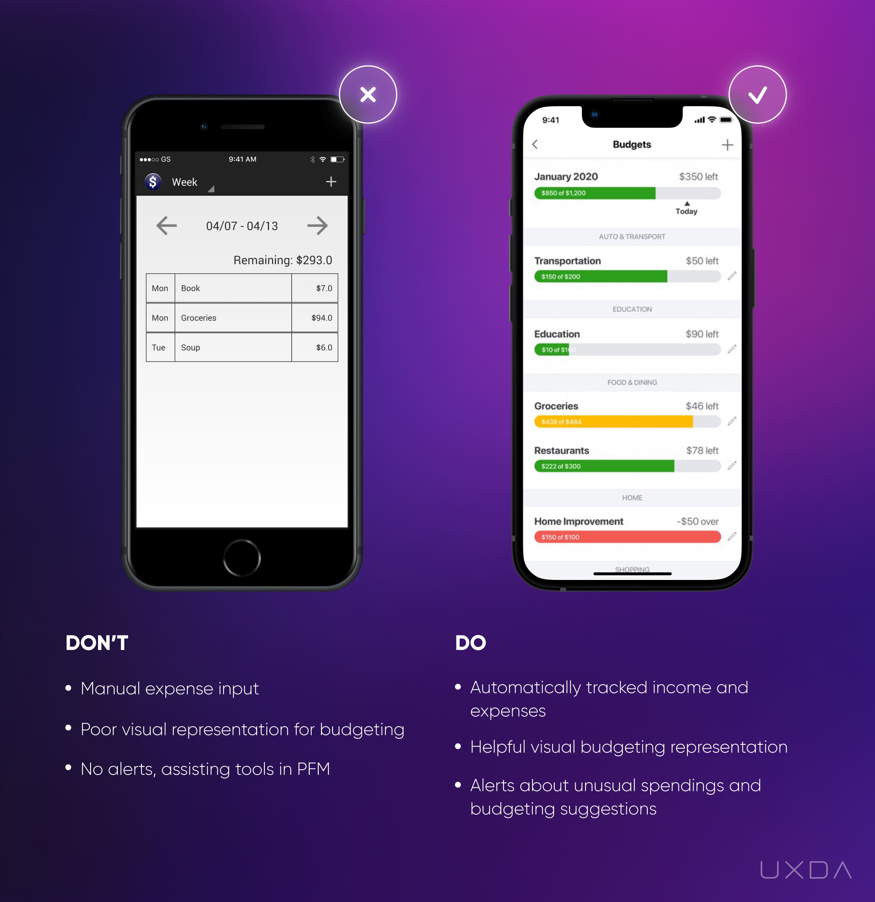
Image source: Weekly Budget Mobile App, 2020 / Mint Mobile App, 2020
In the example on the left, the user is provided with an option to review all of their expenditures by each week, even if the month has started in the middle of the week. There's no ability to view the spent money in another time period, for example, the total per month. Also, there is no option to review total spending amounts in the current month.
If you provide users the ability to review their expenditures, think about what kind of insights could be valuable for them. In the given example, there is only the total amount of weekly expenditures displayed, which gives the user no valuable information to understand, analyze and learn from the financial situation.
Another painful aspect of many budgeting services is that the customer has to enter all of his/her expenses manually. The app doesn't calculate the user’s spendings, so he/she must go through all the spendings by him/herself.
In the example on the left, the table displayed on the screen is difficult to perceive and read. There is no visual representation of the overall situation. The customer must put in a lot of effort to analyze the data and extract any insights by him/herself.
Solve it With Fintech App Design
If you provide your users with a budgeting and spending analysis option, make sure that it really helps to improve their financial life rather than causing additional work and stress, which is sure to lead to harmful decisions. Digital products are tools that are supposed to ease people's lives, not complicate them.
In the example on the right, we can see that the Mint financial app provides several options for how the user can track their budget. First, the user can set the amount that he/she prefers to spend in a specific category during the current month. Users can also see a progress bar that provides immediate insights into how close the users are to reaching their goals. For progress bars, color coding is typically used so the user can get a sense of the overall situation by color. For instance, red usually indicates that the user is very close to overspending the maximum amount of money that was planned for a specific category.
For each category, the user sees the spent amount and the amount that is still left. Here, many inconvenient budgeting features provide only information about the budget goal amount. Think about the main goal of the user who has opened this budgeting screen. It is important for a customer to understand how much money is available for spending in a specific category. If the financial app provides only the total goal amount, the user must put in additional effort to calculate the budget that is left.
Another feature that the Mint financial app offers is automatic categorization of all expenditures. Therefore, the user gets information not only about the progress toward monthly budget goals, but also has an understanding of how the money has been spent.
Here, it's important to view this contextually; the users should have the ability to edit a specific transaction category. For example, if the user buys bottled water at a gas station, the app will probably automatically place this transaction into the category “Auto/Transport” or “Gas/Fuel”. This increases the accuracy and trustworthiness of the budgeting feature.
Many financial apps display spending categories separately from budgeting goals. This is not bad practice, but, if you think from the user’s perspective, then often much more insights could be gained if these two features were combined. Remember that every function of your financial app should meet the user’s expectations and goals according to the specific scenario.
If you provide budgeting and spending options to your users, update your customers about their progress. If the user is close to overspending, send a notification about that so they will be prepared. Inform about possible upcoming financial issues before they occur. The users will feel that their financial health is important not only to them, but also to the bank that they use. As a result, the user will see that it is not just a financial application, but a financial health advisor and companion.
Takeaway
Provide a budgeting and spending feature that's accurate and insightful. Display the total budget for a certain category, as well as how much is already spent. Present this information in a way that's clear and easy to review.
20. Make it Easy to Apply to Products
In the digital world in which we live, the user requires that everything happens immediately, on the go without any additional effort. This is a precondition for creating a delightful banking CX.
If such a scenario applied to banking products can be executed only through the bank's desktop version or by physically going to the banking branch, people might not feel that the service is “user centered”.
A financial institution offering the ability to apply for products right from the app can be seen as a positive service that meets the requirements of the customer expectations in the digital age.
Banking usability struggle
Every bank wants their customers to use as many banking products as possible so the customer can feel the full banking experience but we should accent the way we provide this opportunity to the customers. Some banks still do not offer the ability to utilize products right from their apps, or, if they do, there are limited products available or the application process is complicated.
If the app doesn't offer a list of products that the user can apply for, then, in most cases, the only option for the user is to contact the bank. And, as we have already mentioned in the previous articles of this series, not all banks offer a convenient way to reach them and get support for any questions.
Some banks provide message templates in their apps to apply for the product. On one hand, the bank tries to ease the application for new products, but, on the other hand, if this process is too complicated, the user won't proceed with it anyway. Besides, there are still quite a few banks that don't provide the opportunity to utilize these features right from the app at all.
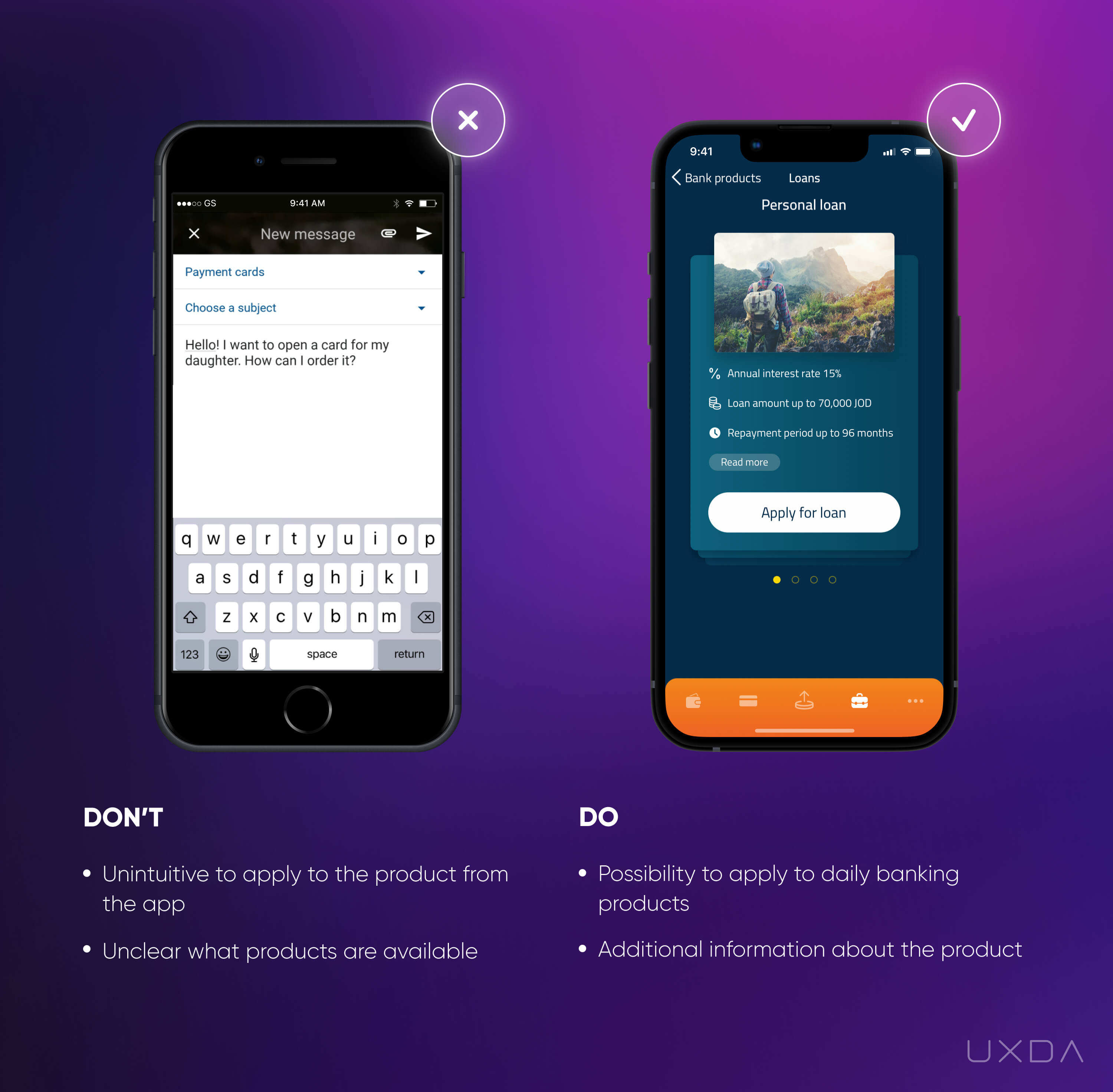
Image source: BlueOrange Mobile App, 2020 / Bank of Jordan Mobile App, 2019
Another struggle is that often there is no information about the full list of available banking products. Since the most popular channel nowadays is mobile, then the customers can't even have an overview of all the product types the bank offers. For example, a family might think that it would be convenient to get a payment card for their children. As they can't find this option in the app, it might seem that the bank doesn't offer this type of service, while, in fact, the bank might offer this option, but only in the desktop version or only at the branch.
The difficulty of signing up for the product decreases the chance of people actually choosing it. If the bank stepped forward and made the process quick and simple for the customer, or even created a personalized offer, the chances of people choosing the bank's products could increase significantly.
Solve it With Fintech App Design
Give the customer the ability to experience the full range of banking products. Try to provide more information about each product so that the user can be sure which one to choose and then guide them through the journey to get it.
In the example on the right, you can see that the user not only has the ability to apply for the product, but also has answers to the most common user questions about the product. By providing such information, you significantly increase the possibility that the user will apply for the product.
If you offer a form to fill out to apply for the products, make sure that users don't have to duplicate personal information. For example, don't make the users fill in data such as name and birth date if the banking app already has this information and can display it automatically.
If the option of applying for products can't be easily added to your app, or it is required to visit the branch, you can still give your clients clues on how to do that from the app.
You can provide your users with insightful information about your products, so that the customers can already evaluate which product is right for them and prepare the needed data and documents to accelerate the process.
Make sure the bank's contact information with phone number and branch locations, as well as their working hours, is easy to find, so that the user can contact support with any additional questions regarding the product or book an appointment at the branch.
Takeaway
Make it easy to apply for the banking products right from the app. Provide a clear overview of all available products and information needed for the users to apply.
#4 Checklist for Usability in Fintech App UI Design
We have identified 20 user pain points your financial service can solve quickly and without huge effort. Please fill out this checklist to find out if you have areas in which you could improve the banking UX of your digital service. For your convenience, it's also available in PDF format to print out and share with your colleagues.
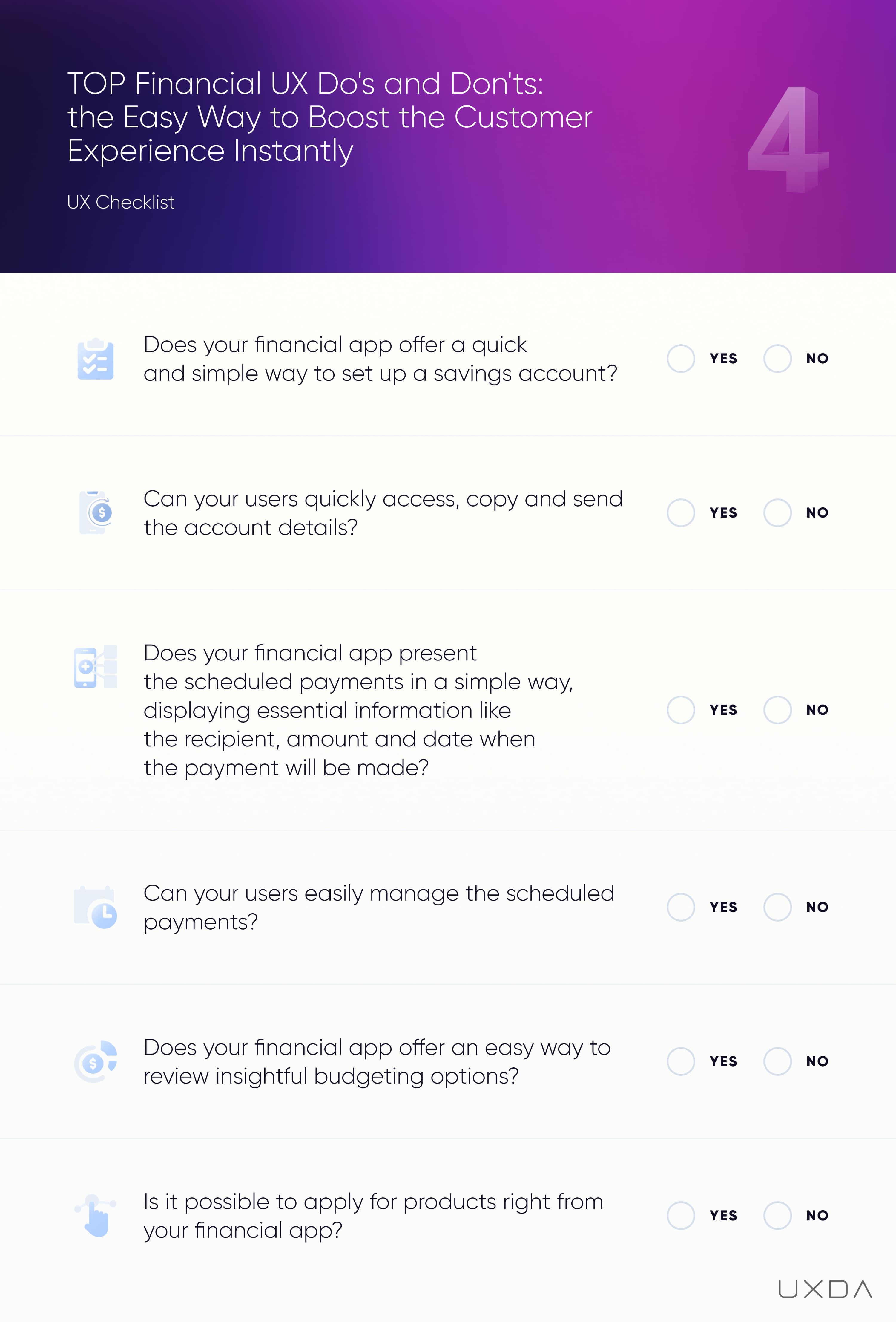
UX architects and UI designers experienced in finance in addition to mobile banking usability improvement can provide significant benefits to financial institutions. In particular, the financial UX design agency UXDA helps to address the digital challenges faced by financial companies from 36 countries in many ways:
- Implementing a successful and effective digital strategy: A financial UX design agency can help a company develop a clear and effective digital strategy that aligns with its business goals and objectives.
- Keeping up with rapidly changing technology and digital trends: A financial UX design agency can help ensure that a company's digital products and services are using the latest and most appropriate technologies and design trends, which can help the company stay competitive and relevant in the rapidly changing digital landscape.
- Providing a seamless and consistent experience across all digital touchpoints: Improving the customer experience across all digital channels: A financial UX design agency can help design digital experiences that are intuitive, easy to use, and provide value to customers, which can help improve the overall customer experience.
- Increasing customer acquisition and retention through digital channels: A financial UX design agency can help design digital products and experiences that attract and retain customers, which can help increase customer acquisition and retention rates.
- Integrating digital products and services with traditional ones: A financial UX design agency can help a company seamlessly integrate its digital and traditional products and services to provide a cohesive experience for customers.
- Managing the cost and resources required for digital initiatives: A financial UX design agency can help a company optimize its digital initiatives to minimize cost and resource requirements while maximizing impact.
- Measuring and analyzing the effectiveness of company digital performance: A financial UX design agency can help a company measure and analyze the effectiveness of its digital initiatives using a variety of tools and techniques, such as user testing and analytics.
- Ensuring security and compliance with regulatory requirements: A financial UX design agency can help design secure and private digital experiences that protect customer data and comply with regulatory requirements.
Get UXDA Research-Based White Paper "How to Win the Hearts of Digital Customers":
 If you want to create next-gen financial products to receive an exceptional competitive advantage in the digital age, contact us! With the power of financial UX design, we can help you turn your business into a beloved financial brand with a strong emotional connection with your clients, resulting in success, demand, and long-term customer loyalty.
- E-mail us at info@theuxda.com
- Chat with us in Whatsapp
- Send a direct message to UXDA's CEO Alex Kreger on Linkedin


