


We're excited to present our story of crystallizing the company's vision through an updated brand identity. Our journey of redefining our visual language has been exhilarating and inspiring. We are eager to share how we found a way to integrate a brand's soul into a visual identity with an elegant solution that required us to look deep into the purpose of our work.
UXDA's Soul Demands for Change
From the very beginning, we created our company with a clear vision and mission: to humanize financial services through customer-centered financial product design. And this is what we have been doing for 10 years. During this time, we have designed more than 150 financial products, received many design awards and perfected our methodology. But, most importantly, we have taken our purpose to the next level by actively inspiring the financial community with our insights, thereby helping the entire industry move to a human-centered perspective.
The desire to make financial services useful, friendly and enjoyable is the essence of UXDA. This is our purpose and soul. What sets us apart from other design agencies is that we focus on integrating our clients' business purpose, their soul, into digital product design. This makes their digital product an organic embodiment of the brand, offering customers a unique and rich experience. And, recently, we realized that our brand requires revitalization to showcase the soul of our company, so we've redefined UXDA's identity to be in sync with our mission, values and core process:
We needed a visual language that conveys the true value we bring to our clients. In our particular case, this entailed showcasing our exceptional ability to highlight and extract focused insights to create purpose-driven digital products. Leading digital pioneers and disruptors emphasize the ability to filter out noise and narrow the search to crystallize value. This is what separates great product design from ordinary solutions, and this is exactly what UXDA's entire process, competencies and methodology are focused on.
This realization inspired us, but how did we integrate such a complex concept into the brand identity? We embarked on a transformative journey to unveil UXDA's most well-kept secret and expose the essence that sets us apart.
Crystallizing Value into UXDA's Brand's Identity
The passion and determination to visualize our value for the client ignited a fervent drive within us. We sought to embody deep meaning and emphasize our commitment to unlock our clients’ hidden potential. The main goal of upgrading our visual style was to achieve a cohesive brand communication that aligned with our mission while boldly conveying our unique character.
As we mentioned earlier, to create next-gen financial products, the UXDA team focused on extracting the essence that enhances the value of financial products and helps them reach their maximum potential, prioritizing the most important aspects while muffling excess noise. We always repeat this process until the financial brand value becomes clear and integrated in the rich user experience.
Such brand value and unique offering crystallization in the digital product is the biggest challenge for the financial industry. That is why there are still so many boring, template-driven, user-unfriendly products with poor experience in the market.
To translate this insight into our brand's identity vision, we focused on three key elements: material, light and form.
The best metaphor for valuable product ideas, and the process of finding and implementing them, is a crystal. Firstly, this material is formed under titanic pressure conditions, reflected in its unique properties and high final value. Secondly, being filled with the energy of light, it transforms it into bright colors of the full spectrum, bewitching in its harmony. And, finally, light is what we work with as designers.
Likewise, we diligently and actively develop our design competencies and methodology challenged by the extremely complex financial industry. As a result, we can use the transformative power of design to reconstruct the energy of our clients' brands into a unique digital product experience filled with special value for users.
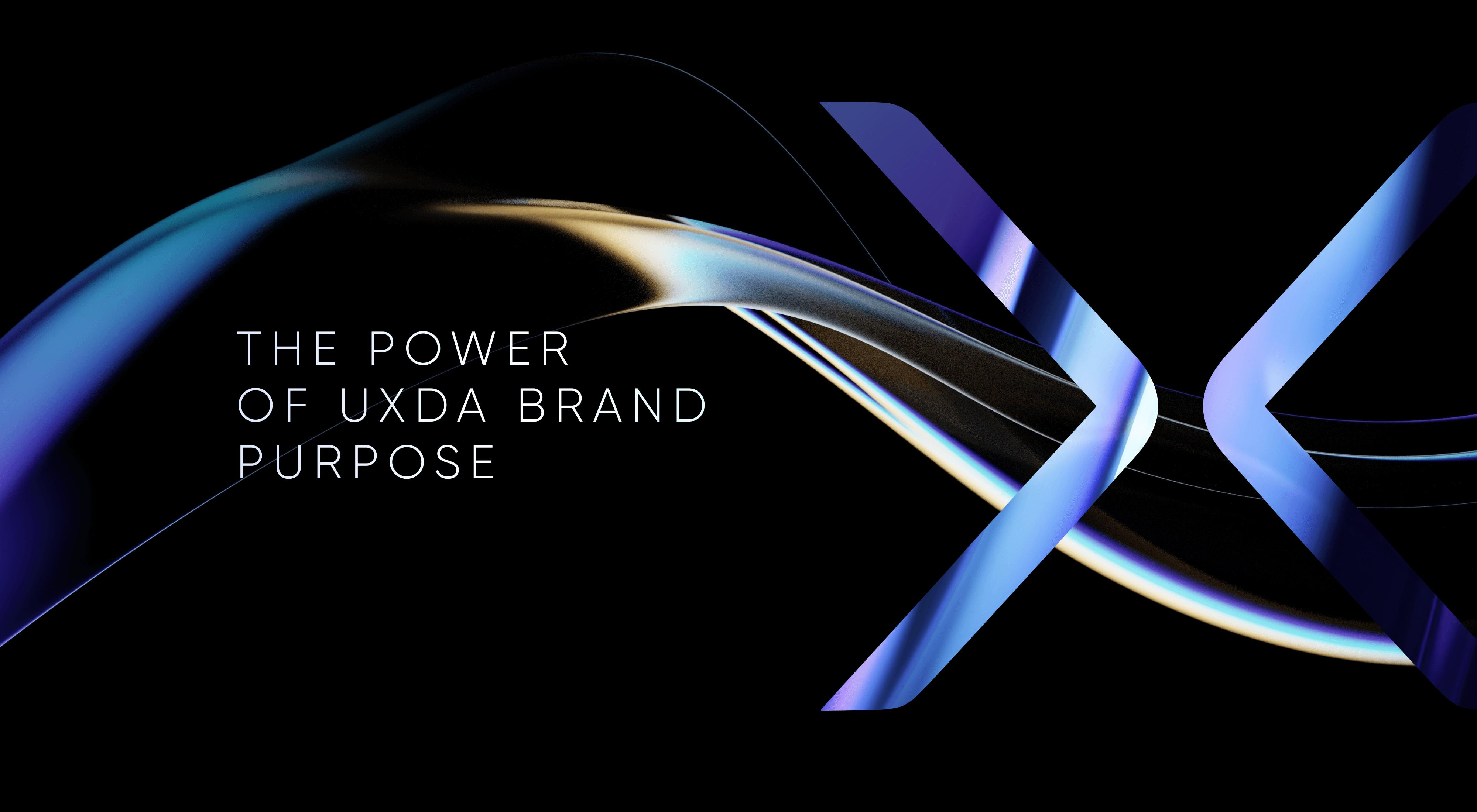
The form search led us to what had long been before our eyes. But to reveal that symbol of crystallization, we had to take a leap beyond the usual perception pattern. It dawned on us that the X in the UXDA logo could be divided into two concentrically directed >< vectors that would represent the search, focus and prioritization process of designing the perfect experience. And "experience" is the exact meaning of the X in the UXDA name.
This symbolism represents a profound concentration and perpetual motion in search of the best design idea. By splitting the letter X into two arrows, we invoke a symbol that propels us towards clarity, focus and unwavering determination to crystallize the intrinsic value of products, bridging the gap between the human and digital realms. This powerful symbol has been organically integrated into our logo and the overall visual language of the updated brand.
Another significant aspect of the UXDA approach lies in our focus on finding new innovative ideas to become architects of the future in finance. We are dedicated to creating the next-gen financial products. Therefore, we are among the first to actively study and implement the latest trends, approaches and technologies in the financial arena. Moreover, in our case studies, we share our discoveries and experiments for everyone to inspire and challenge the entire industry to move toward a human-centered transition into a digital future.
For our minimalistic logo, the key way to represent this focus for the future was the font. We drew inspiration from science fiction films, space exploration companies and futuristic design. At the same time, we had the daunting task of maintaining continuity and recognition of the existing logo, so there was no space for radical changes. As a result, we selected and refined a font associatively connected with the future. Combined with the redesigned X symbol, the logo has communicated a unique and premium identity.
![]() We also revised the color identity of the brand toward greater depth and a premium feel. After all, this is an important differentiator of our services, motivating our clients to work with UXDA. As a result, these changes required a comprehensive update of visual communication across our home page, social profiles, YouTube, etc. And this is just the beginning.
We also revised the color identity of the brand toward greater depth and a premium feel. After all, this is an important differentiator of our services, motivating our clients to work with UXDA. As a result, these changes required a comprehensive update of visual communication across our home page, social profiles, YouTube, etc. And this is just the beginning.![]() Nothing shows our passion to find innovative visual ideas to create the next-gen financial products’ UX better than our latest showreel:
Nothing shows our passion to find innovative visual ideas to create the next-gen financial products’ UX better than our latest showreel:
Get UXDA Research-Based White Paper "How to Win the Hearts of Digital Customers":
 If you want to create next-gen financial products to receive an exceptional competitive advantage in the digital age, contact us! With the power of financial UX design, we can help you turn your business into a beloved financial brand with a strong emotional connection with your clients, resulting in success, demand, and long-term customer loyalty.
- E-mail us at info@theuxda.com
- Chat with us in Whatsapp
- Send a direct message to UXDA's CEO Alex Kreger on Linkedin