


Banking UX design determines how clearly, confidently and efficiently customers can understand and use digital financial services. Across mobile banking, online banking and professional financial platforms, UX needs to translate complex products, data, rules and financial decisions into experiences people can navigate without needing to understand the bank’s internal complexity. Good digital banking user experience goes far beyond attractive financial interfaces. It combines customer research, information architecture, interaction design, content, accessibility, behavioral understanding, Digital Brand Identity and consistency across journeys and channels. In financial services, UX also needs to support trust, informed decisions and recovery when something goes wrong.
Good positions don't win games, good moves do.
Gerald Abrahams, chess master
As banking services functionality becomes increasingly similar across competitors, usability alone is becoming a baseline rather than a lasting differentiator. Strong Banking UX connects functionality with clarity, trust, relevance, emotional value and a distinctive experience customers can recognize and prefer.
What is Banking UX Design
Banking UX design is the process of designing how customers understand, navigate and interact with digital financial products and services. It includes customer research, information architecture, interaction design, content, visual hierarchy, accessibility and behavioral design across mobile banking, online banking and other financial interfaces. The objective is to make complex financial tasks understandable, efficient and trustworthy while helping customers make informed decisions with confidence. Banking UX is a specialized area of Financial UX Design. Financial UX covers a broader range of financial products—including banking, FinTech, investment, insurance, trading and professional financial platforms—while Banking UX focuses specifically on banking products, services and journeys.
Banking UX vs. UI vs. Customer Experience: What Is the Difference?
Banking UX focuses on how customers understand and use digital banking products and journeys.
Banking UI focuses on the visual and interactive interface through which those experiences are delivered.
Banking CX is broader, covering the customer's entire relationship with the institution across digital products, support, communications, branches and other interactions.
| Discipline | Focus | Core question |
|---|---|---|
| Banking UX | Journeys, logic, usability and interaction | Can customers understand and accomplish what they need digitally? |
| Banking UI | Visual and interactive interface | Is information presented clearly and consistently? |
| Banking CX | Entire relationship with the bank | What experience does the institution create across every interaction? |
A banking app can have polished UI but poor UX, while an individual journey can have good UX even when the wider customer experience remains fragmented.
What Makes a Good Digital Banking User Experience
In today's digital age, where customers have numerous options for their banking needs, a strong UX can be a crucial differentiator for banks. Implementing UX design can help the bank stand out from its competitors and differentiate its Digital Brand Identity in the marketplace.
A good digital banking user experience helps customers achieve financial goals with clarity, confidence and appropriate control. It combines usability with understandable information, trustworthy system behavior, accessibility, relevant personalization, consistent interaction patterns and a distinctive Digital Brand Identity.
In banking, simplicity does not mean removing financial depth. It means translating complexity so customers can understand what is happening, what they need to do and what the consequences of their decisions will be.
A good Banking UX should create:
- Clarity: customers understand what is happening.
- Control: customers know what they can do and what happens next.
- Trust: system behavior is predictable and transparent.
- Efficiency: unnecessary effort is removed.
- Accessibility: services work for diverse customer needs.
- Relevance: information and actions reflect customer context.
- Consistency: products and channels behave as one experience.
- Distinctiveness: Digital Brand Identity makes the experience recognizably yours.

7 Banking UX Design Principles for a Better Digital Banking User Experience
Improving Banking UX is not simply about removing clicks or making interfaces more attractive. Financial services combine complex information, high-consequence decisions, regulation, security, emotional pressure and organizational dependencies that shape the customer experience.
The following seven Banking UX Design principles help financial institutions address those challenges—from diagnosing customer friction and reducing cognitive load to strengthening Digital Brand Identity, validating decisions through research and improving the operational systems behind customer-facing journeys.
1. Diagnose Banking UX Problems Before Designing Solutions
Strong Banking UX Design starts by understanding why customers struggle before deciding what to redesign. Too often, financial institutions respond to low adoption, abandonment or support demand by changing screens, adding instructions or introducing new features without validating the actual cause of the problem.
A visible UX issue is often only a symptom. Customers may abandon a transfer not because the form is too long, but because they do not understand the terminology, cannot find required information or are uncertain about fees and timing. A feature may have low adoption not because customers cannot find it, but because they do not understand its value or do not trust what will happen after using it.
This is why UX research should combine multiple sources of evidence, including:
- customer interviews and usability testing;
- behavioral and funnel analytics;
- support requests and complaints;
- failed or abandoned journeys;
- frontline employee observations;
- transaction errors and repeated attempts.
The objective is to distinguish customer symptoms from systemic root causes.
For example, a customer making an international transfer may understand perfectly well that they want to send money abroad but struggle with unfamiliar concepts such as beneficiary type, routing information, SWIFT/BIC details or fee options. The UX problem is not necessarily the financial requirement itself. It is whether the experience explains what is required, why it matters and where the customer can find the necessary information.
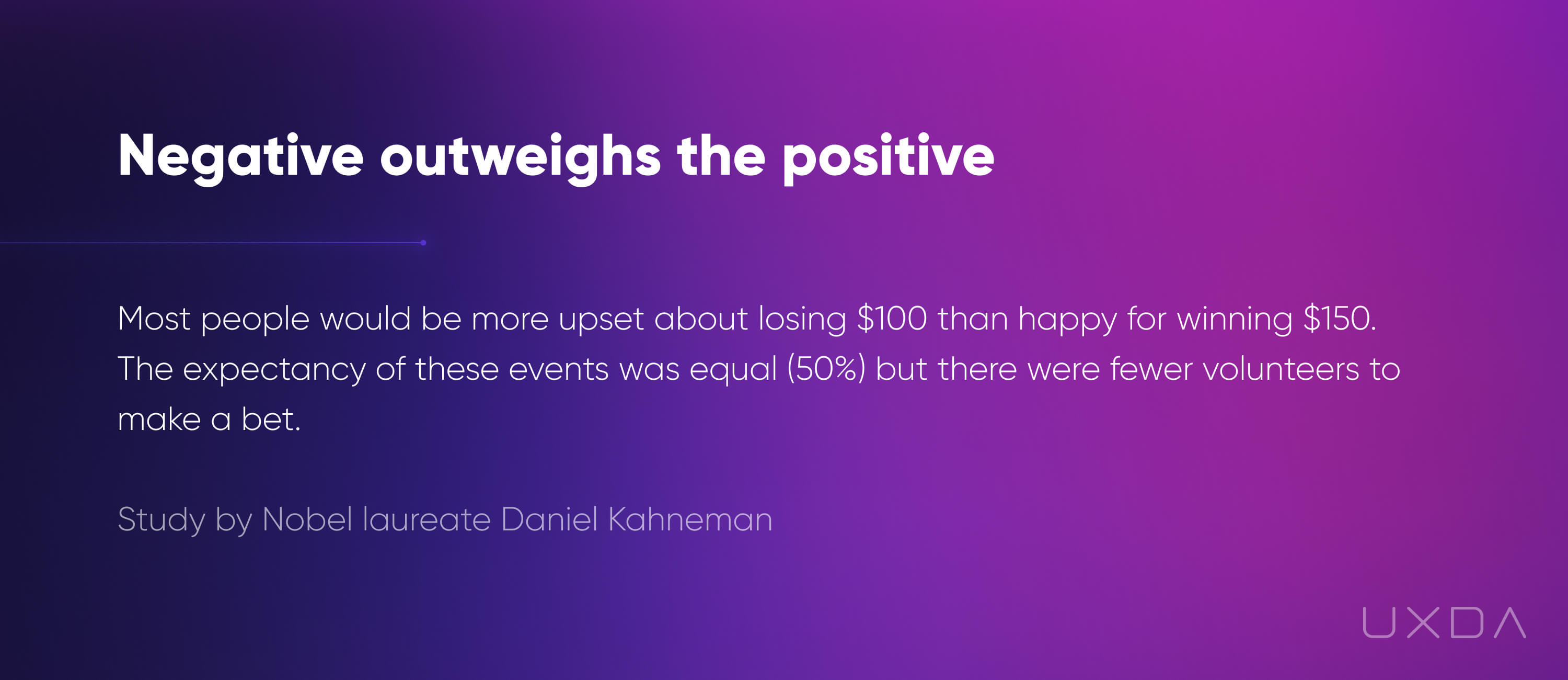
Several independent studies confirm that the negative aspects of any action or event outweigh the positive ones in human consciousness. Nobel laureate Daniel Kahneman conducted an experiment that clearly proves this statement. He investigated people's emotions in the context of making bets.
UXDA uses Failure Mapping to examine the moments where a financial journey breaks down and trace them back to the conditions that created the problem.
A simple Failure Mapping sequence can be:
Customer goal → friction point → observed behavior → probable cause → evidence → design opportunity
For example:
Goal: Send money internationally
Friction: Customer cannot complete beneficiary details
Behavior: Repeated edits, abandonment or support contact
Possible cause: Banking terminology does not match the customer’s mental model
Evidence: Usability testing, support data and abandonment analytics
Design opportunity: Explain required information in customer language and progressively reveal additional fields only when necessary
This prevents teams from jumping directly from a metric such as “high abandonment” to an assumed solution such as “shorten the form.”
The same principle applies beyond individual journeys. Repeated customer confusion may originate in inconsistent terminology, conflicting product rules, fragmented channels or internal processes rather than a single interface.
The goal is to understand why the customer problem exists and solve it at the level where it is actually created.
Here's an example from my own experience:
A customer trying to make an international transfer may understand the goal perfectly while struggling with unfamiliar concepts such as beneficiary type, routing information, SWIFT/BIC or fee options. The UX problem is not necessarily the financial requirement itself—it is whether the interface explains what is required, why it matters and where the customer can find the information.
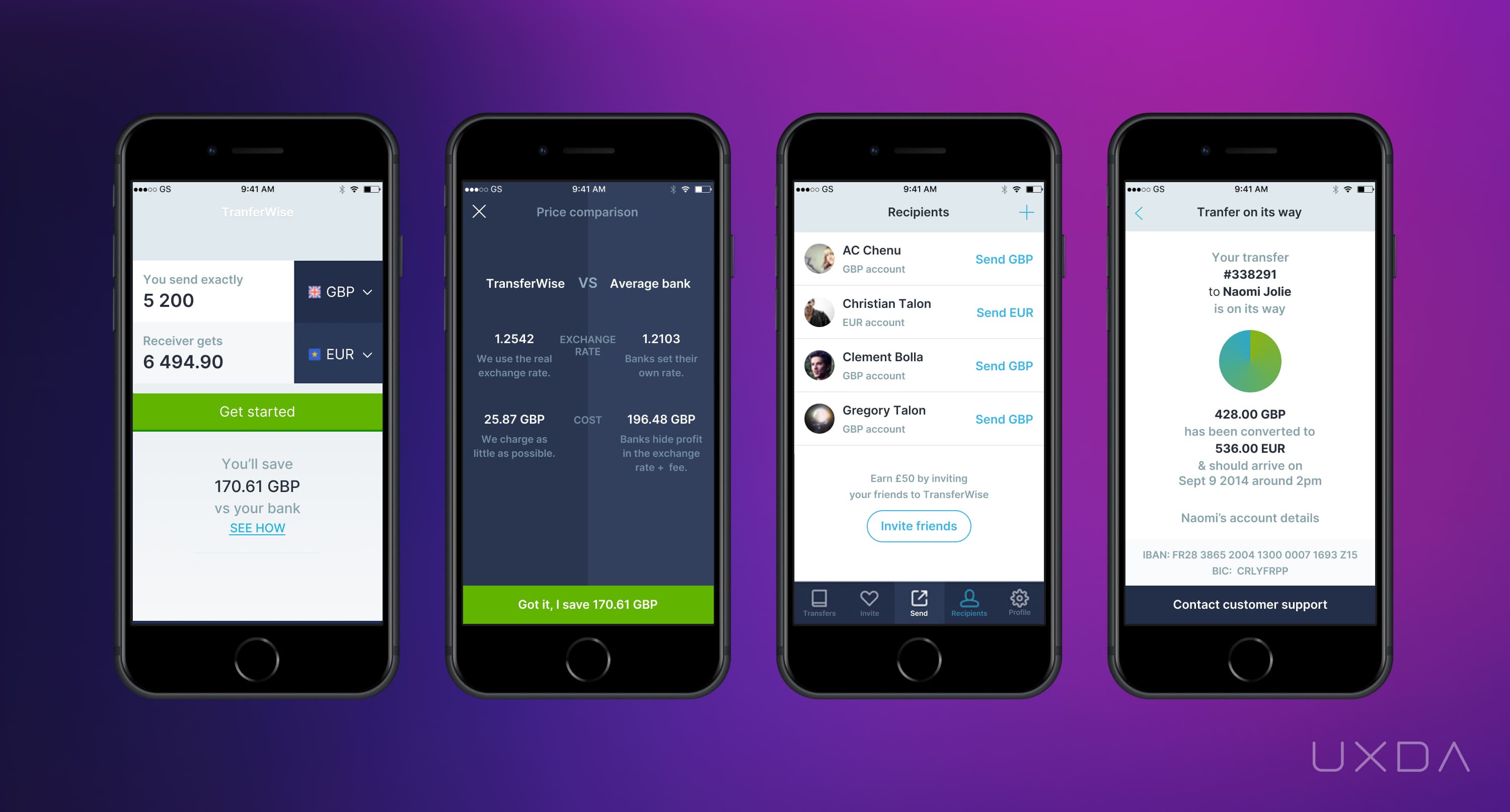
Transferwise provides easy to use alternative for an international money transfer
More about user paint points and “Failure Mapping”: Banks Are Doomed If They Don't Care About User's Pain Points
Customer Experience Trends for the Digital Success 2021
2. Reduce Cognitive Load Without Removing Financial Depth
Financial products are inherently complex. Customers may need to compare products, understand fees, review transaction details, manage multiple accounts or make high-consequence decisions. Good Banking UX should absorb that complexity rather than transfer it directly to the customer.
When a digital service requires some action from the user it is better to divide it into step-by-step tasks instead of squeezing it all into one screen. You can use progressive disclosure in your forms or divide processes into several screens by using layers behind primary pages.
Simplification means helping customers achieve the same financial outcome with less unnecessary effort—not removing capabilities they genuinely need.
Cognitive load increases when customers are asked to:
- interpret unfamiliar banking terminology;
- remember information between steps;
- compare too many options at once;
- understand internal product structures;
- search through dense interfaces for relevant actions;
- or determine what information matters without clear hierarchy.
Banking UX can reduce this effort through progressive disclosure, strong information hierarchy, familiar mental models, clear terminology and contextual guidance.
For example, a customer applying for an investment product may not need to see every legal, market and operational detail at the same moment. The experience can first explain the decision being made, then progressively reveal relevant information as the customer moves deeper into the journey.
The same principle applies to dashboards. Showing more information does not automatically create more value. The interface should help customers distinguish between:
what they need to know now → what requires action → what can remain secondary.
All the interface elements may be located according to their priority for the user. It’s necessary to consider their role in the user tasks execution. So, you can determine their priority in every screen. Use different visual means for accents: font size, color, shape, icon. This will help the user to follow the sequence and interface logic intuitively. The same thing is true for the element grouping. Proper interface space zoning will help to group the elements according to the key user scenarios.
When interacting with any digital service the user builds a mental map in his mind. This map should answer how to implement a particular scenario, where to look for information, and what opportunities the service provides.

It is very important not to confuse simplification with primitivism. The simplification of the car with mechanical transmission is a transition to automatic transmission, which greatly facilitates control. Primitivism would be the transition from a car to a motorcycle or even to a bike. Of course, this can simplify the control, but the key user functions making the real vehicle value are gone.
A suitable simplification allows a user to achieve the same, or an even greater result, but with less effort and less knowledge. Often, in order to simplify the users journey it takes hard work from the ones on the “backstage” of products development.

So, if we go even further into the idea of car simplification, we will see a self driving car with no human involved in the driving. For example, Robinhood simplified stock trading service to make it affordable for ordinary people without brokers mediation.
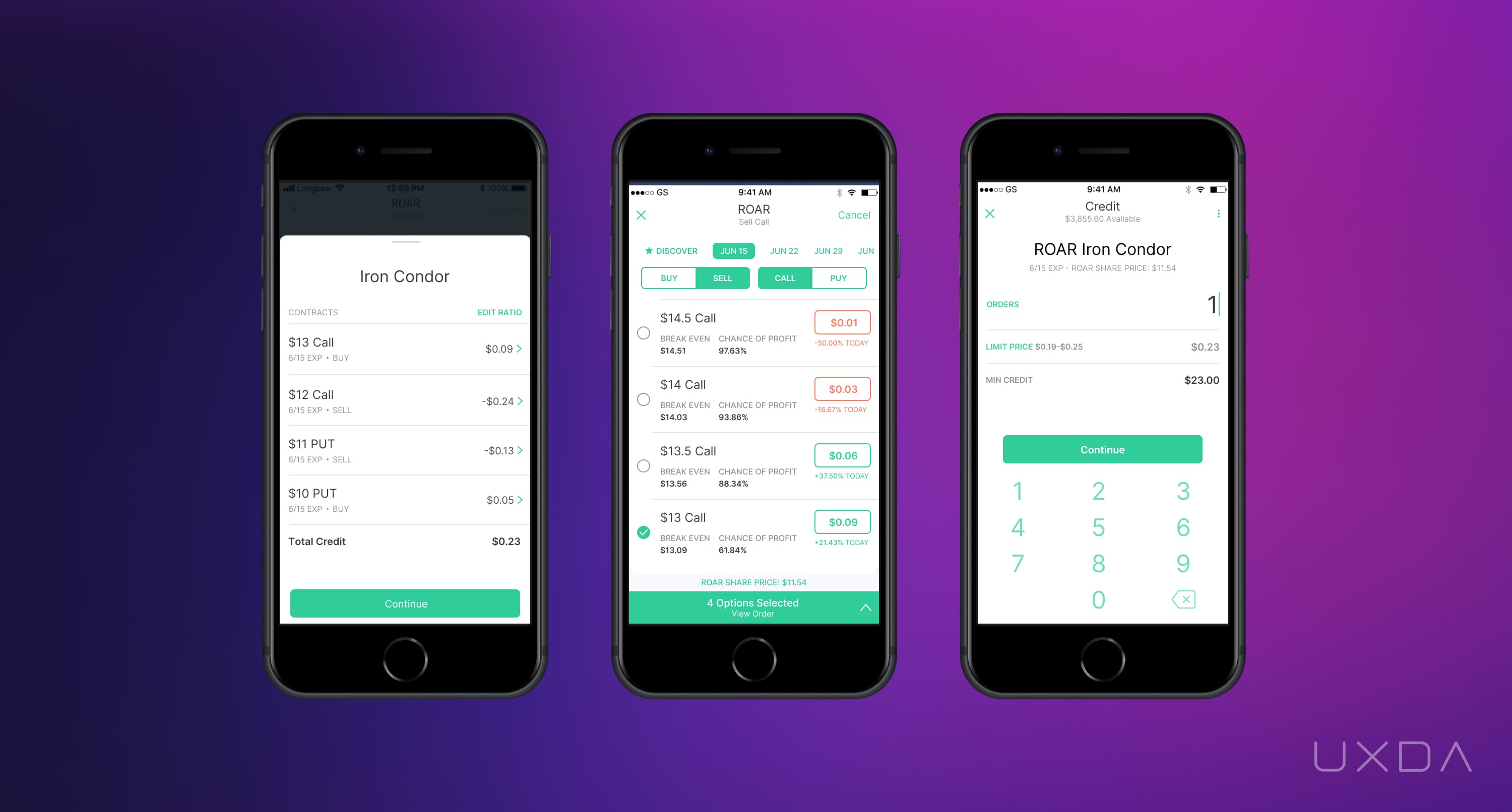
Robinhood simplified traditional trading interface
Simplification should also respect different levels of expertise. A retail banking customer may need guided explanations, while a professional financial user may require greater information density and advanced controls.
More tips about making your banking simple: UX Design Guide: 7 Steps to Make Your Banking Service or Fintech Simple
3. Design Banking UX for Trust, Confidence and Financial Progress
Money is inherently emotional. Customers may feel uncertainty before investing, anxiety when a payment fails, relief when debt decreases or motivation when progress toward a savings goal becomes visible. This means Banking UX should consider not only whether customers can complete a task, but how the experience helps them feel informed, reassured and in control while doing it.

The most important emotional outcomes in financial services often include:
- Confidence — “I understand what I am doing.”
- Control — “I know what I can change or stop.”
- Reassurance — “I understand what happened and what happens next.”
- Progress — “I can see that I am moving toward my goal.”
- Trust — “The bank behaves predictably and transparently.”
- Motivation — “I feel encouraged to continue healthy financial behavior.”
UXDA's Dopamine Banking approach uses meaningful progress, positive reinforcement and carefully designed feedback to support these outcomes. The objective is not maximum emotion or gamification—it is the right emotion at the right moment.
For example, a savings experience can make progress visible through milestones and projections. A debt-repayment journey can reinforce achievement as the balance decreases. A failed transaction should do the opposite of gamification: reduce anxiety by clearly explaining the status, consequences and recovery path.
The effective way to create a product your users will love is to develop digital solutions using the banking UX design process and the Design Thinking approach. This provides the needed “magic” ingredients to deliver financial UX solutions that will not only serve customers according to their needs but also set up an emotional connection fulfilling their expectations.
The emotional response must always match the financial context.
Celebratory feedback may be appropriate when a customer reaches a savings goal, but inappropriate when credit is rejected, fraud is suspected or an investment has lost value.
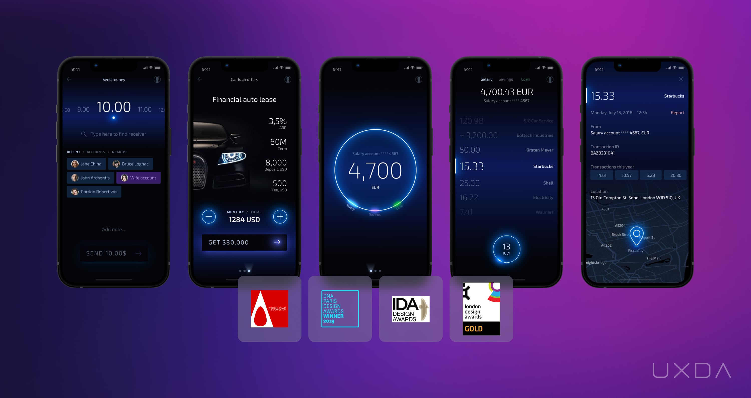
Light Bank by UXDA focused on providing emotional banking experience
Learn more about this topic: 7 Blindspots You Need to Uncover to Achieve Digital Banking Breakthrough
4. Build Consistency Without Losing Digital Brand Identity
Consistency is essential in complex banking ecosystems. Customers should not have to relearn interaction patterns, terminology or product logic every time they move between accounts, cards, payments or other services.
A banking Design System creates reusable interaction patterns, components and standards that help maintain consistency across increasingly large digital ecosystems. But consistency alone is not differentiation. If every bank uses the same patterns in the same way, usability improves while the experience becomes interchangeable.
This is where Digital Brand Identity becomes important.
Digital Brand Identity adds the distinctive layer to translate the financial institution's strategy and brand promise into digital experience through:
- visual language;
- interaction patterns;
- tone of voice;
- motion and feedback;
- personalization;
- service behavior;
- hierarchy and information presentation;
- and the emotional qualities of the experience.
For example, a bank positioned around empowerment should provide strong visibility and control. A brand promising simplicity should avoid internal terminology, unclear statuses and unnecessary steps. A premium financial institution may express its positioning through sophisticated guidance, personalization and service detail.
A Design System helps scale this expression consistently, but not every banking experience problem can be solved through components.
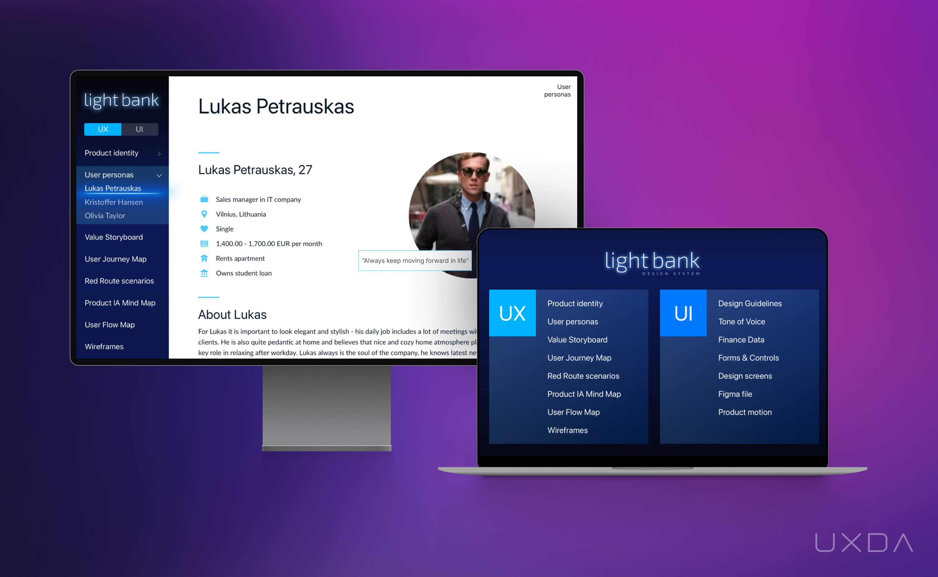
The Financial Design System
Benefits for the customer include using of the same design ’language’ in developing range of complex banking solutions, and even adding new digital channels. This ensures the consistency of the digital bank UX design and is crucial for minimizing the cognitive load on the user.
Benefits for the business - it doesn't matter if the team members working on the project are located in various locations all around the world and speak different languages - the Financial Design System keeps everyone involved ‘on the same page’. It provides a rapid and effective solution, upscaling, and also the possibility to easily adapt to the constantly growing expectations of customers.
Advantages for the designers - it is more convenient to construct interfaces piece by piece, rather than designing all of the screens at the same time. This approach allows designers to adapt and test components to make them pixel perfect.
Benefits for the developers - the Design System allows to create an associated element code library to speed up the development process by copy-pasting similar constructs.
The Financial Design System provides a convenient and quick way to look-up elements, resulting in fast interface design without searching for specific elements or modules in hundreds of already designed screens. This significantly boosts the speed of product development.
For example, Apple have very advanced Design System which called Human Interface Guidelines and covers design principles, essentials, assets using, interactions, etc for iOS, macOS, tvOS, watchOS.
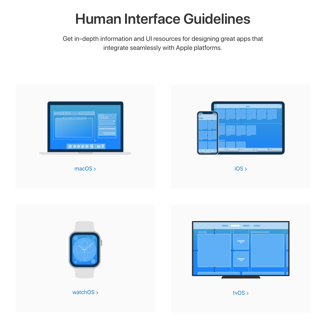
Screenshot of Apple design system
A Design System helps scale this expression consistently, but not every banking experience problem can be solved through components.
Product rules, terminology, operational processes, support interactions and cross-channel journeys also shape the experience. Systemic UX therefore looks beyond the interface to ensure that consistency extends across the wider financial service.
The relationship is simple:
- The Design System helps scale the experience.
- Digital Brand Identity makes it distinctive.
- Systemic UX keeps the wider experience coherent.
5. Validate Banking UX With Real Customer Research
Banking teams work with their products every day. Customers do not.
What feels familiar and obvious internally may be unfamiliar, confusing or intimidating to someone encountering the journey for the first time.
This is why strong banking UX should be validated with real customer evidence rather than internal assumptions alone.
Different research methods answer different questions.
- Customer interviews help uncover motivations, expectations and financial concerns.
- Usability testing reveals where customers misunderstand interfaces, terminology or journey logic.
- Card sorting and tree testing can validate information architecture and navigation.
- Behavioral analytics show where customers abandon, hesitate or repeatedly retry actions at scale.
- Support requests, complaints and frontline observations can reveal recurring friction that conventional product analytics may not explain.
The method should be chosen according to the uncertainty being tested.
If customers abandon onboarding, analytics can show where they leave, but interviews or usability testing may be required to understand why. If customers cannot find a service, navigation testing may be more useful than adding another promotional banner.
Customer research should also avoid relying primarily on broad demographic stereotypes.
Relevant segmentation in financial services often depends more on:
- financial goals;
- behaviors;
- experience levels;
- product usage;
- life context;
- financial confidence;
- and decision-making needs.
The purpose of research is not to validate what the team already believes. It is to replace assumptions with evidence before those assumptions become expensive product decisions.
More about research methods: 5 Effective Research Methods To Create User-Centered Financial Products
6. Use Behavioral Science to Support Better Financial Decisions
Financial interfaces influence how customers understand information, evaluate options and make decisions. Behavioral science can help banking UX reduce unnecessary mental effort and structure financial choices more clearly.
The objective is not to manipulate customers into taking actions that benefit the institution. It is to design an environment in which customers can understand their options and make informed decisions with appropriate confidence.
Four behavioral principles are particularly important in Banking UX.
Mental Models
Customers approach financial products with expectations based on previous experiences.
Using familiar patterns can reduce learning effort, while unfamiliar interaction models should be introduced only when they create meaningful value.
The interface should reflect how customers think about their financial goals—not the internal architecture of the bank.
Cognitive Load
Working memory is limited.
Long forms, dense dashboards, unfamiliar terminology and too many simultaneous choices can make even simple financial tasks feel difficult.
Banking UX should prioritize information, group related content and reveal complexity progressively rather than asking customers to process everything at once.
Feedback and System Status
Customers need to understand what the system is doing.
After an important action, the experience should make clear:
what happened → current status → consequences → what happens next.
This is particularly important for payments, transfers, applications, identity verification and other financial processes where uncertainty can quickly reduce trust.
Decision Architecture
The way financial options are structured affects how easily customers can compare and understand them.
Good decision architecture makes differences, costs, risks and consequences visible without using dark patterns or misleading defaults.
For example, lending or investment journeys should help customers understand the financial implications of their choices rather than optimizing only for conversion.
Behavioral science is therefore most valuable when it helps customers make better decisions—not when it simply makes them click faster.
Good Banking UX reduces unnecessary cognitive effort while preserving meaningful financial understanding.
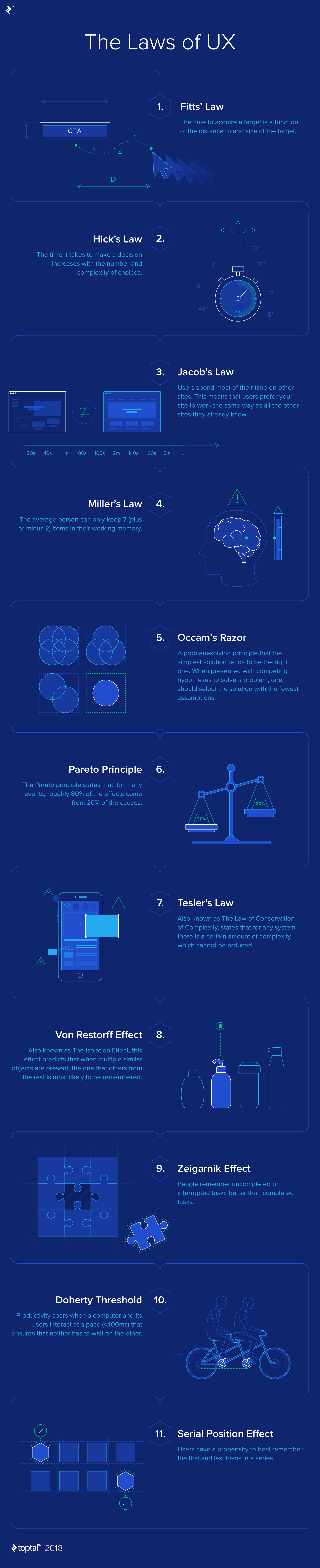
Infographic by Toptal
In the world of banking, we often hear encouraging words about having peace of mind, feeling secure and trusting our banks. But, what exactly makes us trust one particular financial service? Is it a conservative, official look? Information clarity? A 2001 study on users’ trust in cyberspace by expert in software development, Dr. P. Nikander, and expert in human-computer interaction, K. Karvonen, found: Quality of design to be highly among the features which enhance the feeling of trust in users when doing transactions online.
It is actually quite surprising that such a rational matter as people giving their trust to a certain service highly relates to something so emotional as aesthetics of interface. When a person visits a brand new banking or Fintech platform, their first impressions are critical, as the determination of whether the website can be trusted or not literally happens at first glance.
A study coming from B.J. Fogg in 2001 was conducted on “Web credibility.” In this research, 2,440 people participated in viewing professionally-designed websites and gave great insights on people's perception of evaluating trustworthiness. The results of the study concluded that professionally-made design elements and features are more important than its contents.
Once the banking interface is created with an ease of use, the page layout is well constructed, graphics and readability are carefully created by focusing on principles of human psychology, then trust is more likely to be established.
Learn more about psychology concepts vital for creating a great user experience: Ten Essential Psychology Concepts You Should Know to Design Financial Services
7. Improve Banking UX Beyond the Customer-Facing Interface
Customers interact with the banking app, but their experience is shaped by many systems they never see.
Internal employee tools, operational processes, approval logic, legacy platforms, fragmented data and organizational responsibilities can determine whether customer-facing journeys are fast, consistent and reliable.
A modern mobile interface cannot indefinitely compensate for a disconnected banking backstage. Improving digital banking UX therefore requires examining the employee and operational workflows that support the customer journey. Bank-as-a-Product treats these layers as parts of one experience system rather than separate transformation projects.
Read a story from banking employees experience about the fundamental banking back office problems and how a customer-centered approach can help solve them: How to Succeed In The Digital Age: 10 Brutal Truths Every Bank Has to Admit
A beautiful mobile interface cannot indefinitely compensate for a disconnected backstage.
For example, a customer may complete a service request through a modern digital journey only to discover that:
- an employee must manually re-enter the information;
- another department uses different terminology;
- the request cannot be tracked digitally;
- support cannot see the same status;
- or a legacy system introduces delays that were never communicated.
From the customer's perspective, these are not separate operational problems. They are part of one banking experience.
Poor internal UX can therefore create:
- longer resolution times;
- inconsistent information;
- repeated data requests;
- employee errors;
- unnecessary support contacts;
- and reduced customer trust.
Improving banking UX requires examining the entire service system behind critical journeys.
This includes:
customer-facing interfaces → employee workflows → product rules → operations → technology → support → governance.
Systemic banking UX helps identify where customer-facing problems actually originate, while the Bank-as-a-Product model encourages institutions to manage these layers as one evolving customer relationship rather than isolated transformation projects.
The strongest banking UX connects what customers see with the systems, processes and decisions that make the experience possible.
For example, UXDA's digital UX team of financial architects and designers used the same functionality of a typical back-office solution and reinvented it in a friendly and usable manner. Such design do not require months of learning to start serving clients.

Screenshot of outdated banking back office that's still in use
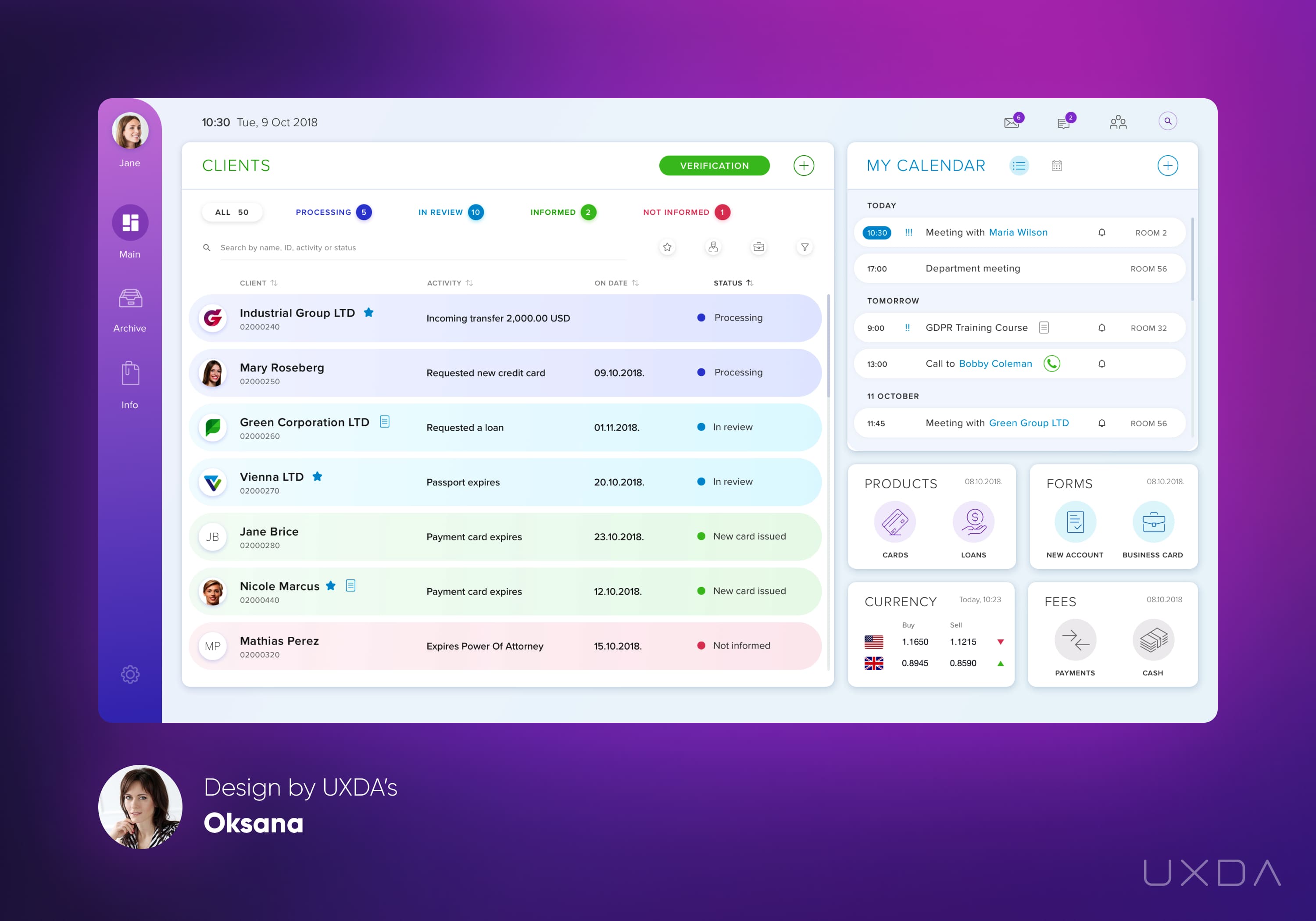
Screenshot of next generation banking back office design by UXDA
Take a look at other next generation banking back office designs by UXDA digital CX agency: Banking Back-Office Designs That will Change Bankers' Perception of the World
HOW TO Make your product remarkable
Professional Financial Platform User Experience: What Makes It Effective?
Professional financial platform UX needs to make sophisticated financial capabilities understandable and controllable without removing the depth expert users require. Unlike many consumer applications, banking, treasury, investment and other professional financial platforms can involve dense data, complex workflows, permissions, multiple entities and high-consequence decisions.
Good financial UX does not simply hide this complexity. UX for banking requires specialized understanding of financial behavior, risk, trust, regulation and complex service ecosystems. It structures it through clear information hierarchy, progressive disclosure, understandable terminology, consistent interaction patterns, transparent system states and safeguards around consequential actions.
Consumer banking UX usually prioritizes simplicity and frequent everyday actions. Professional financial platform UX often needs to balance usability with information density, advanced controls, permissions, complex workflows and expert decision-making.
The objective is to help professional users move efficiently between overview and detail: understand what requires attention, investigate the underlying data and act with confidence. This makes clarity and control as important as visual simplicity when designing complex financial platforms.
A seamless banking experience preserves customer context across journeys, products and channels. Customers should not need to relearn terminology, repeat information, interpret conflicting transaction states or understand which internal department owns a service.
This requires more than smooth UI transitions. Product logic, communication, customer service, technology and operations need to behave as one connected system.
How does better banking UX create business value:
- Higher digital adoption: Customers can successfully use more services independently.
- Improved conversion and journey completion: Clearer journeys reduce avoidable abandonment.
- Lower cost-to-serve: Self-service and fewer preventable support contacts reduce operational load.
- Trust and retention: Clear, reliable interactions strengthen confidence in the relationship.
- Digital differentiation: Digital Brand Identity and coherent experience can create preference beyond feature parity.
Mobile and online banking should share the same underlying experience logic without requiring identical interfaces. Mobile Banking UX usually prioritizes frequent tasks, immediate actions and concise information, while desktop Online Banking UX can support greater information density and more complex financial workflows.
Customers should still encounter consistent terminology, product logic, transaction states and service behavior across both channels. Consistency means one underlying banking experience—not one interface copied across every screen size.
The fundamentals of Banking UX remain important: clarity, usability, feedback, accessibility and customer research. But modern financial experience design cannot stop at individual screens. Digital banking is increasingly shaped by how products, channels, brand behavior, AI, operational systems and organizational decisions work together.
The strongest Digital Banking User Experience therefore combines intuitive interaction with Strategic UX, Digital Brand Identity and Systemic UX. The objective is not simply to make banking easier to use, but to create a coherent financial experience customers can understand, trust and prefer over time.
Banking UX Design: Key Questions
1. What is Banking UX Design?
Banking UX Design is the process of designing how customers understand, navigate and interact with banking products and services. It combines customer research, information architecture, interaction design, content, accessibility, behavioral understanding and visual hierarchy to make complex financial tasks clear, efficient and trustworthy across mobile, online and other banking channels.
2. What is Digital Banking User Experience?
Digital Banking User Experience is the overall experience customers have when using a bank’s digital products, including mobile banking, online banking and other digital financial services. It is shaped not only by interface usability but also by clarity, trust, consistency, personalization, service behavior, system feedback and how well different products and journeys work together.
3. What is the difference between Banking UX and Banking UI?
Banking UX defines how a banking product works and how easily customers can achieve their financial goals, while Banking UI defines how the interface looks and presents those interactions. UI includes elements such as typography, color, buttons, layouts and visual hierarchy; UX includes navigation, information architecture, journey logic, interaction behavior, error recovery and decision-making. A banking app can have attractive UI while still delivering poor UX.
4. What is the difference between Banking UX and Customer Experience?
Banking UX focuses on how customers use and experience specific banking products, interfaces and journeys, while Customer Experience covers the broader relationship with the financial institution. Banking CX includes digital products as well as customer service, communications, branches, operations, brand perception and every other interaction that shapes how customers perceive the bank over time.
5. What makes a good online banking user experience?
A good Online Banking User Experience helps customers understand their financial position, navigate complex services and complete important tasks efficiently on larger screens. Compared with mobile banking, online banking can support greater information density and more advanced workflows, but it should preserve the same terminology, product logic and service behavior customers encounter across other banking channels.
6. How can banks improve Digital Banking UX?
Banks can improve Digital Banking UX by first identifying the real causes of customer friction through UX research, behavioral data, complaints, support insights and usability testing. They should then simplify unnecessary complexity, align journeys across products and channels, strengthen Digital Brand Identity, improve internal processes that affect customer-facing experiences and use Systemic UX Governance to maintain consistency as the digital ecosystem evolves.
7. Mobile Banking UX vs. Online Banking UX?
Mobile Banking UX typically prioritizes frequent tasks, immediate actions and concise information, while Online Banking UX can support greater information density and more complex workflows. The interfaces do not need to be identical. Customers should still encounter consistent terminology, product logic, transaction states and service behavior across both channels. Consistency means one underlying banking experience—not one interface copied across every screen size.
8. What makes a professional financial platform user-friendly?
A professional financial platform is user-friendly when it makes sophisticated financial capabilities understandable and controllable without removing the depth expert users require. Clear information hierarchy, progressive disclosure, efficient navigation, transparent system states, consistent interaction patterns and safeguards around high-consequence actions help users move quickly between overview, analysis and execution.
9. What is Financial UX Design?
Financial UX Design is the specialized discipline of designing digital experiences for banking, FinTech, investment, trading, insurance and other financial products. It combines UX principles with an understanding of financial behavior, regulation, risk, trust, data complexity and high-consequence decision-making. Banking UX Design is one specialized area within the broader Financial UX field.
10. Why is UX research important in banking?
UX research helps banks understand why customers behave as they do before deciding what to redesign or build. It can reveal unmet needs, confusing terminology, incorrect assumptions, behavioral patterns and root causes of abandonment or support demand that analytics alone may not explain. In banking, where products are complex and mistakes can have financial consequences, research reduces the risk of solving the wrong problem.
11. How does Digital Brand Identity improve Banking UX?
Digital Brand Identity translates a bank’s strategy, personality and brand promise into the behavior of its digital products. It goes beyond logos and colors to include interaction patterns, language, motion, personalization, service behavior and emotional qualities. Strong Digital Brand Identity makes Banking UX more coherent and distinctive, helping customers recognize what makes one financial institution meaningfully different from another even when core features are similar.
12. How should banks measure Banking UX?
Banks should measure Banking UX through a combination of behavioral, experience and business outcomes rather than relying on satisfaction scores alone. Relevant metrics can include digital adoption, journey completion, conversion, abandonment, customer effort, task success, error rates, support demand, trust, retention, cross-product engagement and cost-to-serve. The right metrics should reflect the specific customer and business problem being solved and be defined before the UX improvement is implemented.
13. How Do You Create a Seamless Banking Experience?
A seamless banking experience preserves customer context across journeys, products and channels. Customers should not need to relearn terminology, repeat information, interpret conflicting transaction states or understand which internal department owns a service.
Creating this experience requires more than smooth interface transitions. Product logic, communication, customer service, technology and operations need to behave as one connected system.
14. How Does Better Banking UX Create Business Value?
The impact of Banking UX should be measured against the customer and business problem being solved rather than assumed from interface improvement alone.
- digital adoption;
- conversion and completion;
- cost-to-serve;
- trust and retention;
- differentiation.
15. How Is Banking UX Evolving?
Banking UX is evolving from interface-level optimization toward more adaptive, connected and systemic experiences. AI, personalization, embedded finance and automation are changing how banking services behave, while Strategic UX, Digital Brand Identity and Systemic UX are becoming more important for maintaining coherence and differentiation as products become more dynamic.
16. What is the Banking UX Design process?
The process should begin with understanding the problem rather than assuming the solution and continue beyond launch through measurement and ongoing experience governance.
- Diagnose the customer and business problem
- Research customer behavior and context
- Map journeys and systemic dependencies
- Design information architecture and interaction
- Prototype and validate with customers
- Measure outcomes and govern improvement
17. What is the Banking UX Design Checklist?
Before launching or redesigning a banking experience, ask:
- Can customers understand their financial position?
- Can they find frequent actions quickly?
- Is terminology written from the customer perspective?
- Are financial consequences clear?
- Are success, pending and failure states explicit?
- Does security create necessary rather than arbitrary friction?
- Is the experience accessible?
- Are mobile and online channels consistent?
- Does Digital Brand Identity appear through product behavior?
- Have critical journeys been tested with real customers?
- Do employees and internal systems support the promised experience?
- Are customer and business outcomes being measured?
Get UXDA Research-Based White Paper "How to Win the Hearts of Digital Customers":

UXDA partners with banks and financial institutions to research, diagnose and improve complex digital financial experiences. Through Banking UX Design, Strategic UX, Digital Brand Identity, Systemic UX and experience governance, we help organizations improve mobile banking, online banking and professional financial platforms while connecting customer needs with measurable business outcomes.
The objective is not simply to redesign interfaces. It is to create clearer, more coherent and strategically differentiated financial experiences that can evolve across products, channels and customer relationships.
- E-mail us at info@theuxda.com
- Chat with us in Whatsapp
- Send a direct message to UXDA's CEO Alex Kreger on Linkedinank-as-a-Product