


Banks spend millions building best-in-class mobile apps. But a modern bank isn't a collection of channels. Because customers don't experience an organization chart, product teams, technology stack, or operating model. They experience one bank. And they expect that bank to behave like one product. So, the next competitive advantage in banking will come from turning the entire institution into one coherent Bank-as-a-Product—unifying journeys, channels, operations, communications, AI, and brand behavior around one distinctive Digital Brand Identity.
What is the most dangerous UX metric in financial services? Half of all inquiries to us begin with the phrase: “We want the best mobile banking app in the market.” But app rating may be one of the most misleading indicators of banking experience quality.
Not because app rating is useless—but because it measures the experience of one interface while the customer experiences the institution. A bank can have a 4.8-star app and still deliver a poor digital experience. Because the mortgage journey, fraud resolution, onboarding, customer support, statements and cross-channel continuity may still be broken.
Of course, mobile banking has become the most visible expression of a financial brand. It is where customers check their balances, transfer money, manage cards, apply for products and make decisions that directly affect their lives. But most banks are still designed and managed as collections of separate products, channels and functions.
The mobile app may be excellent. The website may be excellent. The contact center may be excellent. The branch may be excellent. And the bank can still deliver a fragmented experience.
There is an uncomfortable truth that usually emerges during the transformation: the mobile app is never the whole UX problem. It is only the most visible expression of the bank-as-a-product. The real UX challenge is making the entire bank behave like one coherent product.
UXDA has designed more than 100 financial products across 39 countries, and one pattern repeatedly appears: the hardest UX problems rarely live only inside the app interface. We should measure journeys, not just channels.
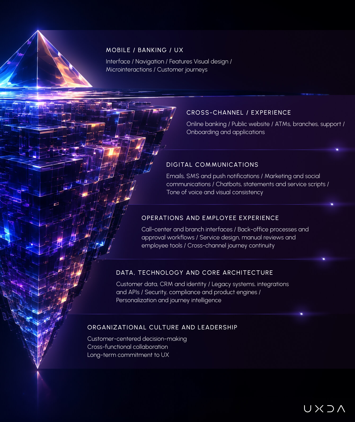
When a bank measures its UX success exclusively through its mobile app, it is measuring only the visible tip of the iceberg. Beneath the surface lies a vast, interconnected digital ecosystem—web portals, ATM interfaces, back-office CRM systems, customer support channels, push notifications and marketing communications. If those underlying layers are fragmented, the shine of a top-tier mobile app quickly wears off.
Redesigning only the app is like polishing the tip of the iceberg while ignoring the mass beneath it. The result may look spectacular in the app store, but the customer is not living in the app store. The customer is moving digitally through all of the bank’s services. So, the next step in banking UX is therefore not better channels. It is designing the digital banking itself as one product. We call this principle Bank-as-a-Product (BaaP).
Bank-as-a-Product is not simply about connecting journeys and channels. It is about making the entire institution behave as one coherent Digital Brand Identity. BaaP does not mean making every digital channel identical. It means making every digital interaction recognizable part of the same bank.
And Digital Brand Identity is how a bank's strategy, brand promise and personality become recognizable through every digital interaction—not only through visual design, but through how the bank behaves, communicates and makes decisions. In a Bank-as-a-Product model, Digital Brand Identity becomes the experience layer.
The Bank-as-a-Product: Why Best-in-Class Apps Fail in Isolation
Consider a typical customer journey: a user downloads bank's newly redesigned, award-winning mobile app. The onboarding is frictionless, the dashboard is elegant, and the micro-interactions feel effortless.
Then, three days later, they attempt to apply for a mortgage online, only to be redirected to a clunky desktop portal built in 2012 that doesn't share login credentials. And every time they switch to other apps on their phone, to find the data they need, they have to log in again and fill out the form from scratch. This is actually happening in 2026.
Or they call support about a flagged transaction, and the customer service representative asks them to repeat every detail because the CRM has zero visibility into their app actions.
A customer does not perceive any bank as a series of separate departments or isolated software builds. They experience each particular bank as a coherent brand entity. In other words, customers experience the bank as one product—even when the bank itself does not operate that way.
Deloitte’s Digital Banking Maturity 2024 study assessed 349 banks across 44 countries, analyzing 1,005 functionalities, such as information discovery, account opening, everyday banking, non-banking services and customer experience, across end-to-end paths. Deloitte found that digital leaders are shifting their attention away from simply expanding functionality and toward personalization, key processes and the remodeling of digital channels around a better overall customer experience.
That distinction matters. Adding more functionality to one channel is not the same as improving the experience across the customer lifecycle.
KPMG’s research on digital transformation in banking describes many banks as operating a patchwork of legacy systems and loosely connected customer-facing channels. In its survey of 200 senior banking executives, 54% said more back-office digitalization was required, 59% thought further work was needed in customer-facing processes, and 60% had invested in customer-experience technology but acknowledged there was still more to do.
The important word here is not merely digital. It is coherent. Integration connects systems. Coherence makes them feel like one product.
PwC’s banking transformation approach makes the same point from an organizational perspective. PwC argues that once a bank defines a customer-centered mission, its entire operating model should follow—requiring coordinated change across business functions, operations, workforce, risk, compliance, employee experience and technology architecture.
Meanwhile, the EY Global Banking Outlook 2025 notes that retail and corporate customers now expect seamless, round-the-clock service across multiple channels and devices. It also highlights a major obstacle: many banks still struggle to generate and interpret detailed customer-journey data, limiting their ability to deliver meaningful personalization.
McKinsey’s research on experience-led growth in banking reinforces this systemic view. It found that banks leading in customer satisfaction also outperform in growth, shareholder returns and cost efficiency while satisfied customers are six times more likely to remain with their bank. Yet a typical regional bank manages more than 1,500 customer journeys, with the greatest improvement opportunities often found in cross-functional experiences, such as onboarding and problem resolution.
The implication is clear: customer experience advantage is not created by perfecting one interface, but by making the journeys, channels and teams behave as parts of one product.
Banking UX cannot be solved inside the boundaries of a single mobile or a desktop application. The central challenge is that every part can be locally optimized while the overall bank remains globally incoherent.
The Bank-as-a-Product Model
The mobile app is the part customers touch, screenshot and rate. It's also the part that's easiest to commission, easiest to benchmark against competitors and easiest for a steering committee to approve because everyone can see it.
Experience: Discovery → Acquisition → Onboarding → Everyday Banking → Advice → Problem Resolution → Growth → Retention
Below the waterline sits everything that actually determines whether that app delivers a coherent experience over time: the internet banking platform built by a different vendor on a different design language five years earlier. The onboarding flow owned by a different department with different KPIs. The call center scripts that were never told the app even changed. The push notifications, SMS alerts and email campaigns written by marketing without a UX brief in sight. The branch tablet running a UI that was frozen in 2019. The chatbot trained on outdated terminology. The internal approval process in which every channel team optimizes its own metrics with no one accountable for the customer's total experience.
Channels: Mobile · Web · Branch · ATM · Contact Center · AI
Communications: Push · Email · SMS · Documents · Marketing
Operations: Processes · Policies · Employees · CRM
Technology: Core · Data · APIs · Platforms · AI
Governance: Strategy · Ownership · Standards · KPIs · Decision rights
A brilliant app sitting on top of a fragmented ecosystem doesn't fix the fragmentation—it just makes it more visible by contrast. Customers don't experience "the app," "internet banking" and "the branch" as separate products.
The customer sees one product. The bank operates dozens of products, channels, systems and teams. The experience gap is created between those two realities. The moment that bank behaves like four different companies stitched together, trust erodes, no matter how many design awards the app itself has won.
AI Changes the Economics of Experience Fragmentation
AI does not change the diagnosis. It increases the stakes. As generative tools make it easier to produce interfaces, messages and product variations, the ability to create a polished screen will become less differentiating.
AI will make the cost of inconsistency cheaper to produce—but more expensive for the customer to experience. When every team will generate experiences independently, experience governance will become more—not less—important.
Fragmented organization + AI → fragmented experience at scale.
The real advantage will come from institutional judgment: the ability to keep hundreds of AI-assisted decisions coherent across channels, products and customer journeys. Without a shared strategy and governance system, AI will not resolve fragmentation; it will accelerate it. This makes BaaP even more important: when AI allows every team to create and change customer experiences faster, the bank needs a stronger principle for making those experiences feel like one institution.
Digital Brand Identity becomes that behavioral reference point—defining how the bank should speak, guide, personalize, explain and act across human and AI interactions. The question is no longer whether AI reflects your brand. The question is whether your bank has defined the behavior AI should represent.
A fragmented organization equipped with faster tools becomes capable of producing inconsistent experiences at unprecedented speed. As we argued in AI in Banking Won’t Kill UX Design—It Could Reverse UX Progress, AI multiplies the quality of the system into which it is introduced. If that system is coherent, AI can strengthen personalization and service. If it is fragmented, AI will generate more inconsistency, more noise and more experience debt.
The Five Sources of Experience Fragmentation
Every disconnected channel, duplicated process, inconsistent message and local exception creates experience debt. Experience debt behaves like technical debt: each individual decision appears rational, but the accumulated system becomes increasingly expensive to change.
Experience Debt = the accumulated cost of past decisions that make today's customer experience harder to understand, use and evolve.
Experience Fragmentation is the gap between how a bank is organized internally and how customers experience it externally. When we examine a bank through the Bank-as-a-Product lens, we frequently discover five sources of experience fragmentation beneath the digital interface:
1. Channel Fragmentation
"Why can't I continue here?"––How often do customers have to switch channels to complete a journey?
The bank’s mobile app, public website, online banking platform, ATMs, branches and support channels have often evolved at different times under different teams. Each fragmented channel develops its own navigation logic, terminology, functionality and interaction patterns.
A product may be described one way on the website and another way inside the app. A feature available through online banking may be missing from mobile. A customer may begin a process digitally but be unable to continue it through a human-assisted channel.
This creates a collection of individually optimized channels rather than one cohesive and seamless experience. A strong banking ecosystem should allow customers to move among channels without losing context, progress or confidence.
The BaaP principle is not “one channel.” It is one continuous customer experience across channels.
2. Tone of Voice & Visual Communication Fragmentation
"Why is the bank talking differently to me?"––How many customer messages are generated outside the product team's experience standards?
Banks often treat emails, push notifications, SMS messages, statements, social media posts, advertising and campaign materials as separate from product UX. But they are not separate.
Every communication is an extension of the banking interface—even when it appears outside the app. In a Bank-as-a-Product model, these communications are also expressions of Digital Brand Identity. They are not simply messages around the product; they are part of how the product behaves.
An email is a banking screen delivered to the inbox. A push notification is an interface that appears without being requested. A call-center script is UX delivered through a human voice. A social media post may be the first interaction a future customer has with the bank.
These touchpoints shape how people understand financial events, evaluate the brand and decide whether it feels relevant to their lives. Yet many banks create a striking contradiction between their digital product and their public communication.
The mobile app may use cutting-edge three-dimensional graphics, sophisticated motion, expressive illustrations and a carefully crafted visual language. But the bank’s advertising may still rely on outdated layouts, dense promotional messages and generic images of smiling families shaking hands.
The app may feel distinctive and premium, while the bank’s social media profiles are filled with flat stock photography, repetitive product banners and generic templates that could belong to any financial institution.
The product says, “We are building the future of banking.” The communication says, “We are still operating from the previous decade.”
Customers do not experience these as separate creative disciplines. They see one institution sending conflicting signals about who it is.
This visual inconsistency is more than a branding imperfection. It creates a credibility gap. If the bank looks progressive inside the app but conventional everywhere else, the transformation can feel like a temporary digital facade rather than a genuine evolution of the organization.
The fragmentation also appears in language and timing. A beautifully designed payment journey can still generate anxiety if the confirmation message is vague. A simple onboarding flow can collapse when a followup email introduces legal terminology that was never explained. A personalized dashboard loses credibility when the same customer receives irrelevant mass promotions. A premium app experience is weakened when an important service update arrives as a poorly structured PDF or an impersonal template.
In each case, the interface may be excellent, but the wider communication system breaks the experience.
To create coherence, banks need more than a tone-of-voice guide or a collection of marketing templates. They need an integrated communication architecture covering:
- Transactional emails, SMS messages and push notifications;
- Marketing campaigns and product advertising;
- Social media content and community communication;
- Visual language, illustration, photography, motion and three-dimensional graphics;
- Statements, documents and regulatory notices;
- Chatbot responses, support scripts and branch communication;
- Error messages, confirmations and service updates.
Each layer should express the same brand character, visual maturity and experience principles as the digital product does.
This does not mean every communication must look like a mobile-app screen. Different channels have different purposes. But they should clearly belong to the same world.
If the app is warm, intuitive and human, the emails should not feel bureaucratic. If the product uses a bold and contemporary visual language, social media should not retreat into generic stock imagery. If the bank promises personalization, its campaigns should not communicate as if every customer were identical.
A bank cannot claim to have transformed its digital experience while communicating through a fragmented collection of voices, styles and visual eras.
Digital communication is not decoration around the product. It is one of the most visible, frequent and emotionally influential layers of the customer experience.
3. Operational Fragmentation
"Why do I have to repeat myself?"––How often do customers or employees repeat information?
The front end may promise immediacy while the operating model behind it still depends on manual reviews, fragmented data, duplicate forms and disconnected employee systems.
This is where many apparently “UX” problems originate. Customers are repeatedly asked to provide the same information because systems cannot share it. Application statuses remain unclear because back-office processes do not expose reliable progress data. Support agents cannot help because their tools provide a different view from the customer-facing channel. The interface becomes a beautiful digital wrapper around an unchanged operational reality.
This is not a reason to abandon interface improvement. It is a reason to connect interface design with service design, employee experience and operational digital transformation.
4. Digital Brand Identity Fragmentation
"Which version of this bank is real?"––How many customer journeys contradict the bank's intended brand behavior?
Marketing may position the bank as human, progressive and caring, while the digital product communicates through cold templates, legal terminology and generic vendor patterns.
The advertising says, “We understand you.” The application form says, “Provide mandatory supporting documentation pursuant to the relevant product eligibility criteria.” The contradiction is not cosmetic; it weakens trust.
A financial brand is no longer defined primarily by campaigns or visual identity, but by the behavior of its digital ecosystem. This is the essence of Digital Brand Identity.
Every interaction should translate the bank’s purpose and positioning into something customers can feel: the way complexity is explained, the way errors are handled, the way choices are presented and the way the bank responds when something goes wrong. If the bank promises one thing but behaves another way, the customer doesn't experience a brand inconsistency—they experience a different bank.
5. Governance Fragmentation
"Why does everything feel inconsistent?"––How many teams can change customer-facing experiences without cross-bank experience review?
Perhaps the deepest problem is that nobody has sufficient authority over the complete experience.
Designers may own screens but not product policy. Product teams may own functionality but not communications. Marketing may own campaigns but not transactional messages. Technology may own platforms but not customer outcomes. Everyone is responsible for a part. Nobody is responsible for coherence.
That is the organizational problem BaaP is designed to solve. BaaP requires someone—or some governance system—to protect the coherence of the product that the customer experiences as “the bank.”
Without an internal UX governance system, even an excellent redesign gradually deteriorates. New features are added under deadline pressure. Different vendors introduce conflicting patterns. Business units create local exceptions. Communications drift away from the product language. Research becomes occasional rather than continuous. The experience accumulates debt one reasonable decision at a time.
As we explored in Why Banks Need Systemic UX to Escape the Build Trap, organizations can become extremely efficient at shipping screens while slowly losing the strategic logic connecting them. The faster independent teams execute, the more organizational entropy they can create without a shared experience architecture.
Every bank should be able to answer:
- Who decides what the experience should be?
- Who decides when teams can deviate from it?
- Who measures whether the experience is getting better or worse?
If the answer is three different departments—or “it depends”—the bank doesn't have experience governance.
The Hidden Cost of a Fragmented Banking Experience
Experience fragmentation is not primarily a design problem. It is a cost structure.
- Lost conversion: Customers abandon journeys when they encounter channel handoffs, repeated information or unclear next steps.
- Higher cost-to-serve: Fragmented digital journeys push customers toward branches and contact centers.
- Lower digital adoption: Customers don't adopt digital journeys they don't trust.
- Slower transformation: Every new feature requires coordination across increasingly incompatible systems and teams.
- Brand erosion: Every inconsistent interaction weakens the credibility of the bank's positioning.
The reason banks repeatedly recreate the same UX problems is not that they lack designers. It is that they lack a mechanism for making experience decisions across organizational boundaries.
A digital financial brand is no longer what a bank looks like. It is how the bank behaves across its entire digital ecosystem. Digital Brand Identity becomes the key reference point for how the bank speaks; how it behaves; how it guides; how it responds; how it makes decisions; how it simplifies complexity; how it expresses trust; how AI interacts with customers; how employees deliver the service.
Not a Competence Problem: Shifting from Channels to Bank-as-a-Product
It would be easy—but wrong—to blame banks' teams for this fragmentation. Banks are among the most complex organizations in the world. They must balance customer needs with security, risk, regulation, legacy infrastructure, shareholder expectations, operational resilience and the interests of many business units.
Most fragmented ecosystems were not created through negligence. They emerged gradually.
A new channel was launched to answer a market need. A specialist platform was introduced for a particular product. A communication system was added by another department. A vendor solved an urgent operational problem. A regulatory change required a fast adjustment.
Each decision made sense in its own context. But over time, these decisions accumulated into a system no single team had intentionally designed. That is why the solution is not another isolated project. It is a new way of designing and governing the bank as one product.
When a bank asks us to create a best-in-class mobile application, the app often becomes the catalyst—not the boundary—of transformation. At UXDA, we use Systemic UX to make the Bank-as-a-Product principle actionable—a strategic approach that elevates UX from tactical interface design to a core business architecture.
When banks come to us, we don't just ask, "What should this mobile screen look like?" We ask, "How does this interaction reflect the bank’s purpose, and how does it connect with every other channel in the customer’s lifecycle?"
A systemic approach expands the work across several interconnected layers:
1. Establish One Experience Strategy
Before redesigning channels, the bank needs a shared answer to several fundamental questions:
- What role should the bank play in customers’ lives?
- What should distinguish its experience from competitors?
- How should customers feel when making difficult financial decisions?
- What principles should guide every product, channel and communication?
- What should make the bank recognizable even when the logo is absent?
Without this foundation, teams can produce attractive but disconnected solutions.
The experience strategy becomes a north star against which product, design, technology, service and communication decisions can be evaluated. This is the shift described in Traditional UX Fails in Finance: Apply Systemic UX in Digital Banking: interface optimization is necessary but insufficient when it is separated from brand identity, business strategy, customer psychology, technological reality and long-term outcomes.
2. Map the Entire Customer Ecosystem
Banks should not map only the screens customers use if the goal is to design the bank as one product. They must map the complete system customers move through, including discovery, acquisition, onboarding, authentication, everyday banking, product applications, problem resolution, financial guidance, relationship growth and eventual offboarding.
For each stage, the bank should identify:
- The channels involved;
- The communications customers receive;
- The teams and systems behind the experience;
- The moments at which context is lost;
- The emotional and financial risks;
- The business outcomes the journey should support.
This exposes problems that cannot be seen through an app audit alone. The objective is not simply to map touchpoints. It is to understand how one bank behaves across the entire customer journey.
3. Create a Shared Experience Architecture
A design system can ensure visual consistency, but a true experience architecture goes further: it translates the bank's Digital Brand Identity into shared behaviors across journeys and channels.
It establishes shared interaction logic, navigation principles, terminology, content patterns, personalization rules, service behaviors and cross-channel continuity. Customers should not have to relearn the bank every time they switch channels or products.
The goal is not to make every touchpoint identical. Mobile, desktop, branch and customer support serve different contexts. The goal is to make them feel unmistakably part of one intelligent UX system.
4. Treat Digital Communications as Product UX
In a Bank-as-a-Product model, the product does not end when the customer leaves the app. Transactional communications should be designed together with customer journeys—not after the journey has already been built.
Every notification, email and message should answer four questions:
- What happened?
- Why does it matter?
- What should the customer do next?
- Where can they get help?
The tone, timing and relevance of these messages should reinforce the same experience principles as the app itself. This requires product, design, CRM, marketing, legal and service teams to work from one communication architecture rather than separate departmental templates.
5. Transform the Employee Experience Behind the Customer Experience
A customer cannot receive a coherent experience if employees are working with fragmented tools and incomplete information.
Call-center agents, branch employees, relationship managers and operational teams need a consistent view of the customer’s context, actions and journey status. Internal interfaces are not merely back-office software; they are part of the customer experience supply chain.
When employee experience (EX) improves, the bank becomes faster, more informed and more human at the moment customers need assistance. Employees are therefore part of the Bank-as-a-Product experience layer: the customer should encounter the same bank whether the next interaction is with an interface, an AI assistant or a human employee.
6. Build an Experience Governance System
A redesign can create a new experience. Governance protects the bank-as-a-product as it evolves.
As outlined in Financial UX Governance for Digital Banking, the goal is to transform UX from a temporary project activity into a permanent institutional capability. And this does not mean creating “design police” who approve button colors.
Effective UX governance defines:
- Who owns the coherence of the end-to-end experience;
- Which principles guide product decisions;
- How customer research informs priorities;
- How new features are assessed before development;
- How channels and communications remain coherent;
- Which metrics indicate customer and business value;
- How exceptions are evaluated;
- How experience quality is monitored after launch.
Governance gives the bank a mechanism for making hundreds of future decisions without losing the strategic intent established during the transformation.
Is Your Bank Managing Channels—or the Experience?
Check your financial institution:
- Would customers recognize your bank's personality without seeing its logo?
- Do your products behave consistently with your brand positioning?
- Can a customer start a journey in one channel and finish it in another without losing context?
- Does every major customer journey have a clearly accountable owner?
- Are customer communications designed as part of the journey?
- Can employees see the same customer context customers see?
- Does your contact center communicate the same promise as your digital channels?
- Does your bank measure journey outcomes across departments?
- Can product teams introduce exceptions without experience governance?
- Do different channels use the same terminology?
- Can you identify your highest-cost experience failures?
- Is there one experience strategy shared across product, marketing, technology and operations?
- Do employees have clear principles for translating the brand into customer interactions?
- Can product teams explain what makes their experience uniquely “your financial institution”?
- Who has the authority to say “this will damage the customer experience” and stop a release?
The primary task isn't to tear down existing systems overnight, but to shift perspective. The move is from a product-centric mindset (“How do we fix the app?”) to a Bank-as-a-Product mindset (“How do we make the entire bank behave as one coherent product with one distinctive Digital Brand Identity?”). This shift unlocks sustainable competitive advantage.
From Bank-as-a-Product to Bank-as-a-Brand Experience
None of this is a criticism of banks for starting with the app—it's the good first move, and every institution we've partnered with has been correct in demanding excellence there first. A world-class mobile app remains enormously valuable. It is the bank’s most frequently used channel, its strongest competitive signal and the clearest demonstration of what a new customer experience could feel like. But its long-term value depends on whether the rest of the bank behaves like the same coherent product.
The deeper opportunity is what comes next: turning the app from an isolated product into the visible expression of a Bank-as-a-Product system. It depends on a governance system, a set of coherent channels and a communication layer working in concert beneath the surface.
That's why UXDA rarely stays "just the app team" for long with the partners we work with most closely. The mobile app proves what's possible. The digital ecosystem transformation is what makes it permanent—turning a single great product into an institutional capability that keeps generating trust long after the original project team has moved on to the next challenge.
Without an ecosystem transformation, the app becomes an isolated island of excellence surrounded by inconsistent communications, disconnected channels and unchanged operations. Without governance, today’s carefully designed experience becomes tomorrow’s collection of exceptions. Without coherent communications, the bank speaks with multiple voices. Without internal transformation, customers encounter a modern interface connected to an old institutional reality.
This is why we increasingly frame financial UX as strategic infrastructure of Bank-as-a-Product rather than a collection of separate design deliverables. As described in 12 Steps to Turn Digital Banking UX into Strategic Infrastructure, the value of UX is created—or lost—through systems, behaviors, decisions and trust over time. It does not exist only inside individual screens.
Bank-as-a-Product is not simply about connecting journeys and channels. It is about making the entire institution behave as one coherent Digital Brand Identity.
Bank-as-a-Product (Ensures digital efficiency)
Are all aspects of customer experience consistent and coherent?
↓
Digital Brand Identity (Ensures digital distinctiveness)
What should the bank feel and behave like?
↓
Experience Principles (Ensures digital coherence)
How should that identity manifest across journeys?
↓
Experience Architecture (Ensures digital delivery)
How do we operationalize it across the ecosystem?
↓
Experience Governance (Ensures digital sustainability)
How do we prevent fragmentation over time?
For years, banking leaders asked: “How do we make our mobile app best-in-class?” Today, that question is too small. The stronger question is: “How do we make the entire bank behave like one digital product?”
A bank is no longer a collection of isolated digital products. Customers don't think: “Now I am using the payments product.”
Then: “Now I am using the lending product.”
Then: “Now I am experiencing the bank's brand.”
They experience one institution. One relationship. One digital environment.
That means the experience across products must add up to something coherent.
One experience strategy across channels. One recognizable Digital Brand Identity across interactions. One communication logic across messages. One customer context across service environments. One governance system protecting the experience as the organization evolves.
The mobile app may be the visible expression of the bank. But customers experience the entire product.
That is the opportunity behind Bank-as-a-Product—and ultimately behind a distinctive Digital Bank-as-a-Brand Identity.
Bank-as-a-Product and Banking UX: Key Questions
What is Bank-as-a-Product in banking?
Bank-as-a-Product is a systemic approach to designing and governing a financial institution as one coherent customer experience rather than as a collection of separate products, channels and departments. It aligns journeys, communications, operations, technology and Digital Brand Identity around shared experience principles.
Why is a mobile banking app redesign not enough?
A redesigned app can improve one visible channel while underlying customer journeys remain fragmented across web, branches, contact centers, operations and back-office systems. Customers experience the entire institution, so isolated channel improvements cannot solve problems created by disconnected processes, teams and technologies.
What causes experience fragmentation in banks?
Experience fragmentation typically emerges when channels, products, communications, operations and technologies evolve independently under different teams, vendors and objectives. Each decision may make sense locally, but together they can create inconsistent journeys, duplicated processes, conflicting messages and loss of customer context.
How does fragmented banking UX affect business performance?
Fragmented experiences can increase journey abandonment, support dependency and cost-to-serve while reducing digital adoption, conversion, trust and customer retention. They can also slow transformation because every new initiative must work around increasingly disconnected systems, processes and experience patterns.
How is Bank-as-a-Product different from omnichannel banking?
Omnichannel banking primarily focuses on connecting customer channels. Bank-as-a-Product goes further by aligning the underlying experience strategy, operations, communications, technology, Digital Brand Identity and governance so that the entire institution behaves coherently across the customer lifecycle.
What role does Digital Brand Identity play in Bank-as-a-Product?
Digital Brand Identity defines how the bank’s strategy, personality and brand promise become recognizable through digital behavior. It guides how the institution communicates, simplifies complexity, personalizes interactions, responds to problems and maintains a distinctive experience across human and AI-enabled touchpoints.
Why does Bank-as-a-Product require UX governance?
A bank’s customer experience is shaped by many teams, channels, vendors and systems. UX governance provides shared principles, ownership, standards, KPIs and decision rights so that individual teams can evolve their areas without gradually fragmenting the overall experience.
How does AI change the need for Bank-as-a-Product?
AI increases the speed and volume at which teams can generate interfaces, communications and personalized experiences. Without a shared experience strategy and governance system, this can scale inconsistency faster; within a coherent Bank-as-a-Product model, AI can instead strengthen personalization, service and cross-channel continuity.
How can banks start moving toward a Bank-as-a-Product model?
Banks can begin by defining one experience strategy, mapping the complete customer ecosystem, identifying where context and consistency break, creating a shared experience architecture and aligning communications, employee tools and customer journeys. Continuous measurement and governance are then needed to keep the experience coherent as the institution evolves.
Does Bank-as-a-Product mean every banking channel should look the same?
No. Mobile, web, branches, ATMs and customer support serve different contexts and should be designed accordingly. The goal is not identical interfaces, but recognizable continuity in language, interaction logic, service behavior, brand identity and customer context across every touchpoint.
Discover our clients' next-gen financial products & UX transformations in UXDA's latest showreel:
Turn Your Bank into One Coherent Digital Product
UXDA defines distinctive Digital Brand Identities for leading financial institutions to ensure coherent digital experiences across products, journeys, channels and ecosystems.
Are you looking for a strategic UX partner to challenge assumptions and ensure the right digital experience? Contact UXDA.
- E-mail us at info@theuxda.com
- Chat with us in Whatsapp
- Send a direct message to UXDA's CEO Alex Kreger on Linkedin